Access provides you with a number of tools that help you to quickly build attractive, easy-to-read reports that present the data in a way that best suits the needs of its users. You can use the commands on the Create tab to create a simple report with a single click. You can use the Report Wizard to create a more complicated report, or you can create a report by adding all the data and formatting elements yourself. Whichever method that you choose, you will probably make at least a few changes to the design of the report to make it display the data the way that you want. This article discusses the general process of designing a report and then shows you how to add specific design elements to your report.
In this article
Decide how to lay out your report
When you design a report, you must first consider how you want the data arranged on the page and how the data is stored in the database. During the design process, you might even discover that the arrangement of data in the tables will not allow you to create the report that you want. This can be an indication that the tables are not normalized — this means that the data is not stored in the most efficient manner.
Make a sketch of your report
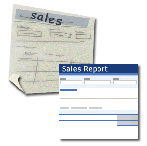
This step is not required — you might find that the Access Report Wizard or the Report tool (both of which are available on the Create tab, in the Reports group) provide a sufficient starting design for your report. However, if you decide to design your report without using these tools, you might find it helpful to make a rough sketch of your report on a piece of paper by drawing a box where each field goes and writing the field name in each box. Alternatively, you can use programs such as Word or Visio to create a mockup of the report. Whichever method that you use, be sure to include enough rows to indicate how the data repeats.
For example, you can use a row for product information, then several repeating rows for that product's sales, and finally a row of sales totals for the product. Then, the sequence repeats for the next product and so on until the end of the report. Or, perhaps your report is a simple listing of the data in the table, in which case your sketch can contain just a series of rows and columns.
Note: This technique is also very useful if you are designing a report for someone else. In this case, the other person can draw the sketch before you begin work.
After you create your sketch, determine which table or tables contain the data that you want to display on the report. If all the data is contained in a single table, you can base your report directly on that table. More often, the data that you want is stored in several tables that you must pull together in a query, before you can display it on the report. The query can be embedded in the RecordSource property of the report, or you can create a separate, saved query and base the report on that.
Decide which data to put in each report section
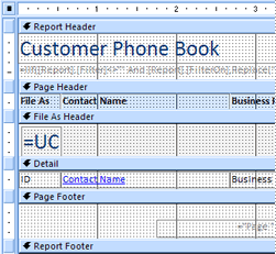
Each report has one or more report sections. The one section that is present in every report is the Detail section. This section repeats once for each record in the table or query that the report is based on. Other sections are optional and repeat less often and are usually used to display information that is common to a group of records, a page of the report, or the entire report.
The following table describes where each section is located and how the section is typically used.
|
Section |
Location |
Typical contents |
|
Report header section |
Appears only once, at the top of the first page of the report. |
|
|
Report footer section |
Appears after the last line of data, above the Page Footer section on the last page of the report. |
Report totals (sums, counts, averages, and so on) |
|
Page header section |
Appears at the top of each page of the report. |
|
|
Page footer section |
Appears at the bottom of each page of the report. |
|
|
Group header section |
Appears just preceding of a group of records. |
The field that is being grouped on |
|
Group footer section |
Appears just after a group of records. |
Group totals (sums, counts, averages, and so on) |
For information about adding or removing report header and footer sections or page header and footer sections, see the section Add or remove report or page header and footer sections in this article. You can add group header and footer sections by using the Group, Sort, and Total pane in Layout view or Design view.
Decide how to arrange the detail data
Most reports are arranged in either a tabular or a stacked layout, but Access gives you the flexibility to use just about any arrangement of records and fields that you want.
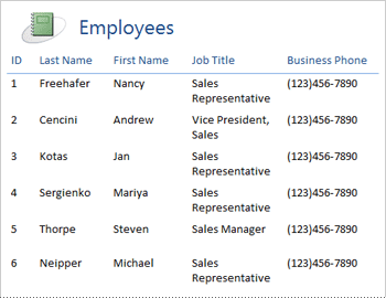
Tabular layout A tabular layout is similar to a spreadsheet. Labels are across the top, and the data is aligned in columns below the labels. Tabular refers to the table-like appearance of the data. This is the type of report that Access creates when you click Report in the Reports group of the Create tab. The tabular layout is a good one to use if your report has a relatively small number of fields that you want to display in a simple list format. The following illustration shows an employee report that was created by using a tabular layout.
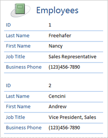
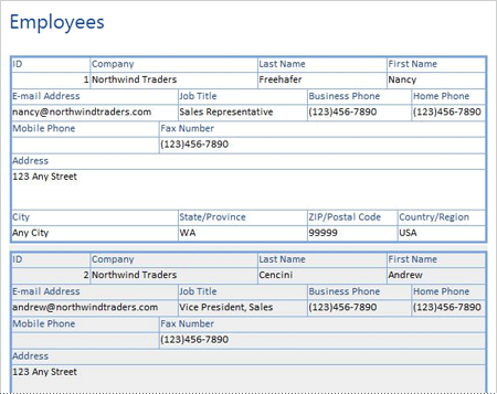
Stacked layout A stacked layout resembles a form that you fill out when you open a bank account or make a purchase from an online retailer. Each piece of data is labeled, and the fields are stacked on top of each other. This layout is good for reports that contain too many fields to display in a tabular format — that is, the width of the columns would exceed the width of the report. The following illustration shows an employee report that was created by using a stacked layout.
Note: In the Report Wizard, this layout is referred to as a columnar layout.
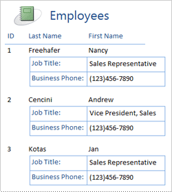
Mixed layout You can mix elements of tabular and stacked layouts. For example, for each record, you can arrange some of the fields in a horizontal row at the top of the Detail section and arrange other fields from the same record in one or more stacked layouts beneath the top row. The following illustration shows an employee report that was created by using a mixed layout. The ID, Last Name, and First Name fields are arranged in a tabular control layout, and the Job Title and Business Phone fields are arranged in a stacked layout. In this example, gridlines are used to provide a visual separation of fields for each employee.
Justified layout If you use the Report Wizard to create your report, you can choose to use a justified layout. This layout uses the full width of the page to display the records as compactly as possible. Of course, you can achieve the same results without using the Report Wizard, but it can be a painstaking process to align the fields exactly. The following illustration shows an employee report that was created by using the Report Wizard's justified layout.
The justified layout is a good layout to use if you are displaying a large number of fields on the report. In the preceding example, if you use a tabular layout to display the same data, the fields extend off the edge of the page. If you use a stacked layout, each record takes up much more vertical space, which wastes paper and makes the report more difficult to read.
Use control layouts to align your data
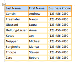
Control layouts are guides that you can add to a report while it is open in Layout view or Design view. Access adds control layouts automatically when you use the Report Wizard to build a report, or when you create a report by clicking Report in the Reports group of the Create tab. A control layout is like a table, each cell of which can contain a label, a text box, or any other type of control. The following illustration shows a tabular control layout on a report.
The orange lines indicate the rows and columns of the control layout, and they are visible only when the report is open in Layout view or Design view. Control layouts help you achieve a uniform alignment of data in rows and columns, and they make it easier to add, resize, or remove fields. By using the tools in the Table and Position groups on the Arrange tab (available in Layout view or Design view), you can change one type of control layout to another, and you can remove controls from layouts so that you can position the controls wherever you want on the report.
Tips for formatting different data types
When you create a report by using the Report tool (available on the Create tab, in the Reports group), or by using the Report Wizard, Access adds the fields to the report for you and creates the most appropriate control to display each field, based on the field's data type. If you are adding fields to a report yourself, the preferred method is to drag each field from the Field List to the report. As with the Report Wizard or the Report tool, Access creates the most appropriate control for each field, depending on the field's data type. For most data types, the most appropriate (default) control to use is the text box.
The following sections provide tips about how to format some of the special case data types.
Multivalued fields The default control for a multivalued field is a combo box. This can seem like a strange choice for a control on a report, because you can't click the arrow on a combo box in a report. However, in the context of a report, a combo box behaves like a text box. The arrow is visible only in Design view.
If the field contains multiple values, those values are separated by commas. If the combo box is not wide enough to display all the values on one line and the CanGrow property of the combo box is set to Yes, the values wrap to the next line. Otherwise, the values are truncated. To set the CanGrow property for a control, open the report in Design view or Layout view, click the control, and then press F4 to display the control's property sheet. The CanGrow property is located on both the Format tab and the All tab of the property sheet for the control.
Rich text fields The default control for a rich text field is a text box. If the text box is not wide enough to display all the values on one line and the CanGrow property of the text box is set to Yes, the values wrap to the next line. Otherwise, the values are truncated. To set the CanGrow property for a control, open the report in Design view or Layout view, click the control, and then press F4 to display the control's property sheet. The CanGrow property is located on both the Format tab and the All tab of the property sheet for the control.
A rich text field helps you to format text in a variety of ways. For example, several words in a field can be underlined, and several other words in the same field can be in italic. You can, however, still set an overall formatting style for the text box that contains the rich text. The text box formatting applies only to the text that has not been specifically formatted by using rich text formatting.
Set formatting styles for a text box that displays a rich text field
-
Right-click the report in the Navigation Pane, and then click Layout View on the shortcut menu.
-
Click the text box that displays the rich text field, and then, on the Format tab, in the Font group, click the formatting style that you want to apply.
Access applies the formatting to all text in the rich text field that has not already had that type (but not value) of formatting applied in a view that supports data entry, such as Datasheet view for a table or query, or Form view for a form. For example, if a portion of the text in the field is formatted with a red font color, and you apply a blue font color to the text box, Access turns all of the text blue except for that which was individually formatted as red. As another example, if a portion of the text in the field is formatted with an 11-point font size, and you apply a 14-point font size to the text box, Access applies the 14-point font size to all of the text except for that which was individually formatted at 11 points.
Attachment fields Attachment fields use a special control that is not used for any other data type. You can attach multiple files to a record by using a single Attachment field, but the field can only display information about one attachment at a time. By default, the attachment control displays either an icon or an image, depending on the file type of the attachment that is currently displayed by the control. If you want, you can set the properties for the attachment control so that all attached files are displayed as icons, or so that the field simply displays a paperclip icon and the number of attachments. Assuming that you already use an attachment control on your report, you can use the following procedure to adjust the control's properties for different uses of the control.
Set the display properties for an Attachment field
-
Right-click the report in the Navigation Pane, and then click Layout View on the shortcut menu.
-
Click the attachment control. If the property sheet is not already displayed, press F4 to display it. On the property sheet, click the Format tab.
Use the following table as a guide for setting the attachment control's properties.
Property
Setting
Display As
-
Image/Icon displays graphics as images and all other files as icons. This is the default setting.
-
Icon displays all files as icons.
-
Paperclip displays a paperclip icon followed by the number of attachments in parentheses.
Default Picture
To make a default picture appear in the attachment control when there are no attached files, click
Note: The default picture is not displayed if the Display As property is set to Paperclip.
Picture Alignment
Select the alignment that you want from the list. The default setting is Center. Adjusting this setting can produce unexpected results, depending on the setting of the Picture Size Mode property.
Picture Size Mode
This setting is available only if the Display As property is set to Image/Icon.
-
Clip displays the image in its actual size. The image is clipped if it is too big to fit inside the control.
-
Stretch stretches the image so that it fills the entire control.
Note: Unless the attachment control is the same exact size as the image, using this setting will distort the image, making it appear stretched either vertically or horizontally.
-
Zoom displays the image as large as possible without clipping or distorting the image. This is the default setting.
-
-
If you are using the control to display graphics, adjust the size of the attachment control so that you can see the amount of detail that you want.

