This topic gives you step-by-step instructions on how to make your OneNote notebooks accessible and unlock your content to everyone, including people with disabilities.
You learn, for example, how to work with the Accessibility Checker to tackle accessibility issues while writing your notebook. You'll also learn how to add alt texts to images so that people using screen readers are able to listen to what the image is all about. You can also read about how to use font colors and styles to maximize the inclusiveness of your notebook before sharing it with others.
Best practices for making OneNote notebooks accessible
The following table includes key best practices for creating OneNote notebooks that are accessible to people with disabilities.
|
What to fix |
How to find it |
Why fix it |
How to fix it |
|---|---|---|---|
|
Include alternative text with all visuals and embedded files. |
To find missing alternative text, use the Accessibility Checker. |
Alternative text helps people who can’t see the screen to understand what’s important in images, other visuals, and embedded files. |
|
|
Add meaningful and accurate hyperlink text. |
To determine whether hyperlink text makes sense as standalone information, visually scan your notebook. |
People who use screen readers sometimes scan a list of links. |
|
|
Give section groups, sections, and pages unique names, and remove empty items. |
To determine whether you have named all content and deleted empty items, visually scan your notebook. |
Notebooks with content named descriptively make it easier to find specific information. This also helps people using screen readers as they can know what an item contains without opening it. |
Rename sections and section groups Delete unused sections and section groups |
|
Ensure that color is not the only means of conveying information. |
Use the Automatic font color for your text. Visually scan your notebook for instances of color-coding. |
People who are blind, have low vision, or are colorblind might miss out on the meaning conveyed by particular colors. |
|
|
If you must use tables, create a simple table structure for data only, and specify column header information. |
To ensure that tables don't contain split cells, merged cells, or nested tables, use the Accessibility Checker. |
Screen readers keep track of their location in a table by counting table cells. Screen readers also use header information to identify rows and columns. |
|
|
Use a larger font size (18pt or larger), sans serif fonts, and sufficient white space. |
To find potential issues related to fonts or white space, review your pages for areas that look crowded or illegible. |
People who have dyslexia describe seeing text merge or distort. |
|
|
Make audio and video files accessible to people who are blind or have low vision or people who are deaf or hard-of-hearing. |
Where possible, ensure that audio and video files have subtitles, closed captions, or video descriptions before being inserted into OneNote. |
||
|
Use built-in headings and styles. |
Screen reader software recognizes built-in heading styles as headings and enables people to navigate by heading. In addition, people with reading disorders such as dyslexia depend on headings to help them structure information. |
Use headings to organize the information in your notes into small chunks which are arranged in a logical order. To find headings that are not in a logical order, use the Accessibility Checker. |
Check accessibility while you work in OneNote
The Accessibility Checker is a tool that reviews your content and flags accessibility issues it comes across. It explains why each issue might be a potential problem for someone with a disability. The Accessibility Checker also suggests how you can resolve the issues that appear.
To launch the Accessibility Checker, select Review > Check Accessibility. The Accessibility pane opens, and you can now review and fix accessibility issues. For more info, go to Improve accessibility with the Accessibility Checker.
Apply built-in heading styles
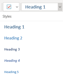
Use the built-in heading styles to form an outline of the notebook pages for screen readers. Screen readers enable people to navigate by heading, but they cannot interpret a line of text with large and bold font as a heading unless the built-in styles are applied.
Organize headings in the prescribed logical order and do not skip heading levels. For example, use Heading 1, Heading 2, and then Heading 3, rather than Heading 3, Heading 1, and then Heading 2.
In addition, people with reading disorders such as dyslexia depend on headings to help them structure information, and divide the information into smaller-sized chunks that are easier to process. Ideally, each heading includes only a few paragraphs.
-
Select the text for the heading.
-
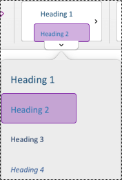
On the Home tab, select a heading style, such as Heading 2.
Avoid using tables
In general, avoid tables if possible and present the data another way, like paragraphs with headings and banners. Tables with fixed width might prove difficult to read for people who use Magnifier, because such tables force the content to a specific size. This makes the font very small, which forces Magnifier users to scroll horizontally especially on mobile devices.
If you have to use tables, use the following guidelines to make sure your table is as accessible as possible:
-
Avoid fixed width tables.
-
Make sure the tables render properly on all devices, including phones and tablets.
-
If you have hyperlinks in your table, edit the link texts, so they make sense and don't break mid-sentence.
-
Make sure the notebook is easily read with Magnifier. View it on your computer and a mobile device to see how it looks on different screens.
Use table headers
If you do need to use tables, add headers to your table to help screen readers keep track of the columns and rows. If a table is nested within another table or if a cell is merged or split, the screen reader loses count and can’t provide helpful information about the table after that point. Blank cells in a table could also mislead someone using a screen reader into thinking that there is nothing more in the table. Screen readers also use header information to identify rows and columns.
All tables created in OneNote automatically have a header row. It is possible to remove or add the header row using the OneNote for Windows app. If your notebook has a table with the Header Row option unselected, you can use the Windows app to resolve this issue.
-
In your table, place the cursor somewhere on the first row.
-
On the Table tab, select Insert Above.
-
Right-click the inserted row in the table, and then select Table. Check that Header Row is selected.
-
Go back to your table and type the column headings.
Add alt text to visuals and embedded files
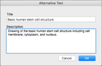
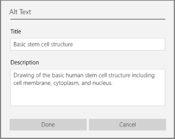
Alt text helps people who can’t see the screen to understand what’s important in images and other visuals. In alt text, briefly describe the image and mention the existence of text and its intent. Screen readers read the text to describe the image to users who can’t see the image.
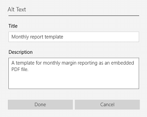
You should also add alt text to embedded files, such as supporting materials, job descriptions, or report templates so that screen reader users can hear a description of the file.
-
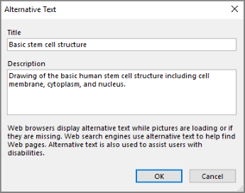
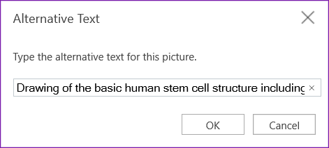
Right-click the visual or embedded file, and then select Alt Text.
-
Type a title and a description for the item.
Depending on your OneNote version, the Description field may already contain a machine-generated alt text. You can edit this text as you see fit.
-
When you're ready, select OK.
For more info on how to write alt text, go to Everything you need to know to write effective alt text. Visual content includes pictures, SmartArt graphics, shapes, groups, charts, embedded objects, ink, and videos.
To find missing alternative text, use Accessibility Checker. For more info, go to Improve accessibility with the Accessibility Checker.
Notes:
-
For audio and video content, in addition to alt text, include closed captioning for people who are deaf or hard of hearing.
-
Avoid using text in images as the sole method of conveying important information. If you must use an image with text in it, repeat that text in your notebook.
Make audio and video files accessible
Where possible, ensure that audio and video files are accessible before being inserted into OneNote. Alternatively, insert an additional file into the notebook to provide supporting subtitles, captions, or video description.
-
Subtitles typically contain a transcription (or translation) of the dialogue.
-
Closed captions typically also describe audio cues such as music or sound effects that occur off-screen.
-
Video description means audio-narrated descriptions of a video's key visual elements. These descriptions are inserted into natural pauses in the program's dialogue. Video description makes video more accessible to people with a vision disability.
Add accessible hyperlink text
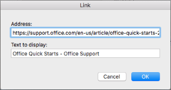
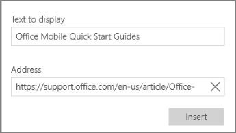
Add meaningful text to a hyperlink to let users know what’s behind the link. People who use screen readers sometimes scan a list of links. Links should convey clear and accurate information about the destination. For example, instead of using link texts such as "Click here," "See this page," "Go here," or "Learn more," include the full title of the destination page.
-
Select the text to which you want to add the hyperlink.
-
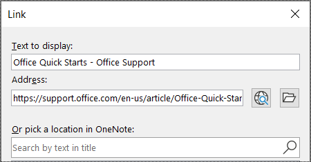
On the Insert tab, select Link.
-
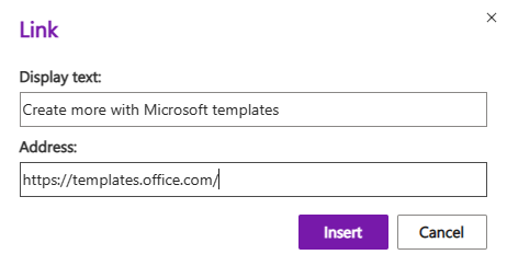
The text you selected is shown in the Text to display field. This is the hyperlink text. You can change it if necessary.
Tip: Avoid using “click here” or similar non-descriptive expressions. The link text should describe the destination page accurately but briefly.
-
Add the hyperlink URL to the Address field.
You can copy and paste the address, use the Browse the Web or Browse for File buttons, or pick a location in OneNote to find the destination page, file, or OneNote item.
-
Select OK.
Use a single note container per page
In OneNote, you can add notes anywhere on a page by clicking and adding content. This creates a new note container.
Having all notes on a page in a single container helps screen reader users read in one place without having to navigate to multiple locations on the page. If a note container becomes too large, you can split it across multiple pages or add descriptive headers. (Screen readers refer to note containers as “content blocks.”)
Rename sections and section groups
When you name your notebook content descriptively and accurately, it is easier for people to find specific information in your notes. This also helps people using screen readers to know what a section or section group contains without opening it.
-
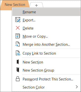
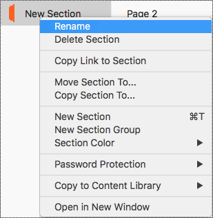
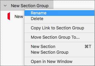
In a notebook, right-click the section or section group name you want to edit, and then select Rename.
-
Type the new name, and then press Enter.
Delete unused sections and section groups
To help everyone find relevant information quickly, remove any unused sections and section groups that contain no information.
-
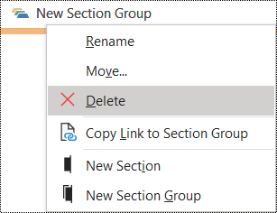
In a notebook, right-click the section or section group you want to remove, and then select Delete.
-
In the confirmation dialog box, select Yes.
Add a page title or rename a page
Pages that are descriptively and accurately titled make it easier to find specific information in your notes. This also helps people using screen readers to know what a page contains without opening it.
-
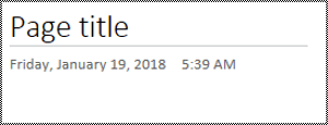
In a notebook, open the page you want to name or rename.
-
Type the name on the page title line above the time and date.
Delete unused pages
To help everyone find relevant information quickly, remove any unused pages that contain no information.
-
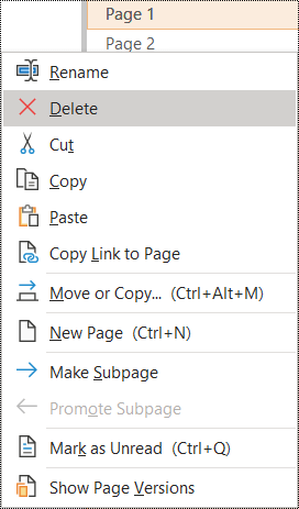
In the page list, right-click the page you want to remove, and then select Delete.
Use accessible text color and formatting
The text in your notebook should be readable in the high contrast mode so that everyone, including people with visual disabilities, can see it well. To ensure that text displays well in the high contrast mode, use the Automatic setting for font color.
People who are blind, have low vision, or are colorblind might miss the meaning conveyed by particular colors. Make sure you don’t use color alone to convey meaning. Create text that duplicates the meaning of the color or other sensory characteristic.
To make your text more accessible with formatting, select a plain sans-serif font and use a larger font size.
-
Select the text you want to format.
-
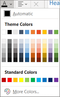
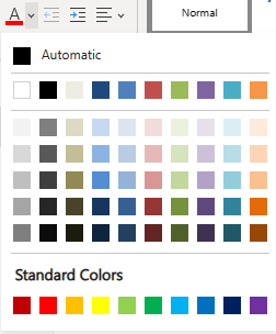
On the Home tab, click the down arrow on the Font Color button, and then select Automatic.
-
On the Home tab, select, for example, a larger font size (18pt or larger) and a familiar sans-serif font, such as Arial or Calibri. You can also use other formatting options, such as bold font for emphasis. Avoid excessive use of block capitals, underlining, and italics.
Use accessible text alignment and spacing
People with dyslexia perceive text in a way that can make it difficult to distinguish letters and words. For example, they might perceive a line of text compressing into the line below, or adjacent letters seeming to merge.
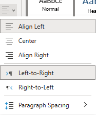
Align your paragraph to the left to avoid uneven gaps between words, and increase or decrease the white space between lines to improve readability. Include sufficient white space between lines and paragraphs but avoid more than two spaces between words and two blank lines between paragraphs.
-
Select the text you want to modify.
-
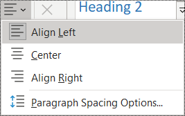
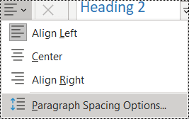
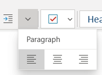
On the Home tab, select Paragraph Alignment.
-
To align the paragraph text to the left, select Align Left.
-
To modify the line spacing, select Paragraph Spacing Options, and enter the spacing you want to use.
Note: The paragraph spacing values in OneNote follow a different logic than the values in, for example, Word. In OneNote, you need to enter the total number (in points) for both the current font size and its intended line spacing. For example, to double-space Calibri font size 11, enter 27 into the Line spacing at least field.
Use bulleted lists
When feasible, break the text into bullet points to improve readability and navigation.
-
Place the cursor where you want to add the list in your notebook, or select the text to be included in the list.
-
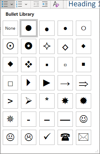
On the Home tab, select Bullets.
-
To change the bullet style, click the down arrow on the Bullets button.
-
If needed, type the list items.
Tip: Use a period or a comma at the end of each list item to make screen readers pause.
Use ordered lists
Use a numbered list for a sequence, as that is easier to follow than a continuous block of text.
-
Place the cursor where you want to add the list in your notebook, or select the text to be included in the list.
-
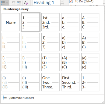
On the Home tab, select Numbering.
-
To change the numbering style, click the down arrow on the Numbering button.
-
If needed, type the list items.
Test accessibility with Immersive Reader
Try reading the notebook with Immersive Reader to check how it sounds like.
-
In your notebook, select View > Immersive Reader. Immersive Reader opens in a new window.
-
Select (Play) to hear your notebook read aloud.
-
To exit Immersive Reader, select (Exit).
For more information, refer to Use Immersive Reader for OneNote.
See also
Improve accessibility with the Accessibility Checker
Rules for the Accessibility Checker
Make your Word documents accessible to people with disabilities
Make your Excel documents accessible to people with disabilities
Make your PowerPoint presentations accessible to people with disabilities
Make your Outlook email accessible to people with disabilities
Best practices for making OneNote notebooks accessible
The following table includes best practices for creating OneNote for Mac notebooks that are accessible to people with disabilities.
|
What to fix |
Why fix it |
How to fix it |
|---|---|---|
|
Include alternative text with all visuals and embedded files. |
Alternative text helps people who can’t see the screen to understand what’s important in images, other visuals, and embedded files. |
|
|
Add meaningful hyperlink text. |
People who use screen readers sometimes scan a list of links. |
|
|
Give section groups, sections, and pages unique names, and remove empty items. |
Notebooks with content named descriptively make it easier to find specific information. This also helps people using screen readers as they can know what an item contains without opening it. |
|
|
Ensure that color is not the only means of conveying information. |
People who are blind, have low vision, or are colorblind might miss out on the meaning conveyed by particular colors. |
|
|
Use sufficient contrast for text and background colors. |
The text in your notebooks should be readable in high contrast mode so that everyone, including people with visual disabilities, can see it well. |
|
|
Use a larger font size (18pt or larger), sans-serif fonts, and appropriate white space. |
People with dyslexia perceive text in a way that can make it difficult to distinguish letters and words. |
|
|
Use built-in headings and styles. |
Screen readers recognize built-in heading styles as headings and enable people to navigate by headings. People with reading disorders such as dyslexia depend on headings to help them structure information. When feasible, break the text into bullet points or numbered lists to improve readability and navigation. |
|
|
If you must use tables, create a simple table structure for data only. |
Screen readers keep track of their location in a table by counting table cells. |
|
|
Make audio or video accessible to people who are blind or have low vision or people who are deaf or hard-of-hearing. |
Subtitles typically contain a transcription (or translation) of the dialogue. Closed captions typically also describe audio cues such as music or sound effects that occur off-screen. Video description means audio-narrated descriptions of a video's key visual elements. These descriptions are inserted into natural pauses in the program's dialogue. Video description makes video more accessible to individuals who are blind or have low vision. |
Where possible, ensure that audio and video files are accessible before being inserted into OneNote. Alternatively, insert an additional file into the notebook to provide supporting subtitles, captions, or video description. |
Check accessibility while you work in OneNote
The Accessibility Checker is a tool that reviews your content and flags accessibility issues it comes across. It explains why each issue might be a potential problem for someone with a disability. The Accessibility Checker also suggests how you can resolve the issues that appear.
To launch the Accessibility Checker, select View > Check Accessibility. The Accessibility Checker pane opens, and you can now review and fix accessibility issues. For more info, go to Improve accessibility with the Accessibility Checker.
Apply built-in heading styles
Use the built-in heading styles to form an outline of the notebook pages for screen readers. Screen readers enable people to navigate by heading, but they cannot interpret a line of text with large and bold font as a heading unless the built-in styles are applied.
Organize headings in the prescribed logical order and do not skip heading levels. For example, use Heading 1, Heading 2, and then Heading 3, rather than Heading 3, Heading 1, and then Heading 2.
In addition, people with reading disorders such as dyslexia depend on headings to help them structure information, and divide the information into smaller-sized chunks that are easier to process. Ideally, each heading includes only a few paragraphs.
To find headings that are not in a logical order, use the Accessibility Checker.
-
Select the text for the heading.
-
On the Home tab, select a heading style, such as Heading 2.
Avoid using tables
In general, avoid tables if possible and present the data another way, like paragraphs with headings and banners. Tables with fixed width might prove difficult to read for people who use Magnifier, because such tables force the content to a specific size. This makes the font very small, which forces Magnifier users to scroll horizontally especially on mobile devices.
If you have to use tables, use the following guidelines to make sure your table is as accessible as possible:
-
Avoid fixed width tables.
-
Make sure the tables render properly on all devices, including phones and tablets.
-
If you have hyperlinks in your table, edit the link texts, so they make sense and don't break mid-sentence.
-
Make sure the notebook is easily read with Magnifier. View it on your computer and a mobile device to see how it looks on different screens.
Add alt text to visuals and embedded files
Alt text helps people who can’t see the screen to understand what’s important in images, shapes, SmartArt graphics, charts, and other visuals. In alt text, briefly describe the image and mention its intent. Screen readers read the text to describe the image to users who can’t see the image.
You should also add alt text to embedded files, such as supporting materials, job descriptions, or report templates so that screen reader users can hear a description of the file.
Avoid using text in images as the sole method of conveying important information. If you must use an image with text in it, repeat that text in the page content.
To find missing alternative text, use the Accessibility Checker.
For more info on how to write alt text, go to Everything you need to know to write effective alt text.
-
Right-click the image in your notebook, and then select Alt Text.
-
Type a title and a description in the fields. Keep it short, start with the most important information, and aim to convey the content and functionality of the image. When you're ready, select OK.
Tip: Fill in both the Title and Description fields, as different screen readers read this information in different ways.
Use accessible hyperlink text
Add meaningful text to a hyperlink to let users know what’s behind the link. People who use screen readers sometimes scan a list of links. Links should convey clear and accurate information about the destination. For example, instead of using link texts such as "Click here," "See this page," "Go here," or "Learn more," include the full title of the destination page.
-
Select the text to which you want to add the hyperlink.
-
Press Command+K or on the Insert tab, select Link.
-
The text you selected is shown in the Text to display field. This is the hyperlink text. You can change it if necessary.
-
Add the hyperlink URL to the Address field. You can copy and paste the address from the original location.
-
Select OK.
Name sections, section groups, and pages descriptively
When you name your notebook content descriptively and accurately, it is easier for people to find specific information in your notes. This also helps people using screen readers to know what a section or section group contains without opening it.
Rename sections
-
In the sections list, right-click the section tab you want to edit, and then select Rename.
-
Type the new section name, and then press Return.
Rename section groups
-
In the sections list, right-click the section group you want to rename.
-
Select Rename.
-
Type the new name for the section group, and then press Return.
Add a title or rename a page
-
In a notebook, open the page you want to name or rename.
-
Type the name on the page title line above the time and date.
Delete unused sections, section groups, and pages
To help everyone find relevant information quickly, remove any unused sections and section groups that contain no information.
Delete sections
-
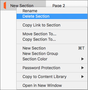
In the sections list, right-click the section tab you want to remove, and then select Delete Section.
-
In the confirmation dialog box, select Yes.
Delete section groups
-
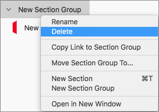
In the sections list, right-click the section group you want to remove.
-
Select Delete.
-
In the confirmation dialog box, select Yes.
Delete a page
-
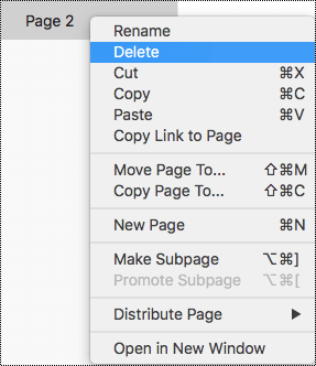
In the page list, right-click the page you want to remove.
-
Select Delete.
Use accessible text color and formatting
The text in your notebook should be readable in the high contrast mode so that everyone, including people with visual disabilities, can see it well. To ensure that text displays well in the high contrast mode, use the Automatic setting for font color.
People who are blind, have low vision, or are colorblind might miss the meaning conveyed by particular colors. Make sure you don’t use color alone to convey meaning. Create text that duplicates the meaning of the color or other sensory characteristic. Use additional means to convey the information, such as a shape or label. For example, consider using a green checkmark to indicate success and a red X to indicate failure, instead of green and red shading.
To make your text more accessible with formatting, select a plain sans-serif font and use a larger font size.
-
Select the text you want to format.
-
On the Home tab you can select, for example, a larger font size and a sans-serif font. You can also use other formatting options, such as bold font for emphasis.
-
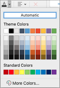
To change the font color, on the Home tab, expand the Font Color menu, and then select Automatic.
Use accessible text alignment and spacing
People with dyslexia perceive text in a way that can make it difficult to distinguish letters and words. For example, they might perceive a line of text compressing into the line below, or adjacent letters seeming to merge. Also, having multiple blank lines or consecutive spaces can make keyboard navigation slow and screen reader usage more cumbersome.
Align your paragraph to the left to avoid uneven gaps between words and increase or decrease the white space between lines to improve readability. Include sufficient white space between lines and paragraphs but avoid more than two spaces between words and two blank lines between paragraphs.
-
Select the text you want to modify.
-
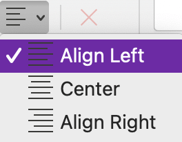
On the Home tab, expand the Paragraph Alignment menu, and then select Align Left.
Create accessible lists
To make it easier for screen readers to read your pages, organize the information into small chunks such as bulleted or numbered lists.
Design lists so that you do not need to add a plain paragraph without a bullet or number to the middle of a list. If your list is broken up by a plain paragraph, some screen readers might announce the number of list items wrong. Also, the user might hear in the middle of the list that they are leaving the list.
-
Place the cursor where you want to add the list in your notebook, or select the text to be included in the list.
-
On the Home tab, select
-
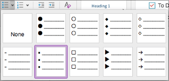
To change the bullet or numbering style, expand the Bullets or Numbering menu, and then select a style you want.
-
If needed, type the list items.
Tip: Use a period or a comma at the end of each list item to make screen readers pause.
Test accessibility with Immersive Reader
Try reading the notebook with Immersive Reader to check how it sounds like.
-
In your notebook, select View > Immersive Reader.
-
Select (Play) to hear your notebook read aloud.
-
To exit Immersive Reader, select (Exit).
For more information, refer to Use Immersive Reader for OneNote.
See also
Improve accessibility with the Accessibility Checker
Rules for the Accessibility Checker
Make your Word documents accessible to people with disabilities
Make your Excel documents accessible to people with disabilities
Make your PowerPoint presentations accessible to people with disabilities
Make your Outlook email accessible to people with disabilities
Best practices for making OneNote notebooks accessible
The following table includes key best practices for creating OneNote for iOS notebooks that are accessible to people with disabilities.
|
What to fix |
Why fix it |
How to fix it |
|---|---|---|
|
Include alternative text with all pictures and embedded files. |
Alternative text helps people who can’t see the screen to understand what’s important in images, other visuals, and embedded files. |
|
|
Add meaningful hyperlink text. |
People who use screen readers sometimes scan a list of links. |
|
|
Give section groups, sections, and pages unique names, and remove empty items. |
Notebooks with content named descriptively make it easier to find specific information. This also helps people using screen readers as they can know what an item contains without opening it. |
Rename a section or section group |
|
Ensure that color is not the only means of conveying information. |
People who are blind, have low vision, or are colorblind might miss out on the meaning conveyed by particular colors. |
|
|
Use a larger font size (18pt or larger), sans-serif fonts, and appropriate white space. |
People with dyslexia might perceive text in a way that can make it difficult to distinguish letters and words. |
Use accessible text formatting |
|
Keep information in a single note container. |
In OneNote, you can add notes anywhere on a page by clicking or tapping and then adding content. This creates a new note container. Having all notes on a page in a single container helps screen reader users read in one place without having to navigate to multiple locations on the page. |
Try moving all of the information on a page into a single note container. If a note container becomes too large, you can split it across multiple pages or add descriptive headers. (Screen readers refer to note containers as “content blocks.”) |
|
Make audio and video files accessible to people who are blind or have low vision or people who are deaf or hard-of-hearing. |
Subtitles typically contain a transcription (or translation) of the dialogue. Closed captions typically also describe audio cues such as music or sound effects that occur off-screen. Video description means audio-narrated descriptions of a video's key visual elements. These descriptions are inserted into natural pauses in the program's dialogue. Video description makes video more accessible to individuals who are blind or have low vision. |
Where possible, ensure that audio and video files are accessible before being inserted into OneNote. Alternatively, insert an additional file into the notebook to provide supporting subtitles, captions, or video description. |
Add alt text to images and embedded files
Alt text helps people who use screen readers to understand what’s important in the images and embedded files. In the alt text, describe the content of the image or file and mention its intent. Keep it brief but include descriptions of what's important about the image or file. Screen readers read the description to users who can’t see the content.
For detailed info on how to write alt text, go to Everything you need to know to write effective alt text.
Add alt text to images
-
On the notebook page, tap and hold the image.
-
In the context menu, swipe left, and then select Alt Text.
-
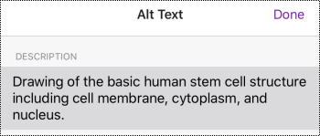
Type a description for the image. When you're ready, select Done.
Add alt text to embedded files
Add alt text to embedded files, such as supporting materials, job descriptions, or report templates so that screen reader users can hear a description of the file.
-
On the notebook page, tap and hold the file.
-
In the context menu, swipe left, and then select Alt Text.
-
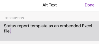
Type a description for the file and select Done.
Add meaningful hyperlink text
Add meaningful text to a hyperlink to let users know what’s behind the link. People who use screen readers sometimes scan a list of links. Links should convey clear and accurate information about the destination. For example, instead of using link texts such as "Click here," "See this page," "Go here," or "Learn more," include the full title of the destination page.
-
Select the text to which you want to add the hyperlink.
-
On the menu bar, swipe left and select
-
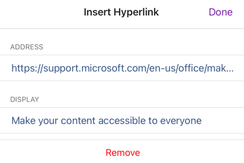
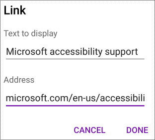
The text you selected is shown in the DISPLAY text field. This is the hyperlink text. You can now change it if necessary.
-
Type or paste the hyperlink URL into the ADDRESS text field, and then select Done.
Name your sections, section groups, and pages descriptively
Descriptive and accurately titled sections, section groups, and pages help users find the section they need.
Rename a section or section group
-
In the Sections list, select Edit.
-
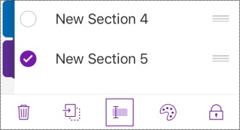
Select the section tab or section group you want to rename, and on the menu bar, select
-
Type the new name, and then select Done.
Rename a page
Descriptive and accurately titled pages help users find the correct page.
-
In the Pages list, select the page you want to name or rename.
-
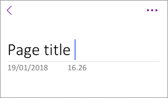
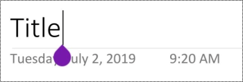
On the page title line above the time and date, modify the page name.
Delete unused sections, section groups, and pages
To help screen readers and users find relevant information quickly, remove any unused sections, section groups, and pages that contain no information.
Delete a section or section group
-
In the Sections list, select Edit.
-
Select the section tab or section group you want to remove, and on the menu bar, select
-
In the confirmation dialog box, select Delete.
Delete a page
-
In the Pages list, select Edit.
-
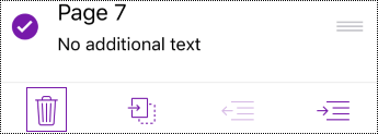
Select the page you want to remove, and on the menu bar, select
Use accessible text formatting
To make your text formatting more accessible, select a plain sans-serif font, use a larger font size, align your text to the left, and avoid excessive use of block capitals and italics.
To change the text colors to increase the contrast between the text and the background, switch to the full desktop or Windows 10 app version of OneNote. For instructions on how to change the text color in OneNote for Windows, OneNote for Mac, or OneNote for Windows 10, go to the respective tab and section in this topic.
Apply text formatting
-
Select the text you want to format.
-
On the menu bar, swipe left and select the option you want. You can select, for example, bold or italic font, or underline for emphasis.
Change the font type and size
-
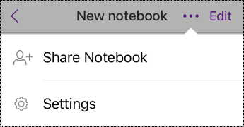
In the Sections view, select
-
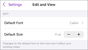
Select Edit and View.
-
Select a larger default font size and a sans-serif default font.
Use appropriate text alignment
Align your paragraphs to the left to avoid uneven gaps between words.
-
Select the text to modify.
-
On the menu bar, select
Use accessible lists
When feasible, break continuous text into bulleted or numbered lists to improve readability and navigation.
-
Place the cursor where you want to add the list in your notebook or select the text to be included in the list.
-
On the menu bar, select
-
If needed, type the list items.
Tip: Use a period or a comma at the end of each list item to make screen readers pause.
Test the accessibility of your pages
When your page is ready, you can try a few things to make sure the pages are accessible:
-
Switch to the full desktop or web version of OneNote, and then run the Accessibility Checker. The Accessibility Checker is a tool that reviews your content and flags accessibility issues it comes across. It explains why each issue might be a potential problem for someone with a disability. The Accessibility Checker also suggests how you can resolve the issues that appear. For instructions, go to Improve accessibility with the Accessibility Checker.
-
In the OneNote for iOS app, you can try navigating the pages using the built-in screen reader, VoiceOver. VoiceOver comes with iOS, so there's no need to install anything. This is one additional way to spot issues in the navigation order, for example.
-
To turn on VoiceOver, in your device settings, select Accessibility > VoiceOver, and then turn on the VoiceOver switch.
-
To navigate the content on the page, swipe left or right. Modify the reading order of the elements on the page if necessary.
-
-
Try reading the page with Immersive Reader to check how it sounds like. Immersive Reader is a free tool, built into OneNote, which might improve reading and writing for people regardless of their age or ability.
-
In the OneNote for iOS app, open the page you want to read with Immersive Reader, and then select (Page actions) > Immersive Reader.
-
For instructions on how to use Immersive Reader on the full desktop version of OneNote, go to Use Immersive Reader for OneNote.
-
See also
Make your Word documents accessible to people with disabilities
Make your Excel documents accessible to people with disabilities
Make your PowerPoint presentations accessible to people with disabilities
Make your Outlook email accessible to people with disabilities
Best practices for making OneNote notebooks accessible
The following table includes key best practices for creating OneNote for Android notebooks that are accessible to people with disabilities.
|
What to fix |
Why fix it |
How to fix it |
|---|---|---|
|
Include alternative text with all pictures and embedded files. |
Alternative text helps people who can’t see the screen to understand what’s important in images, other visuals, and embedded files. |
|
|
Add meaningful hyperlink text. |
People who use screen readers sometimes scan a list of links. |
|
|
Give section groups, sections, and pages unique names, and remove empty items. |
Notebooks with content named descriptively make it easier to find specific information. This also helps people using screen readers as they can know what an item contains without opening it. |
|
|
Ensure that color is not the only means of conveying information. |
People who are blind, have low vision, or are colorblind might miss out on the meaning conveyed by particular colors. |
|
|
Use a larger font size (18pt or larger), sans serif fonts, and sufficient white space. |
People with dyslexia might perceive text in a way that can make it difficult to distinguish letters and words. For example, they might perceive a line of text compressing into the line below, or adjacent letters seeming to merge. |
Use accessible text formatting |
|
Make audio and video files accessible to people who are blind or have low vision or people who are deaf or hard-of-hearing. |
Subtitles typically contain a transcription (or translation) of the dialogue. Closed captions typically also describe audio cues such as music or sound effects that occur off-screen. Video description means audio-narrated descriptions of a video's key visual elements. These descriptions are inserted into natural pauses in the program's dialogue. Video description makes video more accessible to individuals who are blind or have low vision. |
Where possible, ensure that audio and video files are accessible before being inserted into OneNote. Alternatively, insert an additional file into the notebook to provide supporting subtitles, captions, or video description. |
Add alt text to images and embedded files
Alt text helps people who use screen readers to understand what’s important in the images and embedded files. In the alt text, describe the content of the image or file and mention its intent. Keep it brief but include descriptions of what's important about the image or file. Screen readers read the description to users who can’t see the content.
For detailed info on how to write alt text, go to Everything you need to know to write effective alt text.
Add alt text to images
Avoid using text in images as the sole method of conveying important information. If you use images with text in them, repeat the text in the alt text. If your image is decorative, mention that in the alt text.
-
Tap and hold the image in your notebook.
-
In the context menu, select Alt Text.
-
Type a title and description for the image. When you're ready, select DONE.
Tip: Fill in both the Title and Description fields, as different screen readers read this information in different ways.
Add alt text to embedded files
Add alt text to embedded files, such as supporting materials, job descriptions, or report templates so that screen reader users can hear a description of the file.
-
On a notebook page, tap and hold the file where you want to add alt text.
-
In the context menu, select Alt Text.
-
Type a description for the file, and then select DONE.
Add meaningful hyperlink text
Add meaningful text to a hyperlink to let users know what’s behind the link. People who use screen readers sometimes scan a list of links. Links should convey clear and accurate information about the destination. For example, instead of using link texts such as "Click here," "See this page," "Go here," or "Learn more," include the full title of the destination page.
-
Select the text to which you want to add the hyperlink.
-
On the menu bar, swipe left, and then select
-
Type or paste the hyperlink URL into the Address field.
-
Select DONE.
Name your sections and pages descriptively
Descriptive and accurately titled sections and pages help users find the information they need.
To rename section groups, switch to the full desktop or Windows 10 app version of OneNote. For instructions on how to rename section groups in OneNote for Windows, OneNote for Mac, or OneNote for Windows 10, go to the respective tab and section in this topic.
Rename a section
-
In the SECTIONS list, tap and hold the section you want to rename.
-
In the menu bar, select
-
Type the new name and select RENAME.
Rename a page
-
In the PAGES list, select the page you want to rename.
-
Type the new name for the page on the page title line above the time and date.
Delete unused sections and pages
To help screen readers and users find relevant information quickly, remove any unused sections and pages that contain no information.
To delete section groups, switch to the full desktop or Windows 10 app version of OneNote. For instructions on how to delete section groups in OneNote for Windows, OneNote for Mac, or OneNote for Windows 10, go to the respective tab and section in this topic.
Delete a section
-
In the SECTIONS list, tap and hold the section you want to remove.
-
In the menu bar, select
-
In the confirmation dialog box, select DELETE.
Delete a page
To help screen readers and users find relevant information quickly, remove any unused pages that contain no information.
-
In the PAGES list, tap and hold the page you want to remove.
-
In the menu bar, select
-
In the confirmation dialog box, select DELETE.
Use accessible text formatting
Accessible text formatting doesn't exclude or slow down the reading speed of anyone reading a page in your notebook, including people with low vision or reading disability or people who are blind. The right formatting improves the legibility and readability of the page.
To change the font type and size, switch to the full desktop, Windows 10 app, or web version of OneNote. For instructions on how to change the font type and size in OneNote for Windows, OneNote for Mac, OneNote for Windows 10, or OneNote for the web, go to the respective tab and section in this topic.
To make your text more accessible with formatting in the OneNote for Android app, you can, for example, use bold font, align your text to the left, and avoid excessive use of block capitals and italics.
-
Select the text you want to format.
-
On the menu bar, select the option you want. You can, for example, use bold font or underline for emphasis.
Use appropriate text alignment
Align your paragraphs to the left to avoid uneven gaps between words.
-
Select the text you want to align.
-
On the menu bar, select
Create accessible lists
To make it easier for screen readers to read your pages, organize the information into small chunks such as bulleted or numbered lists.
Design lists so that you do not need to add a plain paragraph without a bullet or number to the middle of a list. If your list is broken up by a plain paragraph, some screen readers might announce the number of list items wrong. Also, the user might hear in the middle of the list that they are leaving the list.
-
Place the cursor where you want to add the list or select the text to be included in the list.
-
On the menu bar, select
-
If needed, type the list items.
Tip: Use a period or a comma at the end of each list item to make screen readers pause.
Test the accessibility of your pages
When your page is ready, you can try a few things to make sure the pages are accessible:
-
Switch to the full desktop or web version of OneNote and do one or both of the following:
-
Run the Accessibility Checker. The Accessibility Checker is a tool that reviews your content and flags accessibility issues it comes across. It explains why each issue might be a potential problem for someone with a disability. The Accessibility Checker also suggests how you can resolve the issues that appear. For instructions, go to Improve accessibility with the Accessibility Checker.
-
Try reading the page with Immersive Reader to check how it sounds like. Immersive Reader is a free tool, built into OneNote, that might improve reading and writing for people regardless of their age or ability. For instructions, go to Use Immersive Reader for OneNote.
-
-
In the OneNote for Android app, you can try navigating the pages using the built-in screen reader, TalkBack. TalkBack comes with Android, so there's no need to install anything. This is one additional way to spot issues in the navigation order, for example.
-
To turn on TalkBack, in your device settings, select Accessibility > TalkBack > Use service.
-
To navigate the content on the page, swipe left or right. Modify the reading order of the elements on the page if necessary.
-
See also
Make your Word documents accessible to people with disabilities
Make your Excel documents accessible to people with disabilities
Make your PowerPoint presentations accessible to people with disabilities
Make your Outlook email accessible to people with disabilities
Best practices for making OneNote notebooks accessible
The following table includes best practices in OneNote for Windows 10 for creating notebooks that are accessible to all people.
|
What to fix |
Why fix it |
How to fix it |
|---|---|---|
|
Avoid common accessibility issues such as missing alternative text (alt text) and low contrast colors. |
Make it easy for everyone to read your slides. |
|
|
Use built-in headings and styles. |
Screen readers recognize built-in heading styles as headings and enable people to navigate by headings. People with reading disorders such as dyslexia depend on headings to help them structure information. When feasible, break the text into bullet points or numbered lists to improve readability and navigation. |
|
|
Keep information in a single note container. |
Having notes on a page in several containers makes the page navigation more difficult for people who use screen readers. |
|
|
If you must use tables, create a simple table structure for data only, and specify column header information. |
Screen readers keep track of their location in a table by counting table cells. Screen readers also use header information to identify rows and columns. |
|
|
Include alt text with all pictures and embedded files. |
Alt text helps people who can’t see the screen to understand what’s important in images, other visuals, and embedded files. To find missing alt text, use the Accessibility Checker. |
|
|
Add meaningful hyperlink text. |
People who use screen readers sometimes scan a list of links. |
|
|
Give section groups, sections, and pages unique names, and remove empty items. |
Notebooks with content named descriptively make it easier to find specific information. This also helps people using screen readers as they can know what an item contains without opening it. |
|
|
Ensure that color is not the only means of conveying information. |
People who are blind, have low vision, or are colorblind might miss out on the meaning conveyed by particular colors. |
|
|
Use sufficient contrast for text and background colors. |
The text in your notebooks should be readable in high contrast mode so that everyone, including people with visual disabilities, can see it well. |
|
|
Use a larger font size (18pt or larger), sans-serif fonts, and appropriate white space. |
People with dyslexia might perceive text in a way that can make it difficult to distinguish letters and words. |
|
|
Make audio or video accessible to people who are blind or have low vision or people who are deaf or hard-of-hearing. |
Subtitles typically contain a transcription (or translation) of the dialogue. Closed captions typically also describe audio cues such as music or sound effects that occur off-screen. Video description means audio-narrated descriptions of a video's key visual elements. These descriptions are inserted into natural pauses in the program's dialogue. Video description makes video more accessible to individuals who are blind or have low vision. |
Check accessibility while you work in OneNote
The Accessibility Checker is a tool that reviews your content and flags accessibility issues it comes across. It explains why each issue might be a potential problem for someone with a disability. The Accessibility Checker also suggests how you can resolve the issues that appear.
To launch the Accessibility Checker, select View > Check Accessibility. The Accessibility Checker pane opens, and you can now review and fix accessibility issues. For more info, go to Improve accessibility with the Accessibility Checker.
Apply built-in heading styles
Use the built-in heading styles to form an outline of the notebook pages for screen readers. Screen readers enable people to navigate by heading, but they cannot interpret a line of text with large and bold font as a heading unless the built-in styles are applied.
Organize headings in the prescribed logical order and do not skip heading levels. For example, use Heading 1, Heading 2, and then Heading 3, rather than Heading 3, Heading 1, and then Heading 2.
In addition, people with reading disorders such as dyslexia depend on headings to help them structure information and divide the information into smaller-sized chunks that are easier to process. Ideally, each heading includes only a few paragraphs.
-
Select the text for the heading.
-
On the Home tab, select
Use a single note container per page
In OneNote, you can add notes anywhere on a page by clicking and adding content. This creates a new note container.
Having all notes on a page in a single container helps screen reader users read in one place without having to navigate to multiple locations on the page. If a note container becomes too large, you can split it across multiple pages or add descriptive headers. (Screen readers refer to note containers as “content blocks.”)
Avoid using tables
In general, avoid tables if possible and present the data another way, like paragraphs with headings and banners. Tables with fixed width might prove difficult to read for people who use Magnifier, because such tables force the content to a specific size. This makes the font very small, which forces Magnifier users to scroll horizontally especially on mobile devices.
If you have to use tables, use the following guidelines to make sure your table is as accessible as possible:
-
Avoid fixed width tables.
-
Make sure the tables render properly on all devices, including phones and tablets.
-
If you have hyperlinks in your table, edit the link texts, so they make sense and don't break mid-sentence.
-
Make sure the notebook is easily read with Magnifier. View it on your computer and a mobile device to see how it looks on different screens.
-
Use table headers. To insert a table header to a table that you've created in OneNote for Windows 10, switch to the full desktop version of OneNote.
Add alt text to visuals and embedded files
Alt text helps people who use screen readers to understand what’s important in the visuals in your slides. Visual content includes pictures, SmartArt graphics, shapes, groups, charts, ink, and videos. Also add alt text to embedded files, such as supporting materials, job descriptions, or report templates so that screen reader users can hear a description of the file.
In alt text, briefly describe the image, its intent, and what is important about the image. Screen readers read the description to users who can’t see the content.
Tip: To write a good alt text, make sure to convey the content and the purpose of the image in a concise and unambiguous manner. The alt text shouldn’t be longer than a short sentence or two—most of the time a few thoughtfully selected words will do. Do not repeat the surrounding textual content as alt text or use phrases referring to images, such as, "a graphic of" or "an image of." For more info on how to write alt text, go to Everything you need to know to write effective alt text.
Avoid using text in images as the sole method of conveying important information. If you use images with text in them, repeat the text in the slide. In alt text of such images, mention the existence of the text and its intent.
To find missing alternative text, use Accessibility Checker. For more info, go to Improve accessibility with the Accessibility Checker.
Add alt text to visuals
-
Right-click an image in your notebook, and then select Alt Text.
-
Type a title and a description in the fields. When you're ready, select Done.
Tip: Fill in both the Title and Description fields, as different screen readers read this information in different ways.
Add alt text to embedded files
-
Right-click the file on the page.
-
Select
-
Type a title and a description for the file, and then select Done.
Use accessible hyperlink texts
People who use screen readers sometimes scan a list of links. Links should convey clear and accurate information about the destination. For example, avoid using link texts such as "Click here," "See this page," "Go here," or "Learn more." Instead include the full title of the destination page.
Tip: If the title on the hyperlink's destination page gives an accurate summary of what’s on the page, use it for the hyperlink text. For example, this hyperlink text matches the title on the destination page: Create more with Microsoft templates.
-
Select the text which you want to turn into a hyperlink.
-
Press Ctrl+K or on the Insert tab, select Link.
-
The text you selected is shown in the Text to display field. This is the hyperlink text. You can change it if necessary.
-
In the Address text field, type or paste the hyperlink URL, and then select Insert.
Rename sections, section groups, and pages
When you name your notebook content descriptively and accurately, it is easier for people to find specific information in your notes. This also helps people using screen readers to know what a section, section group, or page contains without opening it.
Rename sections or section groups
-
In a notebook, right-click the section tab or section group you want to edit, and then select Rename Section or Rename Section Group.
-
Type the new name, and then press Enter.
Add a page title or rename a page
-
In a notebook, open the page you want to name or rename.
-
Type the name on the page title line above the time and date.
Delete unused sections, section groups, and pages
-
In a notebook, right-click the section tab, section group, or page tab you want to remove, and then select Delete Section, Delete Section Group, or Delete Page.
-
In the confirmation dialog box for sections and section groups, select Yes.
Use accessible text color and formatting
The text in your notebook should be readable in the high contrast mode so that everyone, including people with visual disabilities, can see it well. To ensure that text displays well in the high contrast mode, use the Automatic setting for font color.
People who are blind, have low vision, or are colorblind might miss the meaning conveyed by particular colors. Make sure you don’t use color alone to convey meaning. Create text that duplicates the meaning of the color or other sensory characteristic. Use additional means to convey the information, such as a shape or label. For example, consider using a green checkmark to indicate success and a red X to indicate failure, instead of green and red shading.
To make your text more accessible with formatting, select a plain sans-serif font and use a larger font size.
-
Select the text you want to format.
-
On the Home tab, you can select, for example, a larger font size and a sans-serif font. You can also use other formatting options, such as bold font for emphasis.
-
To change to font color, on the Home tab, select
Use accessible text alignment and spacing
People with dyslexia perceive text in a way that can make it difficult to distinguish letters and words. For example, they might perceive a line of text compressing into the line below, or adjacent letters seeming to merge. Also, having multiple blank lines or consecutive spaces can make keyboard navigation slow and screen reader usage more cumbersome.
Align your paragraph to the left to avoid uneven gaps between words, and increase or decrease the white space between lines to improve readability. Include sufficient white space between lines and paragraphs but avoid more than two spaces between words and two blank lines between paragraphs.
-
Select the text you want to modify.
-
On the Home tab, select
Create accessible lists
To make it easier for screen readers to read your pages, organize the information into small chunks such as bulleted or numbered lists.
Design lists so that you do not need to add a plain paragraph without a bullet or number to the middle of a list. If your list is broken up by a plain paragraph, some screen readers might announce the number of list items wrong. Also, the user might hear in the middle of the list that they are leaving the list.
-
Place the cursor where you want to add the list, or select the text to be included in the list.
-
On the Home tab, select
-
To change the bullet or numbering style, expand the Bullets or Numbering menu, and then select the style you want.
-
If needed, type the list items.
Tip: Use a period or a comma at the end of each list item to make screen readers pause.
Make audio and video files accessible
To make your audio and video files accessible for everyone, make sure the files have subtitles, closed captions, or video descriptions before you insert them into OneNote. Alternatively, insert an additional file into the notebook to provide supporting subtitles, captions, or video description.
-
Subtitles typically contain a transcription (or translation) of the dialogue.
-
Closed captions typically also describe audio cues such as music or sound effects that occur off-screen.
-
Video description means audio-narrated descriptions of a video's key visual elements. These descriptions are inserted into natural pauses in the program's dialogue. Video description makes video more accessible to people with a vision disability.
Test accessibility with Immersive Reader
Try reading the notebook with Immersive Reader to check how it sounds like.
-
In your notebook, select View > Immersive Reader.
-
Select (Play) to hear your notebook read aloud.
-
To exit Immersive Reader, select (Exit).
For more information, refer to Use Immersive Reader for OneNote.
See also
Improve accessibility with the Accessibility Checker
Rules for the Accessibility Checker
Make your Word documents accessible to people with disabilities
Make your Excel documents accessible to people with disabilities
Make your PowerPoint presentations accessible to people with disabilities
Make your Outlook email accessible to people with disabilities
Best practices for making OneNote for the web notebooks accessible
The following table includes best practices for creating OneNote for the web notebooks that are accessible to people with disabilities.
|
What to fix |
Why fix it |
How to fix it |
|---|---|---|
|
Include alternative text with all pictures, embedded files, and tables. |
Alternative text helps people who can’t see the screen to understand what’s important in images, other visuals, embedded files, and tables. |
|
|
Add meaningful hyperlink text. |
People who use screen readers sometimes scan a list of links. |
|
|
Give sections, and pages unique names, and remove empty items. |
Notebooks with content named descriptively make it easier to find specific information. This also helps people using screen readers as they can know what an item contains without opening it. |
|
|
Ensure that color is not the only means of conveying information. |
People who are blind, have low vision, or are colorblind might miss out on the meaning conveyed by particular colors. |
|
|
Use sufficient contrast for text and background colors. |
The text in your notebooks should be readable in high contrast mode so that everyone, including people with visual disabilities, can see it well. |
|
|
Use a larger font size (18pt or larger), sans-serif fonts, and appropriate white space. |
People with dyslexia perceive text in a way that can make it difficult to distinguish letters and words. |
|
|
Use built-in headings and styles. |
Screen readers recognize built-in heading styles as headings and enable people to navigate by headings. People with reading disorders such as dyslexia depend on headings to help them structure information. When feasible, break the text into bullet points or numbered lists to improve readability and navigation. |
|
|
Keep information in a single note container. |
Having notes on a page in several containers makes the page navigation more difficult for people who use screen readers. |
|
|
If you must use tables, create a simple table structure for data only. |
Screen readers keep track of their location in a table by counting table cells. |
|
|
Where possible, ensure that audio and video files are accessible before being inserted into OneNote. |
Make audio or video accessible to people who are blind or have low vision or people who are deaf or hard-of-hearing. |
Check accessibility while you work in OneNote for the web
The Accessibility Checker is a tool that reviews your content and flags accessibility issues it comes across. It explains why each issue might be a potential problem for someone with a disability. The Accessibility Checker also suggests how you can resolve the issues that appear.
To launch the Accessibility Checker, select View > Check Accessibility. The Accessibility pane opens, and you can now review and fix accessibility issues. For more info, go to Improve accessibility with the Accessibility Checker.
Apply built-in heading styles
Use the built-in heading styles to form an outline of the notebook pages for screen readers. Screen readers enable people to navigate by heading, but they cannot interpret a line of text with large and bold font as a heading unless the built-in styles are applied.
Organize headings in the prescribed logical order and do not skip heading levels. For example, use Heading 1, Heading 2, and then Heading 3, rather than Heading 3, Heading 1, and then Heading 2.
In addition, people with reading disorders such as dyslexia depend on headings to help them structure information, and divide the information into smaller-sized chunks that are easier to process. Ideally, each heading includes only a few paragraphs.
-
Select the piece of text you want to turn into a heading.
-
On the Home tab, select a heading style, such as Heading 2.
Avoid using tables
In general, avoid tables if possible and present the data another way, like paragraphs with headings and banners. Tables with fixed width might prove difficult to read for people who use Magnifier, because such tables force the content to a specific size. This makes the font very small, which forces Magnifier users to scroll horizontally especially on mobile devices.
If you have to use tables, use the following guidelines to make sure your table is as accessible as possible:
-
Avoid fixed width tables.
-
Make sure the tables render properly on all devices, including phones and tablets.
-
If you have hyperlinks in your table, edit the link texts, so they make sense and don't break mid-sentence.
-
Make sure the notebook is easily read with Magnifier. View it on your computer and a mobile device to see how it looks on different screens.
Add alt text to visuals, embedded files, and tables
Alt text helps people who can’t see the screen to understand what’s important in images, other visuals, and tables. In alt text, briefly describe the visual or table and mention the existence of text and its intent. Screen readers read the text to describe the visual or table to users who can’t see them.
You should also add alt text to embedded files, such as supporting materials, job descriptions, or report templates so that screen reader users can hear a description of the file.
-
Right-click the visual or table in your notebook, and then select Alt Text.
-
Type a description to the text field. For tables, add a title for the alt text, too. Keep it short, start with the most important information, and aim to convey the content and functionality of the visual or table. When you're ready, select OK.
For more info on how to write alt text, go to Everything you need to know to write effective alt text. Visual content includes pictures, SmartArt graphics, shapes, groups, charts, embedded objects, ink, and videos.
To find missing alternative text, use Accessibility Checker. For more info, go to Improve accessibility with the Accessibility Checker.
Note: Avoid using text in images as the sole method of conveying important information. If you must use an image with text in it, repeat that text in your notebook.
Make audio and video files accessible
To make your audio and video files accessible for everyone, make sure the files have subtitles, closed captions, or video descriptions before you insert them into OneNote. Alternatively, insert an additional file into the notebook to provide supporting subtitles, captions, or video description.
-
Subtitles typically contain a transcription (or translation) of the dialogue.
-
Closed captions typically also describe audio cues such as music or sound effects that occur off-screen.
-
Video description means audio-narrated descriptions of a video's key visual elements. These descriptions are inserted into natural pauses in the program's dialogue. Video description makes video more accessible to people with a vision disability.
Use accessible hyperlink text
Add meaningful text to a hyperlink to let users know what’s behind the link. People who use screen readers sometimes scan a list of links. Links should convey clear and accurate information about the destination. For example, instead of using link texts such as "Click here," "See this page," "Go here," or "Learn more," include the full title of the destination page.
If the title on the hyperlink's destination page gives an accurate summary of what’s on the page, use it for the hyperlink text. For example, this hyperlink text matches the title on the destination page: Create more with Microsoft templates.
-
Select the text to which you want to add the hyperlink.
-
Press Ctrl+K or on the Insert tab, select Insert Link.
-
The text you selected is shown in the Display text field. This is the hyperlink text. You can change it if necessary.
-
Type or paste the hyperlink URL to the Address field, and then select Insert.
Use a single note container per page
In OneNote, you can add notes anywhere on a page by clicking and adding content. This creates a new note container.
Having all notes on a page in a single container helps screen reader users read in one place without having to navigate to multiple locations on the page. If a note container becomes too large, you can split it across multiple pages or add descriptive headers. (Screen readers refer to note containers as “content blocks.”)
Name sections and pages descriptively
When you name your notebook content descriptively and accurately, it is easier for people to find specific information in your notes. This also helps people using screen readers to know what a section or section group contains without opening it.
You can rename section groups in the OneNote desktop or Windows 10 app version. For the instructions on how to rename section groups in OneNote desktop or Windows 10 app, go to the respective sections in this topic.
For the step-by-step instructions on how to rename sections or pages, go to Rename a section in OneNote for the web or Rename a page in OneNote for the web.
Delete unused sections and pages
To help everyone find relevant information quickly, remove any unused sections and section groups that contain no information.
You can delete section groups in the OneNote desktop or Windows 10 app version. For the instructions on how to delete section groups in OneNote desktop or Windows 10 app, go to the respective sections in this topic.
For the step-by-step instructions on how to delete sections or pages, go to Delete a section in OneNote for the web or Delete a page in OneNote for the web.
Use accessible text color and formatting
The text in your notebook should be readable in the high contrast mode so that everyone, including people with visual disabilities, can see it well. To ensure that text displays well in the high contrast mode, use the Automatic setting for font color.
People who are blind, have low vision, or are colorblind might miss the meaning conveyed by particular colors. Make sure you don’t use color alone to convey meaning. Create text that duplicates the meaning of the color or other sensory characteristic. Use additional means to convey the information, such as a shape or label. For example, consider using a green checkmark to indicate success and a red X to indicate failure, instead of green and red shading.
To make your text more accessible with formatting, select a plain sans-serif font and use a larger font size.
-
Select the text you want to format.
-
On the Home tab you can select, for example, a larger font size and a sans-serif font. You can also use other formatting options, such as bold font for emphasis.
-
To change the font color, expand the Font Color menu, and then select Automatic.
Use accessible text alignment and spacing
People with dyslexia perceive text in a way that can make it difficult to distinguish letters and words. For example, they might perceive a line of text compressing into the line below, or adjacent letters seeming to merge. Also, having multiple blank lines or consecutive spaces can make keyboard navigation slow and screen reader usage more cumbersome.
Align your paragraph to the left to avoid uneven gaps between words, and increase or decrease the white space between lines to improve readability. Include sufficient white space between lines and paragraphs but avoid more than two spaces between words and two blank lines between paragraphs.
-
Select the text you want to modify.
-
On the Home tab, expand the Paragraph Alignment menu, and then select Align Left.
Create accessible lists
To make it easier for screen readers to read your pages, organize the information into small chunks such as bulleted or numbered lists.
Design lists so that you do not need to add a plain paragraph without a bullet or number to the middle of a list. If your list is broken up by a plain paragraph, some screen readers might announce the number of list items wrong. Also, the user might hear in the middle of the list that they are leaving the list.
-
Place the cursor where you want to add the list in your notebook, or select the text to be included in the list.
-
On the Home tab, select
-
To change the bullet or numbering style, expand the Bullet Library or Numbering menu, and then select the style you want.
-
If needed, type the list items.
Tip: Use a period or a comma at the end of each list item to make screen readers pause.
Test accessibility with Immersive Reader
Try reading the notebook with Immersive Reader to check how it sounds like.
-
In your notebook, select View > Immersive Reader.
-
Select (Play) to hear your notebook read aloud.
-
To exit Immersive Reader, select (Exit).
For more information, refer to Use Immersive Reader for OneNote.
See also
Rules for the Accessibility Checker
Improve accessibility with the Accessibility Checker
Make your Word documents accessible to people with disabilities
Make your Excel documents accessible to people with disabilities
Make your PowerPoint presentations accessible to people with disabilities
Make your Outlook email accessible to people with disabilities
Technical support for customers with disabilities
Microsoft wants to provide the best possible experience for all our customers. If you have a disability or questions related to accessibility, please contact the Microsoft Disability Answer Desk for technical assistance. The Disability Answer Desk support team is trained in using many popular assistive technologies and can offer assistance in English, Spanish, French, and American Sign Language. Please go to the Microsoft Disability Answer Desk site to find out the contact details for your region.
If you are a government, commercial, or enterprise user, please contact the enterprise Disability Answer Desk.


