What to fix
Use a larger font size (11pt or larger), sans serif fonts, and sufficient white space.
Why fix it
People who have dyslexia describe seeing text “swim together” on a page (the compressing of one line of text into the line below). They often see text merge or distort.
For people who have dyslexia or have low vision, reduce the reading load. For example, they may benefit from familiar sans serif fonts such as Arial or Calibri. Avoid using all capital letters and excessive italics or underlines. Include ample white space between sentences and paragraphs.
How to fix it
Use accessible font format
-
Select your text.
-
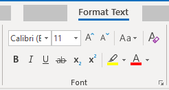
Select the Format Text tab.
-
In the Font group, which provides options for font type, size, style, and color, select your formatting choices.
Adjust space between sentences and paragraphs
Increase or decrease white space between sentences and paragraphs.
-
Select your text.
-
Select the Format Text tab.
-
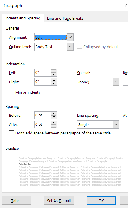
In the Paragraph group, in the lower-right corner of the group, select the Dialog box launcher button. The Paragraph dialog box opens, showing the Indents and Spacing tab.
-
Under Spacing, select the spacing options you want.


