What to fix
Use sufficient contrast for text and background colors.
Why fix it
The text in your email should be readable in High Contrast mode so that everyone, including people with visual disabilities, can see it well.
For example, use bright colors or high-contrast color schemes on opposite ends of the color spectrum. White and black schemes make it easier for people who are colorblind to distinguish text and shapes.
To find insufficient color contrast, use the Accessibility Checker.
How to fix it
Use accessible font color
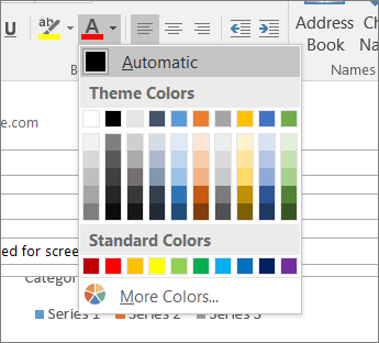
To ensure that text displays well in High Contrast mode, use the Automatic setting for font colors.
-
Select your text.
-
Select Message > Font Color.
-
Select Automatic.


