Georgia is the quintessential serif typeface for reading onscreen. That's what it was designed for, and that's what it excels at. You can use Georgia as your default text typeface in any kind of long text, whether onscreen or in print; it will be familiar and comfortably readable. The font's default numerals are "old-style" (like lowercase letters), which look good in text but might be surprising in a spreadsheet.
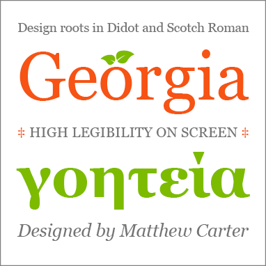
Type designer Matthew Carter created Georgia in 1996 to make reading on low-resolution screens easy and acceptable. It is related to his text typeface Miller, which is very popular in print publications, and which shares the same roots in the 19th-century text typefaces known as Scotch Roman. Georgia manages to accommodate a host of limitations presented by 1990s screen technology, yet the designer's skill is such that you'd never notice any compromises in the design. Georgia has become one of the most common typefaces used on the web.
In 2011 Georgia was expanded into a larger family, Georgia Pro, with more typographic features, additional weights, and a set of narrower Condensed variants.


