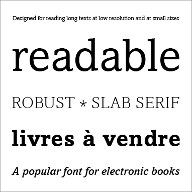
Amasis Pro is a robust, readable text typeface with an even texture and familiar letter shapes. It was designed for reading long texts at low resolution and at small sizes, so it is an appropriate choice for body text, both in print and onscreen.
Amasis has thick, slab serifs with a slight taper and abrupt ends. Both the upright and the slanted letters, including a true italic, are based on traditional written forms; this helps make them feel familiar and comfortable to read in text. They have little contrast between thick and thin strokes, even in the heaviest weights, so paragraphs set in Amasis have an even visual texture.
Amasis was designed by typeface designer Ron Carpenter for the Monotype foundry in 1990. It has five weights, from Light to Black, with a true italic companion for each. Amasis has been used as a default font for the Nook e-reader.


