You can use a map chart to compare values and show categories across geographical regions. Use it when you have geographical regions in your data, like countries/regions, states, counties or postal codes.

Note: This feature is available if you have a Microsoft 365 subscription. If you are a Microsoft 365 subscriber, make sure you have the latest version of Office.
Download our examples
You can download a workbook with several map chart examples like the ones in this article.
Map charts can display both values and categories, and they each have different ways of displaying color. Values are represented by slight variations of two to three colors. Categories are represented by different colors.
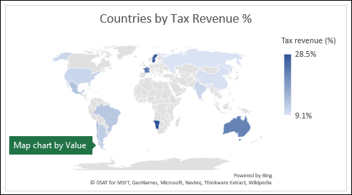
For example, the Countries by Tax Revenue % chart below uses values. The values represent tax revenue in each country with each portrayed using a gradient spectrum of two colors. The color for each region is dictated by where along the spectrum its value falls. By default, the higher the value is, the darker its corresponding color will be.
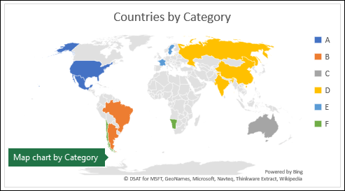
In the following example, Countries by Category, the categories are displayed using a standard legend to show groups or affiliations. Each country is represented by a different color.
Create a Map chart with Data Types
-
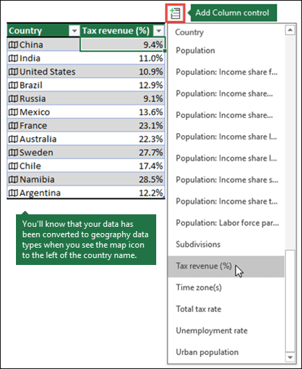
Map charts have gotten even easier with geography data types. Simply input a list of geographic values, such as country, state, county, city, postal code, and so on, then select your list and go to the Data tab > Data Types > Geography. Excel will automatically convert your data to a geography data type, and will include properties relevant to that data that you can display in a map chart. In the following example, we've converted a list of countries to geography data types, then selected the Tax revenue (%) field from the Add Column control to use in our map.
-
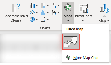
Now it's time to create a map chart, so select any cell within the data range, then go to the Insert tab > Charts > Maps > Filled Map.
-
If the preview looks good, then press OK. Depending on your data, Excel will insert either a value or category map.
Tip: If your data is set up as an Excel table, and then you add a country to the list, Excel will automatically update it as a geography data type and update the linked map chart. Similarly, if you remove a country, then Excel will also remove it from the chart.
Formatting your Map chart
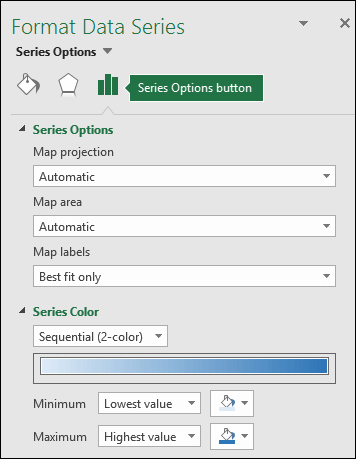
Once your map chart has been created you can easily adjust its design. Just select the map, then choose from the Chart Design or Format tabs in the ribbon. You can also double-click the chart to launch the Format Object Task Pane, which will appear on the right-hand side of the Excel window. This will also expose the map chart specific Series options (see below).
Notes:
-
There are several map chart specific Series options, however they are not supported in Android devices or Excel Mobile. If you need some of the map Series options, then you can build your chart in Excel for Windows or Mac and view it on an Android device or Excel Mobile.
-
-
Learn more about Formatting Map Charts.
-
Map projections - Change the map's projection style. By default, Excel will display the most efficient style.
-
Map area - Change the map's Zoom level, ranging from a state/province view, all the way to the world view.
-
Map labels - Show geographic names for your countries/regions. Chose to show names based on fit, or show all labels.
Frequently Asked Questions
Question: When I use certain text-based locations, I end up with a blank map and an error, or some of my points map in other countries.
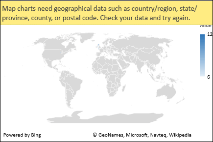
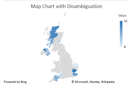
Answer: If you use data where there might be more than one similar location in the world, map charts can’t necessarily tell the difference without more guidance. If possible, add a higher-level detail column to your data. For example, the following locations won’t necessarily map the way you expect since there are many places in the world where these are valid county names:
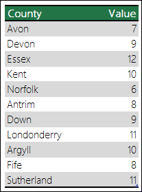
But the data should map correctly if you add another column for higher-level detail, in this case, Province – This is called Disambiguation:
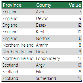
When there are multiple levels of geographic details, you must separate each level into its own cell/column. For example, “Washington, United States” (State, Country) will not successfully generate a map. In this instance, the data will map successfully when placing “Washington” and “United States” into separate columns.
Limitations
-
Map charts can only plot high-level geographic details, so latitude/longitude, and street address mapping isn’t supported. Map charts also support one-dimensional display only, but if you need multi-dimensional detail you can use Excel’s 3D Map feature.
-
Creating new maps, or appending data to existing maps requires an online connection (to connect to the Bing Map service).
-
Existing maps can be viewed without an online connection.
-
There is a known issue where Map Charts which make use of Geography Data Types can sometimes map incorrectly. Please try to include Admin Fields, such as Province or Country when attempting to plot these until the problem is fixed.
Need more help?
You can always ask an expert in the Excel Tech Community or get support in Communities.

