Sign in with Microsoft
Sign in or create an account.
Hello,
Select a different account.
You have multiple accounts
Choose the account you want to sign in with.

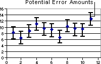
Error bars graphically express potential error amounts relative to each data marker in a data series. For example, you could show 5 percent positive and negative potential error amounts in the results of a scientific experiment:

Chart with error bars

Chart types that support error bars You can add error bars to data series in 2-D area, bar, column, line, xy (scatter), and bubble charts. For xy (scatter) and bubble charts, you can display error bars for the x values, the y values, or both.

More information

Add error bars to a data series

Equations for calculating the error amount

Need more help?

Want more options?

Explore subscription benefits, browse training courses, learn how to secure your device, and more.

Communities help you ask and answer questions, give feedback, and hear from experts with rich knowledge.

Was this information helpful?

What affected your experience?
By pressing submit, your feedback will be used to improve Microsoft products and services. Your IT admin will be able to collect this data. Privacy Statement.

Thank you for your feedback!

×