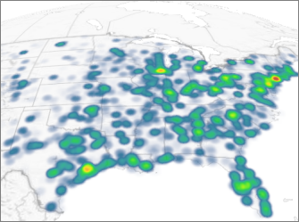
When you open Power Map, Bing Maps automatically plots your data in a column chart. You can change to a heat map, where colors represent your data, making it easy for people to take in lots of data at a quick glance.

-
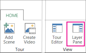
Click Home >Layer Pane.
-
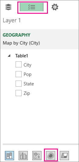
On the Field List tab, click Heat Map.
Notes:
-
When you switch to a heat map, the Height field changes to Value.
-
You may want to zoom in or rotate the chart to get a better view of the heat map.
-
You can’t add annotations to heat maps.
-


