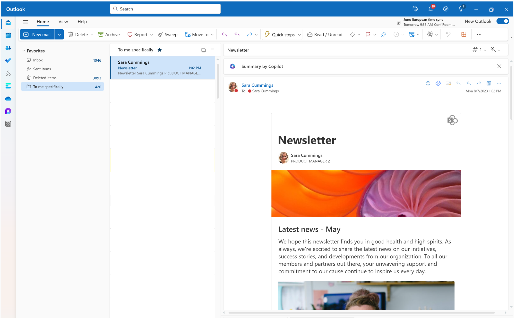
Page analytics allows you to view information about how users interact with your page or news post across all the distribution channels where it has been shared, such as Outlook, SharePoint, Teams, and Engage.
If you are a page owner or member of the site where the page resides, you can view analytics for your page or news post by selecting Analytics at the top of the page.
Visitors of the site can view analytics by selecting Views at the bottom of the page.
What's in the usage report
The analytics page provides charts and graphs with data on usage and engagement on the published news post. You can view the number of people who have viewed the news, number of times content of the news post has been viewed, average time spent reading the news per user, page traffic by time, emoji reactions that the content has received, how often is the content getting promoted and click through rate. You can filter the report for different time periods of 24 hours, 7 days, 30 days, 90 days, 365 days,12 months and lifetime of the news. You can also see the usage broken down by distribution channels to which the news post was amplified including Outlook, SharePoint, Teams and Engage. If you wish to use the analytics data to create your own dashboards or presentations, you can also export the data in an excel sheet or in a PowerPoint file.
Note: A Microsoft Viva suite or Viva Communications and Communities license is required to view hourly trends (24h), daily data for 365 days, and metrics such as Reactions, Promotions, and Unique viewers who clicked a link, as well as usage breakdowns by distribution channels like Outlook, SharePoint, Teams, and Engage, and to export data to Excel and PowerPoint,. Note that usage data from guest and anonymous users is currently not included, even with these licenses. For more details, see Microsoft Viva plans and pricing.
Unique viewers
Shows the total number of individual visitors to the news post, regardless of how often they've visited.
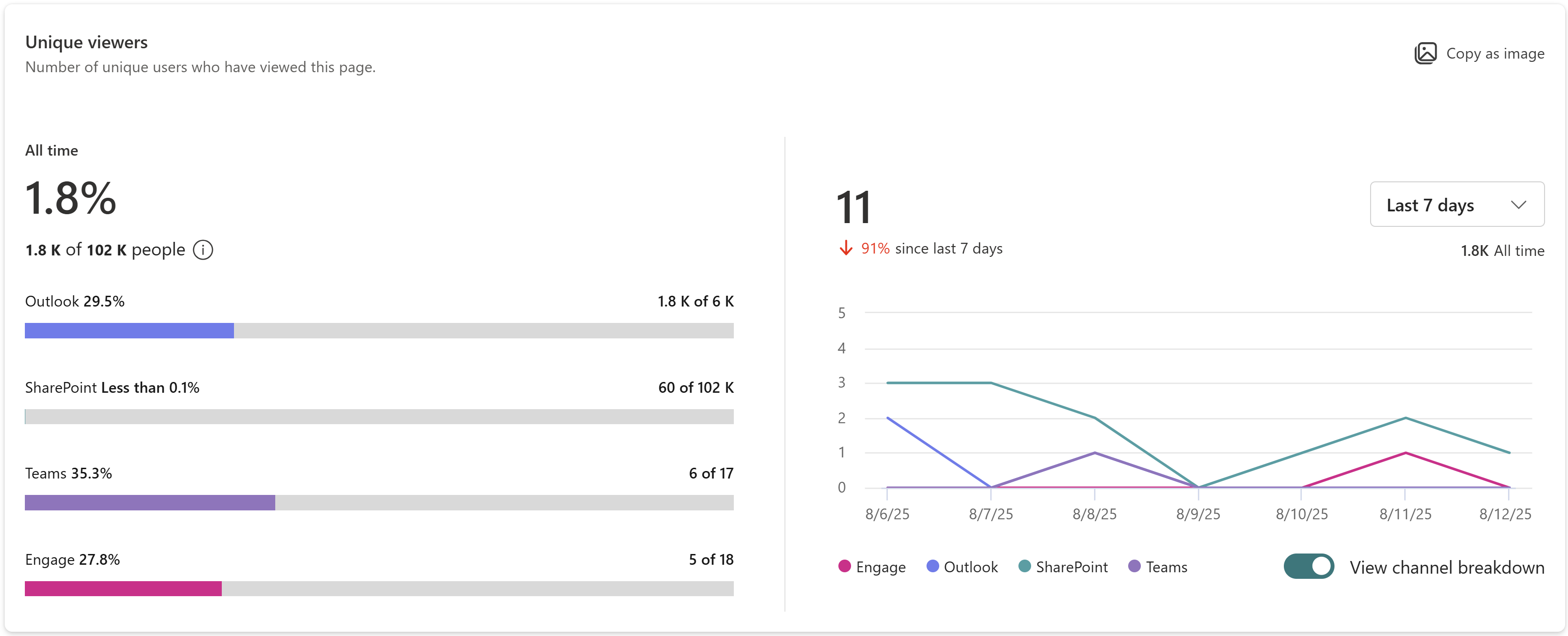
You can see the trend of unique viewers by hour or day or calendar month for the selected timeframe. Hover over the trend line to see data for a specific day or hour or month. Along with the trend, the card also displays the aggregated number of unique viewers for the selected time period across distribution channels including Outlook, SharePoint, Teams and Engage. You can select a different timeframe using the dropdown menu. The View channel breakdown toggle lets you display trends for each distribution channel, and you can choose to enable or disable specific channels from showing in the legend.
Audience view rate:
You can view the total number of unique visitors to the page over its lifetime, along with the percentage of users who have seen the news compared to the total audience it was shared with. The count of unique viewers and audience view rate is available as overall across the distribution channels and also for each distribution channel to help you assess the user engagement for each distribution channel.
The total audience is calculated by adding up the members of all groups with rights to see the news post. The user count is determined by adding the Microsoft Entra ID users with permissions to the published news post. If a user is present in multiple groups, he/she is counted only once. If the news is shared across multiple channels, the common users across channels are counted only once. If a news post is shared with the entire organization, audience size is not calculated for this case.
In the example below, over the lifetime of the news post, 1.8K users have viewed this news post compared to the audience size of 102K to which the news was shared with indicating an audience view rate of 1.8%. You can also see that over the last 7 days, 11 unique users have viewed the content across distribution channels which is a 91% decrease in traffic compared to the prior 7-day period.
Note: Audience view rate is available only for news posts created after September 2025
Total views
Shows the total number of page views for the news post.
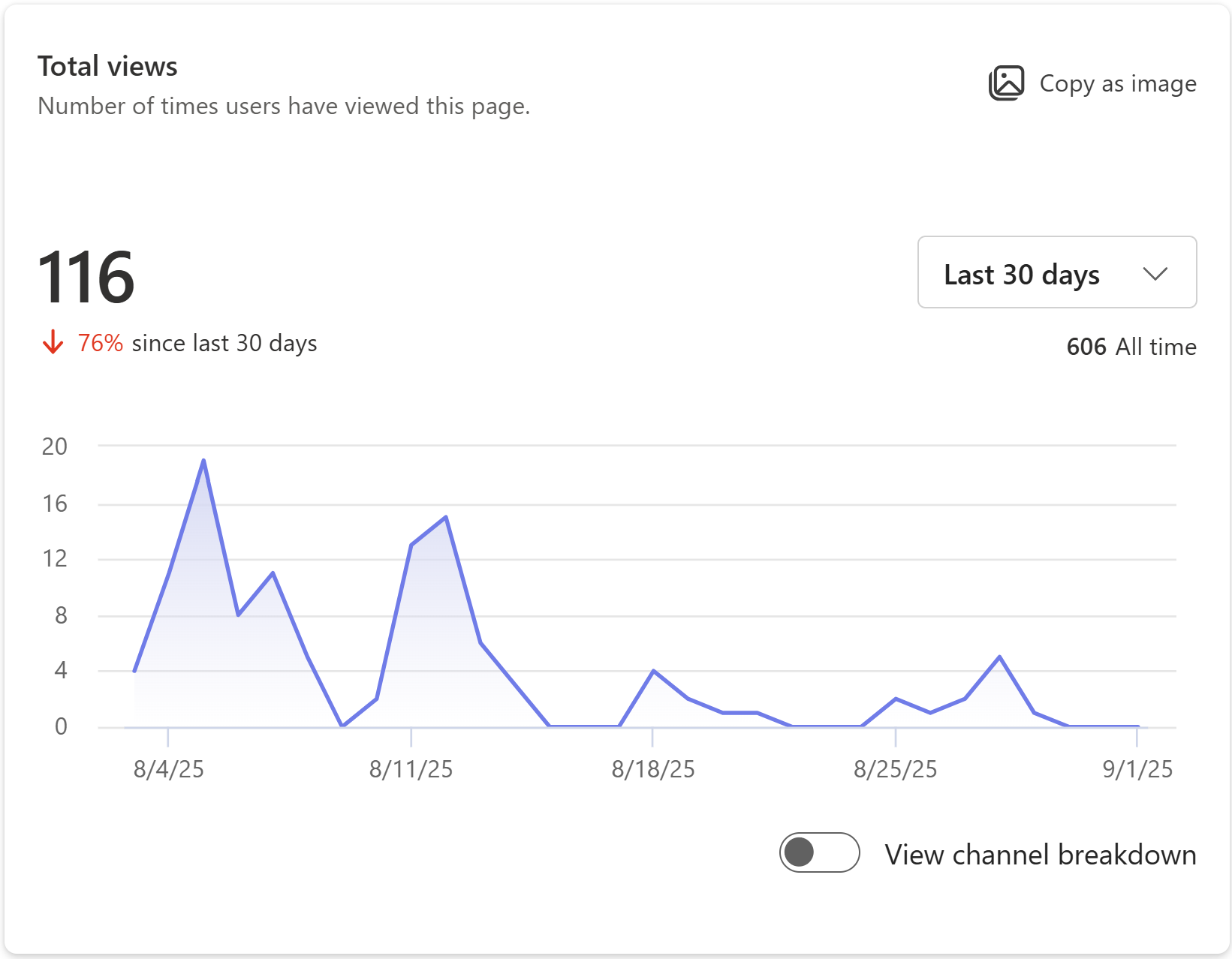
You can see the trend of page views over the chosen time period. The algorithm used to calculate total views is designed to filter out repetitive, continual operations by the same user on the same item, such as when a user repeatedly refreshes the page. Along with the trend, you can also see the total number of views from the selected time period across distribution channels Outlook, SharePoint, Teams and Engage. You can also see the lifetime views for this page across distribution channels. Just like the unique viewers card, you can hover over the trend line to see point in time data, select a different timeframe, toggle on or off to view channel breakdown.
In the example below, over the last 30 days, users have viewed the content 116 times across distribution channels which is a 76% decrease from the prior 30-day period. The lifetime visits for this page are 606.
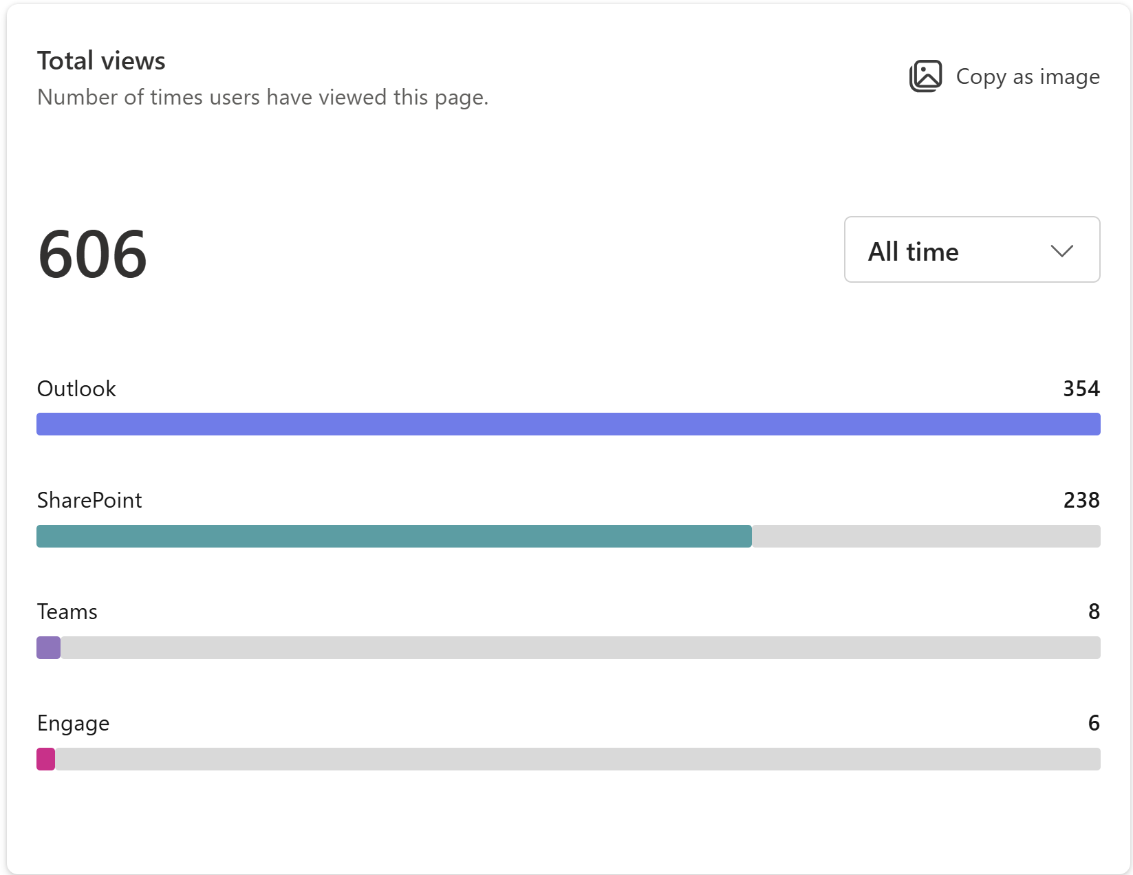
The All time views indicate the breakdown of 606 lifetime views across distribution channels, such as Outlook, SharePoint, Teams, and Engage.
Average time spent per user
Represents the dwell time, showing the average time users spent reading the news post in Outlook and SharePoint.
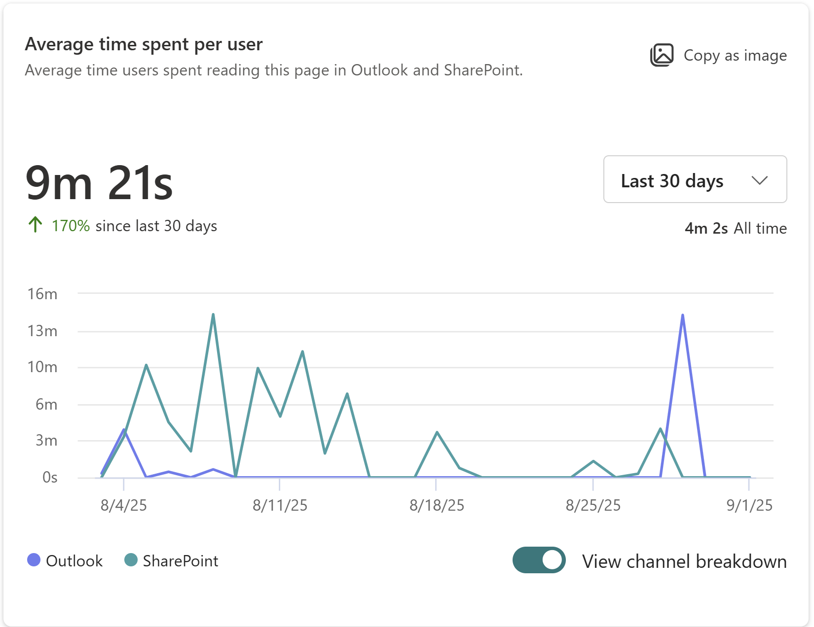
The report calculates the time users are active on a news post. It displays the average time spent per user over the selected timeframe by dividing the total time on the page by the number of unique visitors during the given timeframe. You can also view the average time spent per user across the lifetime of the news post. As with other cards, you can hover over the trend line to see point in time data, select different timeframes, and toggle the View channel breakdown on or off.
Notes:
-
This metric is available for SharePoint and Outlook distribution channels only.
-
This metric is available for 7 days, 30 days, 90 days, 365 days, 12 months, and the lifetime of the news post.
-
Usage on the SharePoint mobile app is currently not incorporated in calculation of this metric.
In the example below, the 30-day view for this page tells us that on average, a user spends 9 minutes, and 21 seconds actively engaged with the page which is a 170% increase from the prior 30-day period.
Page traffic by time
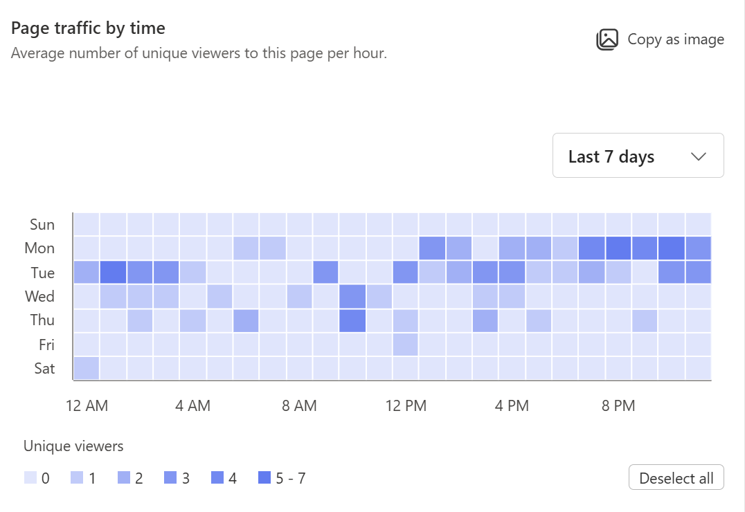
Shows the hourly trend of visitors to the news post, based on the viewer's local time zone. The darker shades on the chart indicate the time periods when the page receives higher user traffic. You can use this map to determine to best time to post news and big announcements.
Notes:
-
This metric is available for time frames of 7 days, 30 days, and 90 days.
-
The user numbers displayed in the 30- and 90-day views for a specific day and hour represent the average number of users for that day and hour across the 30- or 90-day period.
Promotions
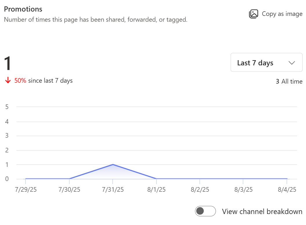
Shows the total number of shares, @mentions, and email forwards this news post has received. You can select different time periods, view breakdown by distribution channel, and enable or disable specific endpoints from showing.
Reactions
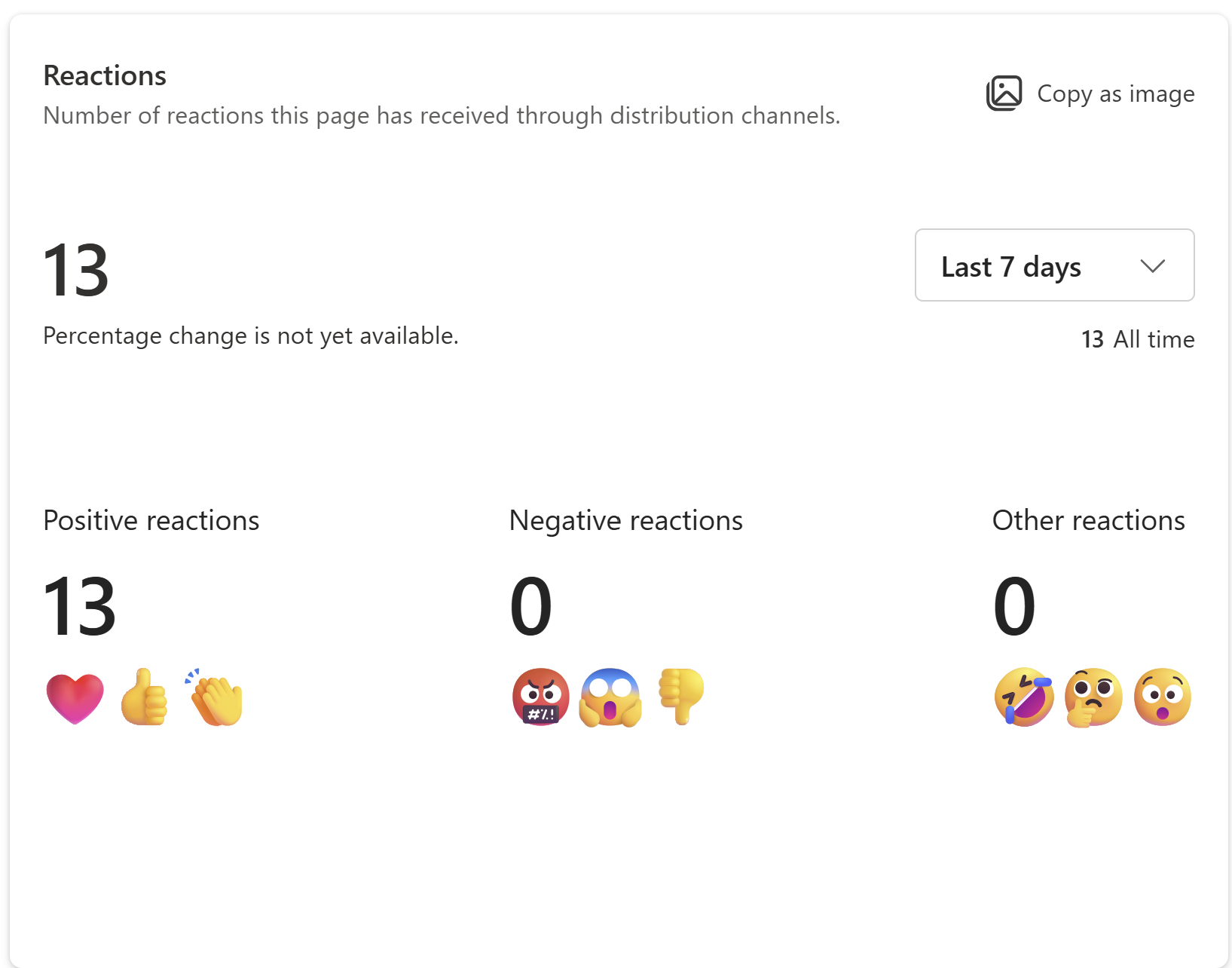
Shows the total number of reactions (like a thumbs up, smiley face, and more) this news post has received across distribution channels. Not all distribution channels provide users the ability to react to content, and even when reactions are possible, different distribution channels use different language or gestures to represent similar user intent. Reactions across channels with similar user intent are grouped into three categories: Positive, Negative and Other.
|
Reaction |
Definition |
|---|---|
|
Positive |
Likes, thumbs up, smiley face, heart, across the different publishing destinations are groups as Positive reactions. |
|
Negative |
Sad face, thumbs down |
|
Other |
When the user’s intent is ambiguous, the reaction is classified as neutral. This is different from a user expressing indifference, but that a reaction was recorded by the system, but it is unclear what the user intended to express. For example, “Surprise” reaction without context would be classified as neither positive nor negative. |
Unique viewers who clicked a link
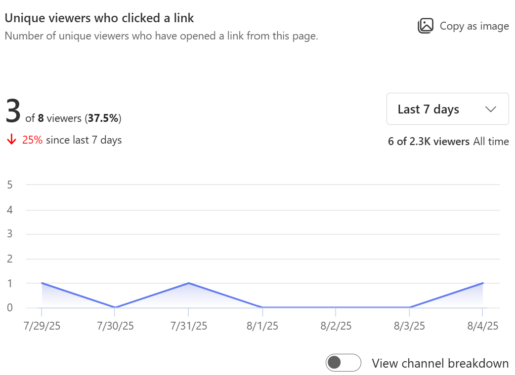
Represents CTR (click through rate), showing the number and percentage of unique viewers of the news post who have also clicked a link on the news post. You can select different time periods, view a breakdown by distribution channel, and enable or disable specific endpoints from showing.
In the example below, during the last 7-days, of the 8 unique users who viewed the page, 3 users also clicked on a link in the page indicating a click rate of 37.5%.
Note: This metric is available for SharePoint and Outlook distribution channels only.
Export report data and charts
There are three ways to export data from SharePoint Page analytics: Copy as image, Export to Excel, and Export to PowerPoint. Copying an image is an easy way to see one aspect of a report, while the Excel and PowerPoint options allow you to do deeper analysis.
Copy as image
You can copy a card from the report to your clipboard by selecting Copy as image on the card and then paste it over a document or email or Teams chat. You can do this on any desktop or browser application that supports cut and paste from the clipboard.
Export to Excel
Exporting the report as an excel file generates a file on your machine that contains all the data available for the underlying report. This option can help you do further data analysis and manipulation than what is available in the standard analytics experience.
Click on export options dropdown at the top of the page and select Excel to download the Excel spreadsheet that contains all the information on the analytics page.
Export to PowerPoint
Export to PowerPoint generates a ready-to-share PowerPoint file on your machine. When you export the page analytics data, each card appears as a separate slide. The export reflects the configured channel breakdown, the status of enabled or disabled channels, and the selected time period for each card.
What's in the usage report
The analytics page provides charts and graphs providing data on usage and engagement on the page. You can view the number of people who have viewed the page, number of times content of the page has been viewed, average time spent on the page per user, and page traffic by time. You can filter the report for different time periods of 7 days, 30 days, and 90 days.
Unique viewers
Shows the total number of individual visitors to the page, regardless of how often they've visited.
You can see the daily trend of unique viewers for the last 7 days, last 30 days and last 90 days. Hover over the trend line to see data for a specific day. Along with the trend, the card also displays the aggregated number of unique viewers for the selected time period across distribution channels Outlook, and SharePoint. You can select a different timeframe using the dropdown menu.
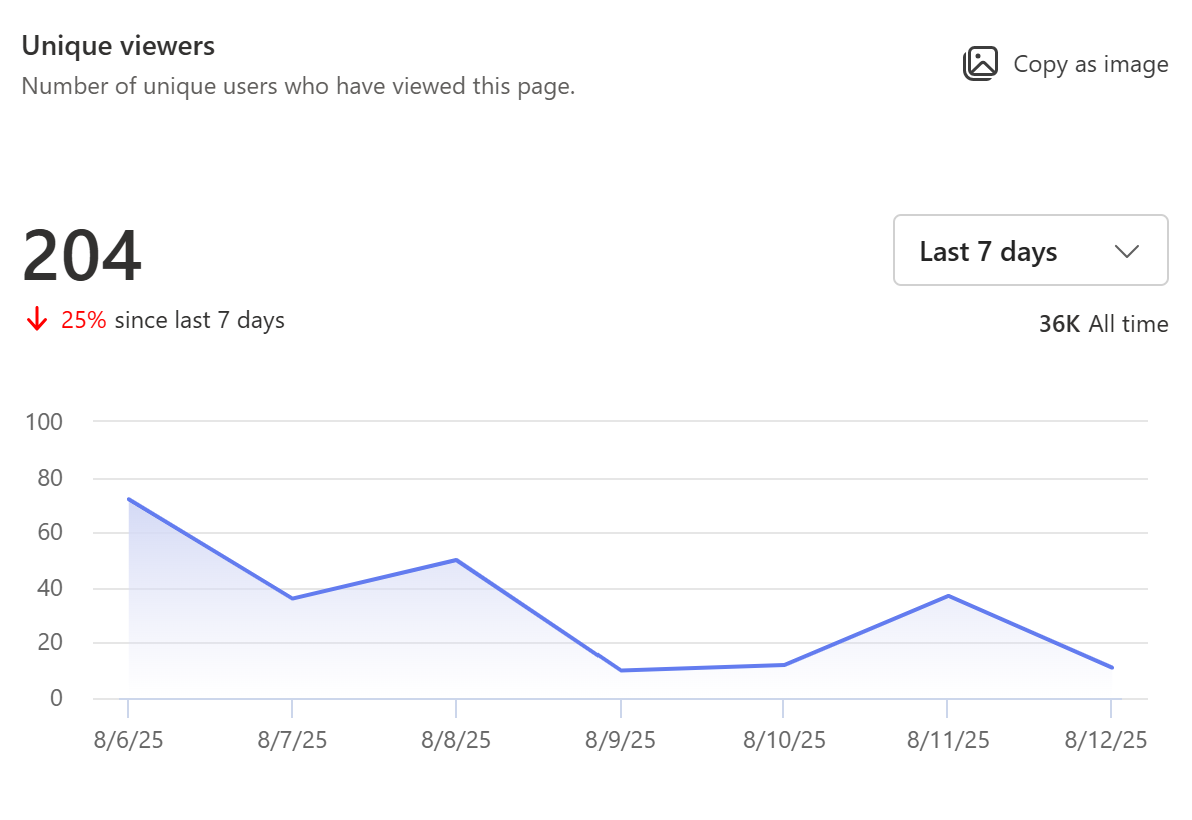
In the example below, over the last 7 days, 204 unique users have viewed the content across Outlook and SharePoint which is a 25% decrease in traffic compared to the prior 7-day period. Over the life of the page, 36K users have viewed this page.
Total views
Shows the total number of page views for the last 7 days, last 30 days, and last 90 days.
You can see the trend of page views over the chosen time period. The algorithm used to calculate total views is designed to filter out repetitive, continual operations by the same user on the same item, such as when a user repeatedly refreshes the page. Along with the trend, you can also see the total number of views from the selected time period across distribution channels Outlook, and SharePoint. You can also see the lifetime views for this page.
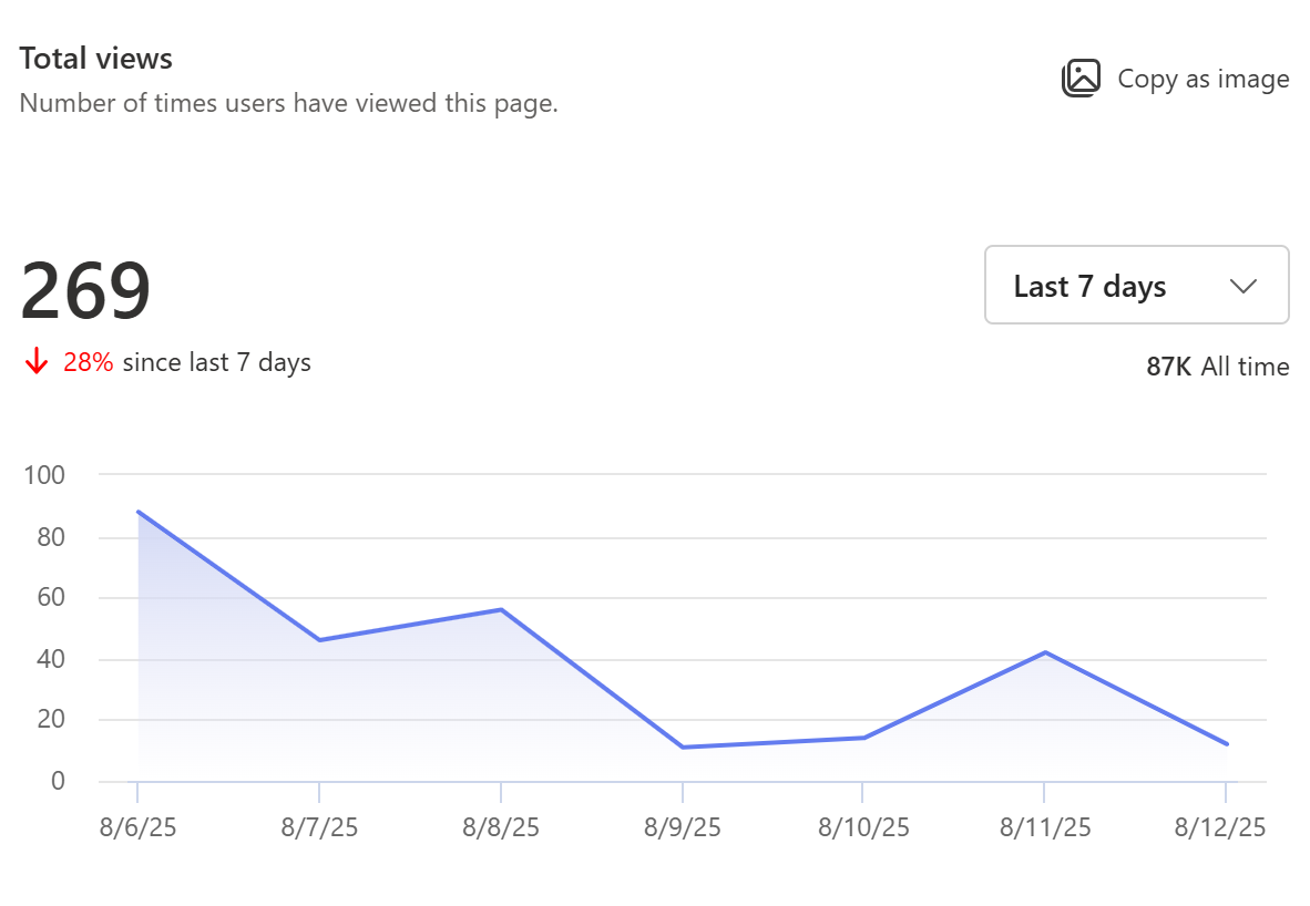
In the example below, over the last 7 days, users have viewed the content 269 times across Outlook and SharePoint distribution channels which is a 28% decrease from the prior 7-day period. The lifetime visits for this page are 87K.
Average time spent per user
Represents the dwell time, showing the average time users spent reading the page in Outlook and SharePoint. The report calculates the time users are active on a page. It displays the average time spent per user over the selected timeframe by dividing the total time on the page by the number of unique visitors during the given timeframe. You can also view the average time spent per user across the lifetime of the page.
Notes:
-
This metric is available for SharePoint and Outlook distribution channels only.
-
Usage on the SharePoint mobile app is currently not incorporated in calculation of this report.
-
A small amount of traffic will not be accounted for in this report due to web browser restrictions.
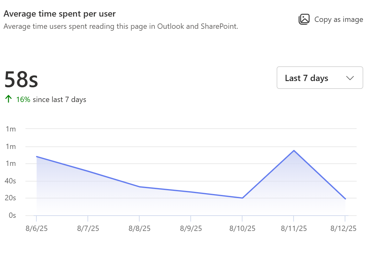
In the example below, the 7-day view for this page tells us that on average, a user spends 58 seconds actively engaging with the page which is a 16% increase from the prior 7-day period.
Page traffic
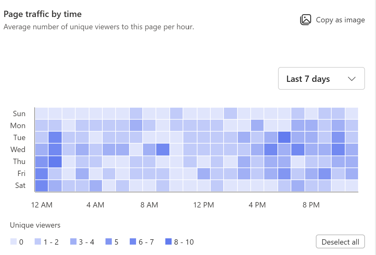
Shows the hourly trend of visits to the page over the last 7 days, last 30 days, and last 90 days for the viewer's local time zone. Darker shades on the chart refer to time slots when there are more views. Use this map to determine to best time to publish the page to maximize user engagement.
Notes:
-
Lifetime stats are shown for pages created after February 2018. Sites created before this date will show stats from February 2018 forward.
-
Usage data (except hourly trend) is aggregated and displayed based on Coordinated Universal Time (UTC). Hourly trend is displayed in local time zone.
-
Guest users will not have access to page analytics.
"Made for Email" News Post Analytics
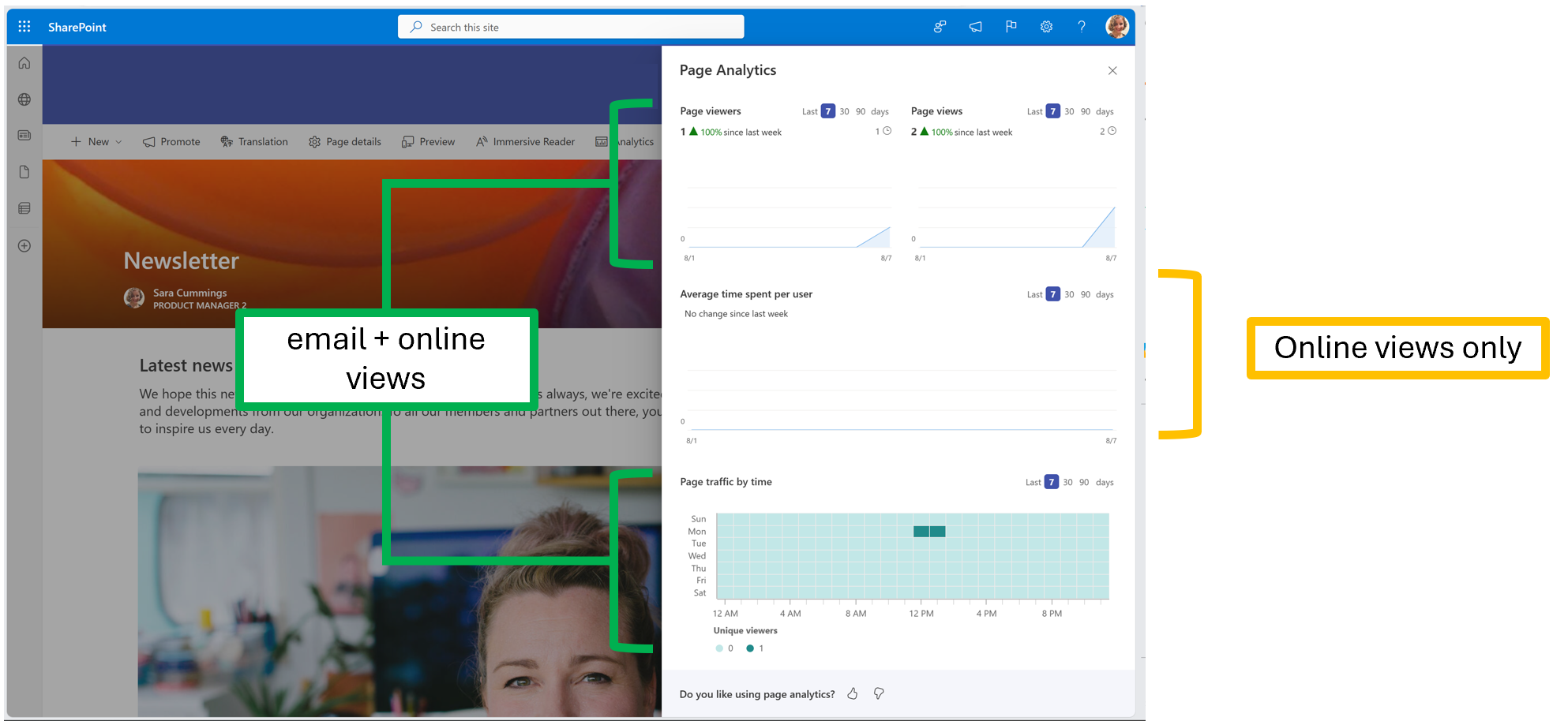
When you use create a "Made for Email" News post, you can send a natively readable version of your news post straight to your reader's inbox. Your email views, viewers, and page traffic will be added to your page analytics, but your average time spent per user will only reflect your online views.
Get usage data for a SharePoint site
As a SharePoint owner in Microsoft 365 site, you can view information about how users interact with your site. For example, you can see how many people have visited the site, the total number of visits, and which files have been viewed the most. Learn more.
