Symptom
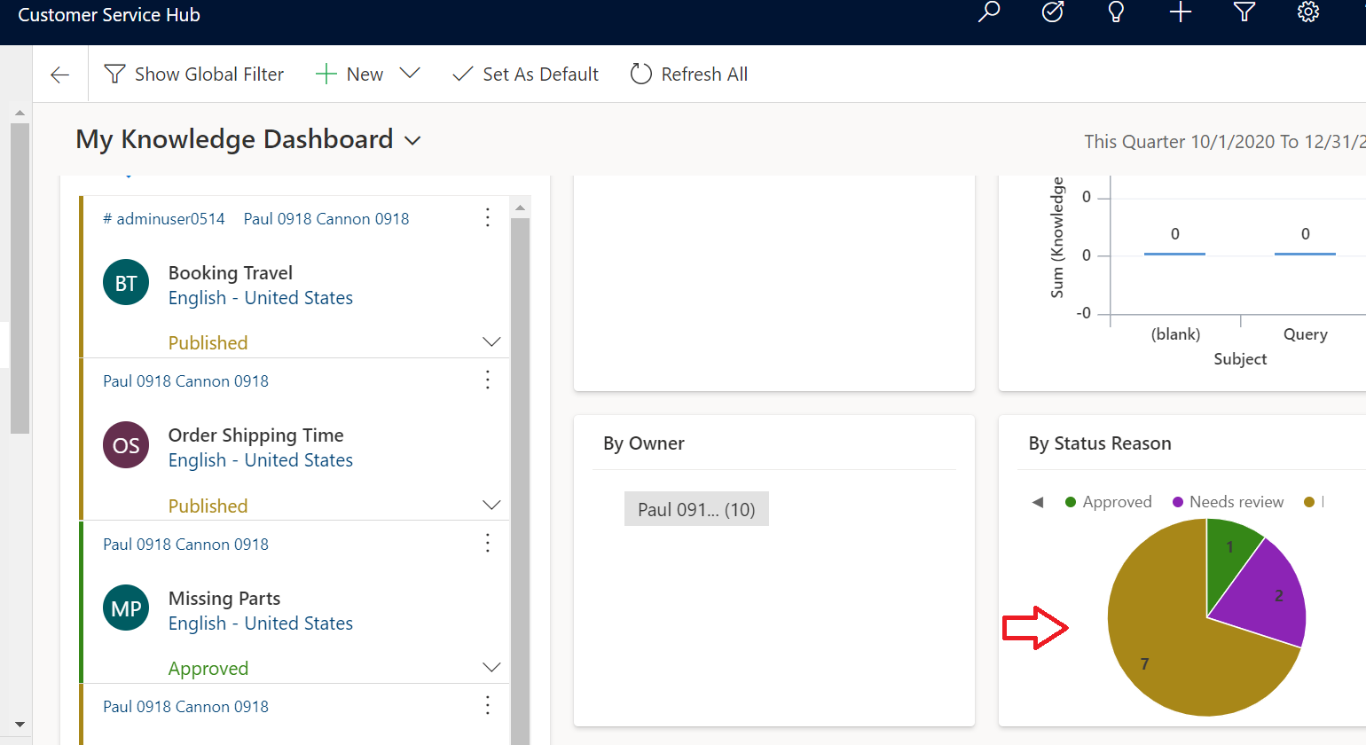
Some charts on interactive dashboards do not behave correctly. Random colors are not being generated, which causes charts to have same color for different areas.
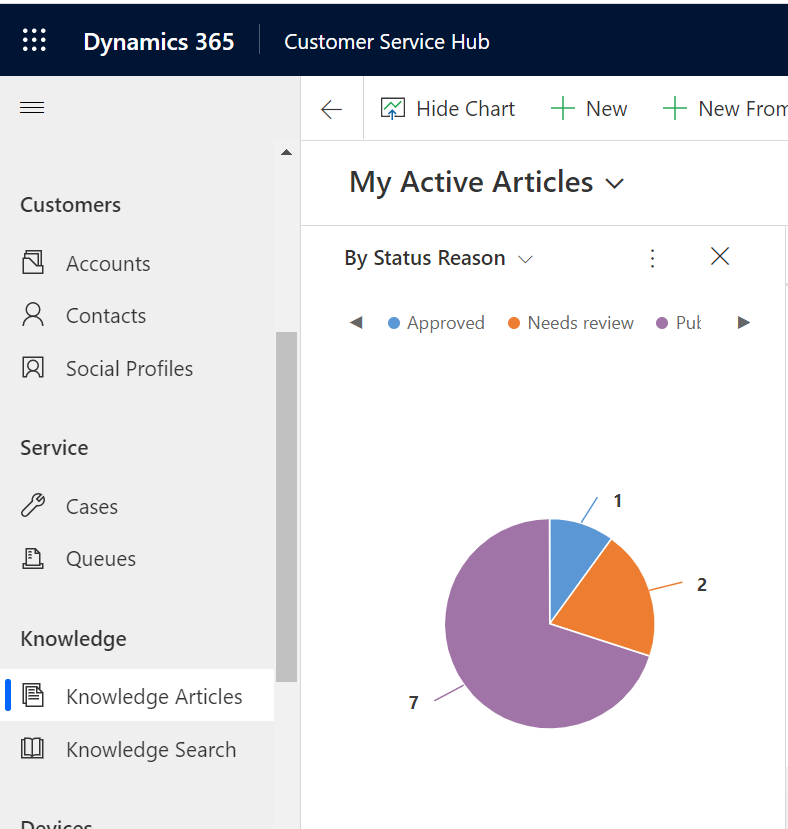
Notice the same chart on home grid page is correctly displayed.
Cause
In Unified Interface, for chart rendered on interactive dashboard (note: only on interactive dashboard, not normal dashboard, or grid page, or form page), if the chart is group by an option set field, then the chart honors the option set colors.
Basically, chart will only honor the option set color settings if:
- The chart is rendered on interactive dashboard;
- And the chart has only 1 group by and 1 series (aka: 1 x-axis, 1 y-aixs) (if we support chart honoring option set color on multiple series, it will cause some problem with duplicate color)
Same applies to a two option field or a status reason field.
This is by design.
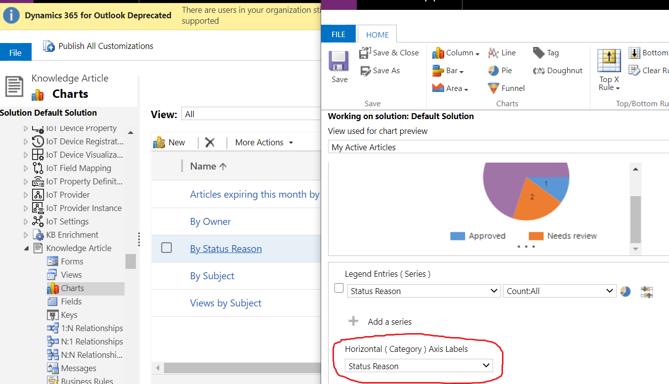
In the screenshot, the chart is group by status reason field. You can find the type in customization setting.
Mitigation
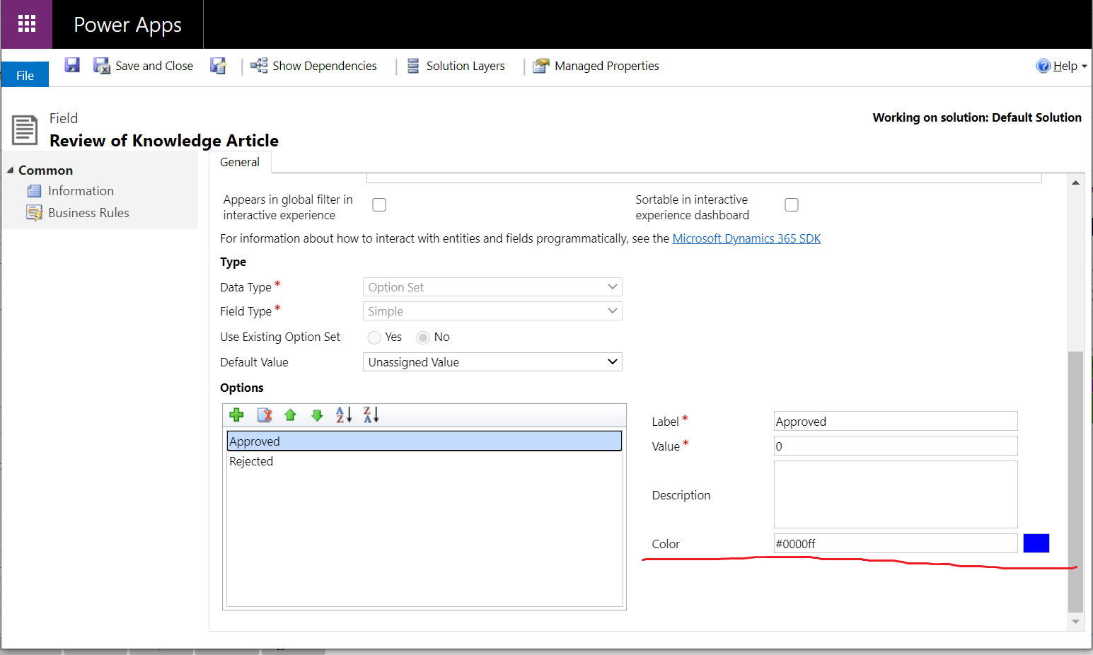
Go to the optionset/status reason/two option field from customization.
For example,
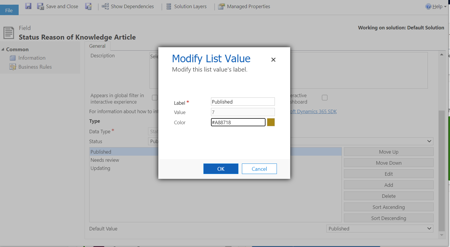
Double click to access the status reason field and find the value you want to change, then change the color.
For example,
In the example, the Approved and Published are both green, so change the Published value to brown.
Save and publish all customization.
Refresh the dashboard page, a chart with different colors is displayed.
It is similar to change the two option field color.
For option set field color, it looks like this screenshot.
Read more here in documentation.


