
In Visio for the web, with the help of a new add-in, you can create an organizational chart that is based on Excel data.
Important: This process only works if you have a Microsoft 365 work or school account. It isn't available for personal Microsoft 365 accounts (Hotmail, outlook.com, live.com, etc.).
If you want to make an org chart that is not based on Excel data, see Create an organization chart in Visio.
The chart is based on Excel data
The org chart is derived from data in an Excel workbook. We'll give you some sample data to make it easy to get started. You'll replace the sample data with data about the people you want to include in your organizational chart.
There are several steps in the process, all described below. An advantage of this process is that when changes occur, you simply update the employee data in the Excel workbook and then click a button to entirely refresh the Visio diagram.
Start with the Visio Data Visualizer add-in
The Data Visualizer add-in is available for Excel on PC, Mac, and the browser with a Microsoft 365 work or school account. Here we focus on using Excel and Visio in a web browser.
-
Open Excel for the web and create a new Blank workbook.
-
Save the workbook to a OneDrive or SharePoint location.
-
Ensure that an empty cell is selected in the workbook.
-
Select Insert > Add-ins:

-
In the Office Add-ins window, select the Store tab, search for Data Visualizer, and then select Add next to Microsoft Visio Data Visualizer. If you see a security message regarding the add-in, select Trust this add-in.
-
Sign in with the account associated with your Microsoft 365 work or school subscription.
-
If you see a permissions prompt, select Allow.
Modify the data-linked table to customize your diagram
-
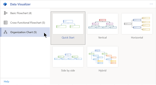
In the Data Visualizer window, select Organization Chart. Then select one of the five layout options:
A sample diagram and its data-linked table are added to the workbook. This process may take a minute.
-
The diagram is saved as a Visio file in the same location where you saved the Excel workbook.
-
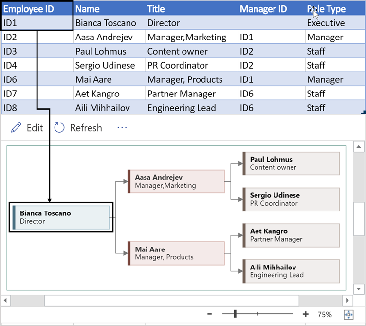
Replace the sample data in Excel table with information about your organization. Fill in the Employee ID, Name, Manager ID, Title, and Role Type for each person you want to include in the organization chart.
Don't change the names of the column headings. Just change the data below the headings. You can use any numbering scheme you like for Employee ID, but each entry in that column must be unique. For more information, see the next section, "How the table data interacts with the diagram."
-
Add or remove entries for people by adding or removing rows in the data table.
-
After you've finished modifying the data table, select Refresh in the diagram area to update the appearance of the chart.
Note: If there is a flaw in the source data table, the Data Checker appears next to the chart and gives instructions on how to fix the flaw. After you make the corrections in the table, select Retry in the Data Checker to confirm the flaw is corrected. Then the diagram updates itself.
How the table data interacts with the diagram
Each column of the table uniquely identifies an important aspect of the organization chart that you see. See the reference information below to learn more about each column and how it applies and affects the diagram.
Select a subheading below to expand it and see the detailed information.
A number that identifies each employee in your organization chart. This column is required, and each value in the Excel table must be unique and not blank. This value doesn't appear in the diagram.
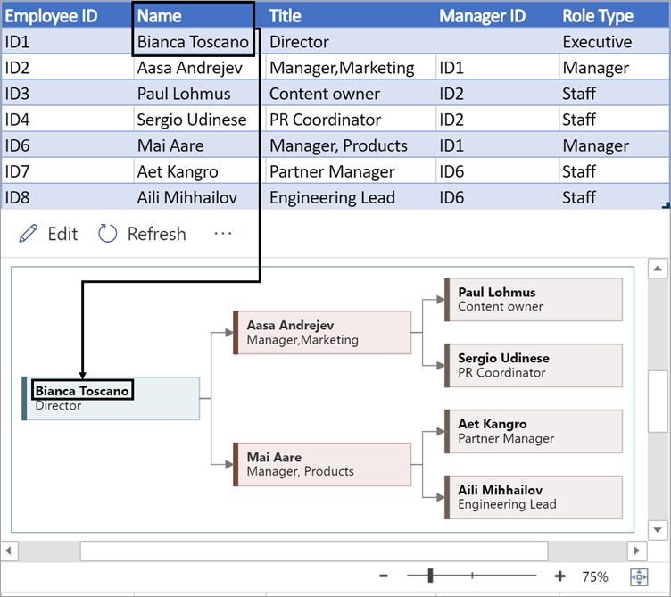
Enter the full name of the employee you want to associate with the employee ID number. This text appears in the diagram as shape text.
Provide additional details for the employee by entering the job title or role. This text appears in the diagram shapes below the employee's name.
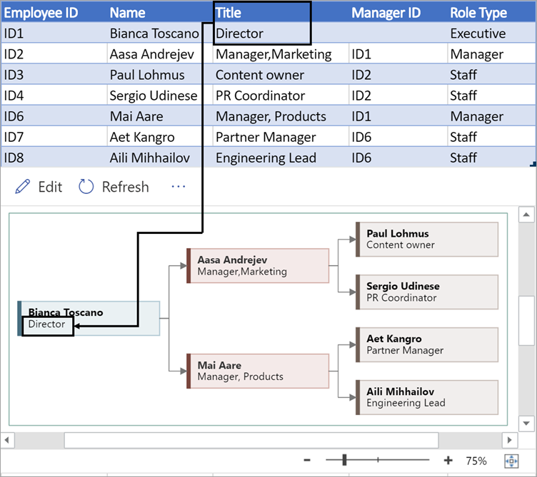
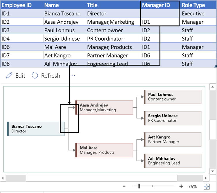
To create the structure of the organization chart, use this column to identify the manager of each employee. You may leave it blank for those who don't report to anyone. You'll enter the corresponding employee ID from the first column. In the example pictured below, notice how the employee ID (ID1) of Bianca Toscano appears in the Manager ID column for Aasa Andrejev, indicating that Bianca is the manager of Aasa.
You can also separate multiple manager IDs by using a comma.
Organization charts in the add-in come with different role types for you to choose from. Select a field under the Role Type column to choose from a pre-set list of roles. The role you select determines the color of the shape in the diagram.

View, print, or share your Visio diagram
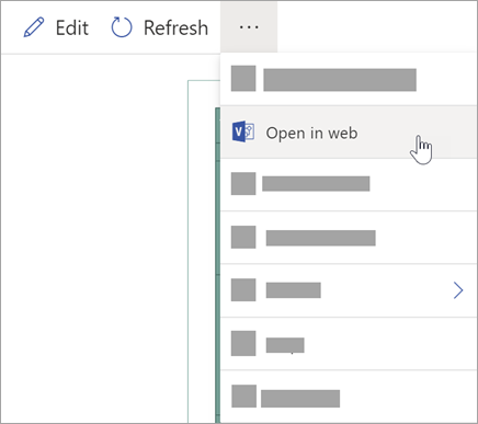
Open the Data Visualizer flowchart in Visio for the web to view, print, or share your diagram with others. Here's how:
-
To view the diagram in Visio for the web, select the ellipses (...) in the diagram area and select Open in web.
-
After the Visio file is opened in a new browser tab, select the ellipses (...) at the top and then select Print to print your diagram. (For more details, see Print a diagram.
-
To share your diagram, select the Share button to create a link or to enter the email addresses of those you want to share with.
Edit the diagram
If you have a subscription to Visio,you can edit the diagram in certain ways in Visio for the web—change the theme, modify the layout, or add and format text.
-
In the diagram area in Excel, select Edit

-
Make your changes to the diagram in Visio for the web as follows:
To do this
Use
Add and format text
Home > Font options:

For more details, see Add and format text.
Change the theme
Design > Themes

Design > Theme Colors

For more details, see Apply a theme or theme color.
Change the diagram's layout
Design > Layout

For more details, see Re-layout a diagram.
-
When you're done editing the diagram, you can go go back to the Excel file and select Refresh


