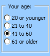
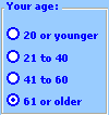
You can use a group box or a frame control to group related controls (such as option buttons, check boxes, or closely related contents) into one visual unit.
Group boxes and frame controls are rectangular objects with optional labels. Use a group box or a frame control to visually organize related items on a form. For example, in a customer order application, group the name, address, and account number of a customer. Or in an order form, group a list of available items.
|
Group box (Form control)
|
Frame control (ActiveX control)
|
What type of control do you want to use?
-
Make sure the Developer tab is available.
Display the Developer tab
-
Click File > Options > Customize Ribbon.
-
Under Customize the Ribbon, click Main tabs from the dropdown list.
-
Select the Developer checkbox, and then click OK.
-
Make sure that you are in design mode. On the Developer tab, click Design Mode
-
-
On the Developer tab, click Insert, and then under Form Controls, click Group box
-
Click the worksheet location where you want the upper-left corner of the group box to appear.
-
Place related controls inside the boundary of the Group box.
For example:
-
Check boxes, such as a list of related products for purchase.
-
Labels and text boxes, such as name and address information.
-
Option buttons that indicate a set of mutually exclusive choices, such as Small, Medium, or Large.
-
-
To specify the control properties, right-click the control, and then click Format Control.
-
Make sure the Developer tab is available.
Display the Developer tab
-
Click File > Options > Customize Ribbon.
-
Under Customize the Ribbon, click Main tabs from the dropdown list.
-
Select the Developer checkbox, and then click OK.
-
Make sure that you are in design mode. On the Developer tab, click Design Mode
-
-
On the Developer tab, click Insert, and then under ActiveX Controls, click More Controls
-
In the More Controls dialog box, select Microsoft Forms 2.0 Frame from the list of available controls on your computer.
-
Click the worksheet location where you want the upper-left corner of the frame control to appear.
-
To specify the control properties, on the Developer tab, click Properties
Tip: You can also right-click the control, and then click Properties.
The Properties dialog box appears. For detailed information about each property, select the property, and then press F1 to display a Visual Basic Help topic. You can also type the property name in the Visual Basic Help Search box.
This table summarizes by functional categories the properties available.
|
If you want to specify |
Use this property |
|---|---|
|
General: |
|
|
Whether the control is loaded when the workbook is opened. (Ignored for ActiveX controls.) |
AutoLoad (Excel) |
|
Whether the control can receive the focus and respond to user-generated events. |
Enabled (Form) |
|
Whether the control can be edited. |
Locked (Form) |
|
The name of the control. |
Name (Form) |
|
The way the control is attached to the cells below it (free floating, move but do not size, or move and size). |
Placement (Excel) |
|
Whether the control can be printed. |
PrintObject (Excel) |
|
Whether the control is visible or hidden. |
Visible (Form) |
|
Text: |
|
|
Font attributes (bold, italic, size, strikethrough, underline, and weight). |
Bold, Italic, Size, StrikeThrough, Underline, Weight (Form) |
|
Descriptive text on the control that identifies or describes it. |
Caption (Form) |
|
Size and position: |
|
|
The height or width in points. |
Height, Width (Form) |
|
The distance between the control and the left or top edge of the worksheet. |
Left, Top (Form) |
|
Formatting: |
|
|
The background color. |
BackColor (Form) |
|
The color of the border. |
BorderColor (Form) |
|
The foreground color. |
ForeColor (Form) |
|
Whether the control has a shadow. |
Shadow (Excel) |
|
The visual appearance of the border (flat, raised, sunken, etched, or bump). |
SpecialEffect (Form) |
|
Image: |
|
|
The bitmap to display in the control. |
Picture (Form) |
|
The location of a background picture (top left, top right, center, and so on). |
PictureAlignment (Form) |
|
How to display the background picture on the control (crop, stretch, or zoom). |
PictureSizeMode (Form) |
|
Whether you want to tile multiple copies of the picture in the control. |
PictureTiling (Form) |
|
Keyboard and mouse: |
|
|
A custom mouse icon. |
MouseIcon (Form) |
|
The type of pointer that is displayed when the user positions the mouse over a particular object (for example, standard, arrow, or I-beam). |
MousePointer (Form) |
|
Specific to frame: |
|
|
The type of border used, either a single-line or none. |
BorderStyle (Form) |
|
Whether the control has vertical scroll bars, horizontal scroll bars, or both. |
ScrollBars (Form) |
|
The action to take when the user leaves the last control on a frame or page (all forms or current form). |
Cycle (Form) |
|
Whether scroll bars remain visible when not required. |
KeepScrollBarsVisible (Form) |
|
The height or width, in points, of the total area that can be viewed by moving the scroll bars. |
ScrollHeight, ScrollWidth (Form) |
|
The distance, in points, of the left or top edge of the logical form from the left or top edge of the frame. |
ScrollLeft, ScrollTop (Form) |
|
How much to change the size of an image in the frame. |
Zoom (Form) |
Notes:
-
If you plan to use the frame control frequently, add it to a "Saved controls" worksheet, and then save the worksheet for reuse. The next time that you need the frame control, open that worksheet, and then copy the frame control to the worksheet form that you are editing.
-
All option buttons in a frame are mutually exclusive by default.
-
You can also use a toggle button inside a frame to select one or more items from a related group. For example, you can create an order form that contains a list of available items with a toggle button preceding each item.

