Logige sisse Microsofti kontoga
Logige sisse või looge konto.
Tere!
Valige mõni muu konto.
Teil on mitu kontot
Valige konto, millega soovite sisse logida.
inglise
Palume vabandust. See artikkel pole teie keeles saadaval.

Exploring charts in Excel and finding that the one you pick isn’t working well for your data is a thing of the past! Try the Recommended Charts command on the Insert tab to quickly create a chart that’s just right for your data.

  1. Select the data you want to chart.

    Selecting more data for an Office chart

  2. Click the Insert tab, and then do one of the following:

    • Click Recommended Charts and select the chart type you want.

      Excel for Mac Recommended Charts Ribbon Command

      OR

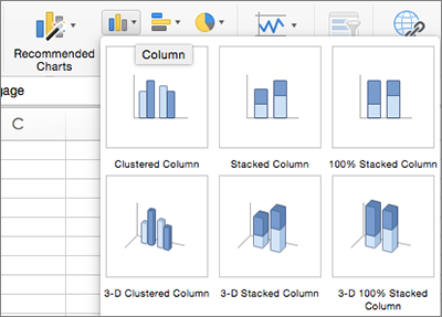
    • Click a specific chart type and select the style you want.

      Choose another type of chart
  3. With the chart selected, click the Chart Design tab to do any of the following:

    • Click Add Chart Element to modify details like the title, labels, and the legend.

      Chart design tab left half
    • Click Quick Layout to choose from predefined sets of chart elements.

    • Click one of the previews in the style gallery to change the layout or style.

    • Click Switch Row/Column or Select Data to change the data view.

      Chart design tab right half
    • Click Change Chart type to switch to a different kind of chart.

Select data for a chart

Structure data for specific types of charts

Format data labels in a chart in Office for Mac

Add data series in charts

Kas vajate veel abi?

Kas soovite rohkem valikuvariante?

Explore subscription benefits, browse training courses, learn how to secure your device, and more.

Communities help you ask and answer questions, give feedback, and hear from experts with rich knowledge.

Kas sellest teabest oli abi?

Mis mõjutas teie hinnangut?
Kui klõpsate nuppu Edasta, kasutatakse teie tagasisidet Microsofti toodete ja teenuste täiustamiseks. IT-administraator saab neid andmeid koguda. Privaatsusavaldus.

Täname tagasiside eest!

×