
A box and whisker chart shows distribution of data into quartiles, highlighting the mean and outliers. The boxes may have lines extending vertically called “whiskers”. These lines indicate variability outside the upper and lower quartiles, and any point outside those lines or whiskers is considered an outlier.
Box and whisker charts are most commonly used in statistical analysis. For example, you could use a box and whisker chart to compare medical trial results or teachers' test scores.

Create a box and whisker chart
-
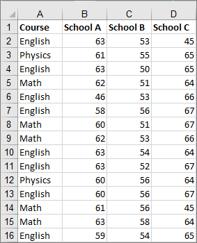
Select your data—either a single data series, or multiple data series.
(The data shown in the following illustration is a portion of the data used to create the sample chart shown above.)
-
In Excel, click Insert > Insert Statistic Chart >Box and Whisker as shown in the following illustration.
Important: In Word, Outlook, and PowerPoint, this step works a little differently:
-
On the Insert tab, in the Illustrations group, click Chart.
-
In the Insert Chart dialog box, on the All Charts tab, click Box & Whisker.

-
Tips:
-
Use the Chart Design and Format tabs to customize the look of your chart.
-
If you don't see these tabs, click anywhere in the box and whisker chart to add the Chart Design to the ribbon.
Change box and whisker chart options
-
Right-click one of the boxes on the chart to select that box and then, on the shortcut menu, click Format Data Series.
-
In the Format Data Series pane, with Series Options selected, make the changes that you want.
(The information in the chart following the illustration can help you make your choices.)
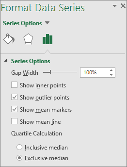
Series option
Description
Gap width
Controls the gap between the categories.
Show inner points
Displays the data points that lie between the lower whisker line and the upper whisker line.
Show outlier points
Displays the outlier points that lie either below the lower whisker line or above the upper whisker line.
Show mean markers
Displays the mean marker of the selected series.
Show mean line
Displays the line connecting the means of the boxes in the selected series.
Quartile Calculation
Choose a method for median calculation:
-
Inclusive median The median is included in the calculation if N (the number of values in the data) is odd.
-
Exclusive median The median is excluded from the calculation if N (the number of values in the data) is odd.
-
Tip: To read more about the box and whisker chart and how it helps you visualize statistical data, see this blog post on the histogram, Pareto, and box and whisker chart by the Excel team. You may also be interested learning more about the other new chart types described in this blog post.
Create a box and whisker chart
-
Select your data—either a single data series, or multiple data series.
(The data shown in the following illustration is a portion of the data used to create the sample chart shown above.)
-
On the ribbon, click the Insert tab, and then click

Tips:
-
Use the Chart Design and Format tabs to customize the look of your chart.
-
If you don't see the Chart Design and Format tabs, click anywhere in the box and whisker chart to add them to the ribbon.
Change box and whisker chart options
-
Click one of the boxes on the chart to select that box and then in the ribbon click Format.
-
Use the tools in the Format ribbon tab to make the changes that you want.


