Keep your presentation on-brand with Copilot
Applies To
Important: Copilot (including Brand kit) is available for PowerPoint for Windows, Mac and the web.
Your PowerPoint template is the foundation Copilot learns from. A well-structured template helps Copilot in PowerPoint generate on-brand, visually consistent presentations.
When you give Copilot in PowerPoint a prompt, it analyzes several sources to generate brand-consistent output:
-
Slides and layouts – The sample slide types and their layouts defined in your brand template
-
Objects – Design elements like text, shapes, images and data visualizations in those sample slides, provided in templates
-
Your prompt – The specific instructions you provide
Copilot synthesizes all this information to create slides that look like your organization created them. This is not just applying a theme – it's understanding and replicating your brand's presentation approach.
Optimize your PowerPoint templates for on-brand presentations with Copilot
Copilot primarily uses your sample slides, and secondarily your template’s structure and layouts to understand how your organization communicates visually. To generate presentations that reflect your brand, you can additionally set up a Brand kitwhich will apply your brand voice, tone, style and imagery, giving you results that reflect your brand’s look, layout, and content style.
Note: If you don’t see Copilot in Word, Excel, PowerPoint, or OneNote, it might not be included with your Microsoft 365 subscription or available based on your organization’s settings. Learn which Copilot license you have.
This article explains how to optimize your PowerPoint templates so Copilot can produce more consistent, on‑brand presentations.
How Copilot uses templates to create presentations
Copilot in PowerPoint uses your:
-
Templates
-
Brand Kit assets
to generate and edit slides using natural language prompts.
When you ask Copilot to create or edit slides:
-
Copilot interprets your request.
-
It looks at sample slides and selects layouts from your template.
-
It generates content based on the template structure.
-
It applies brand assets like images, icons, and even brand voice from brand kits
Presentations created with Copilot prioritize your templates to produce on‑brand output.
Why template optimization matters
Copilot learns from:
-
Layout structure
-
Placeholder types
-
Content density
-
Visual hierarchy
-
Object relationships
present in your template’s sample slides.
Without this information, Copilot may generate:
-
Generic layouts
-
Minimal formatting
-
Slides that do not match brand intent
If your template does not contain enough sample slides, Copilot falls back to the Slide Master — which may result in less optimal output.
How to optimize your template for Copilot
1. Provide Representative Sample Slides
Copilot learns from the sample slides in your template. Therefore, your template should include representative slides that reflect how your organization typically presents content, so Copilot can extract and replicate those patterns to match your brand's style. The more realistic and varied your samples, the better Copilot can understand and apply your brand’s presentation approach.
What to include in your sample slides
Ensure there are multiple slide types and layouts in your template. This helps Copilot recognize and reuse the right layouts.
We recommend adding the following generic layouts:
-
Title
-
Agenda
-
Section Header / Section Divider
-
Content (text, bullets, icons, focus areas, image layouts)
-
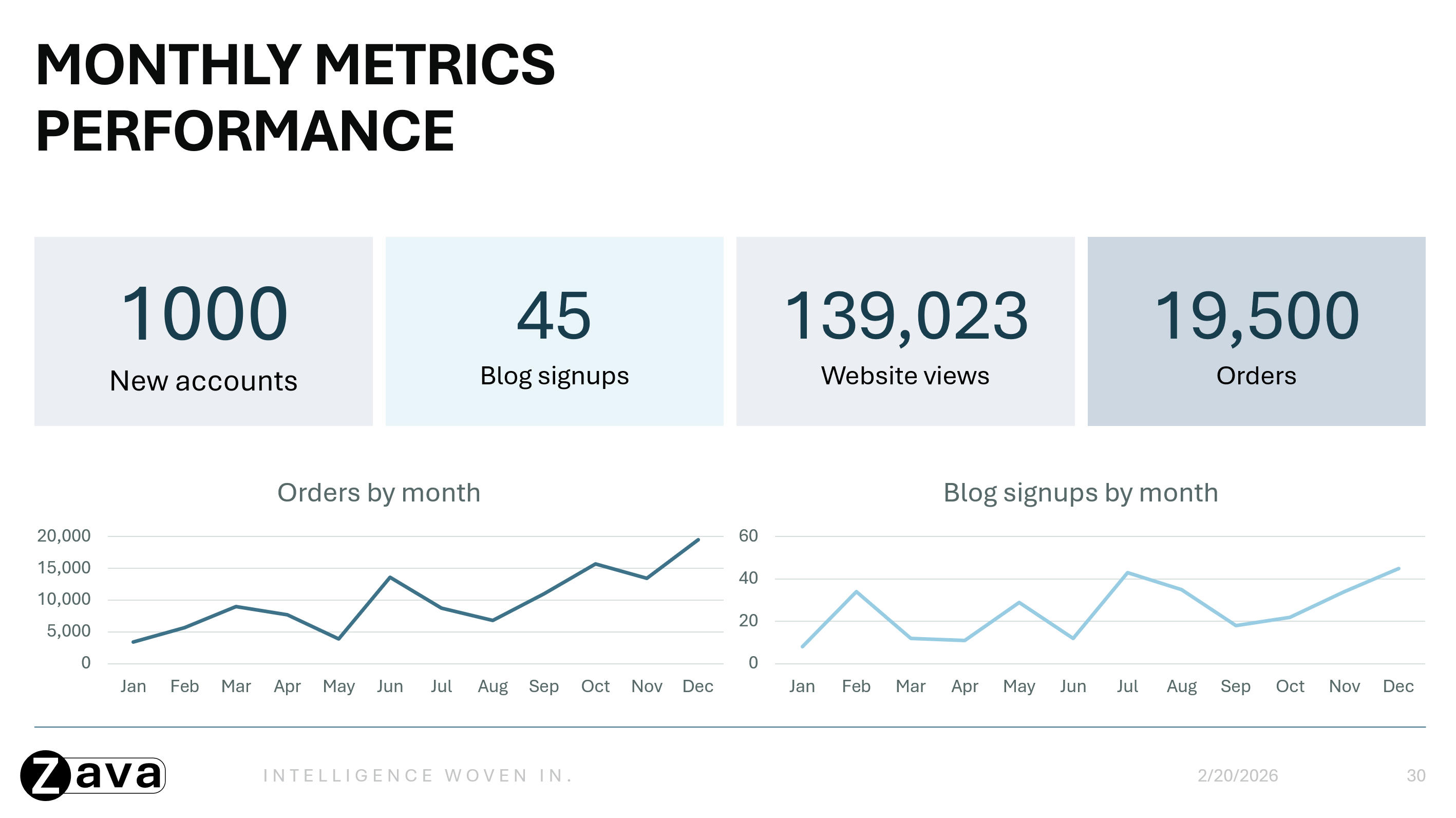
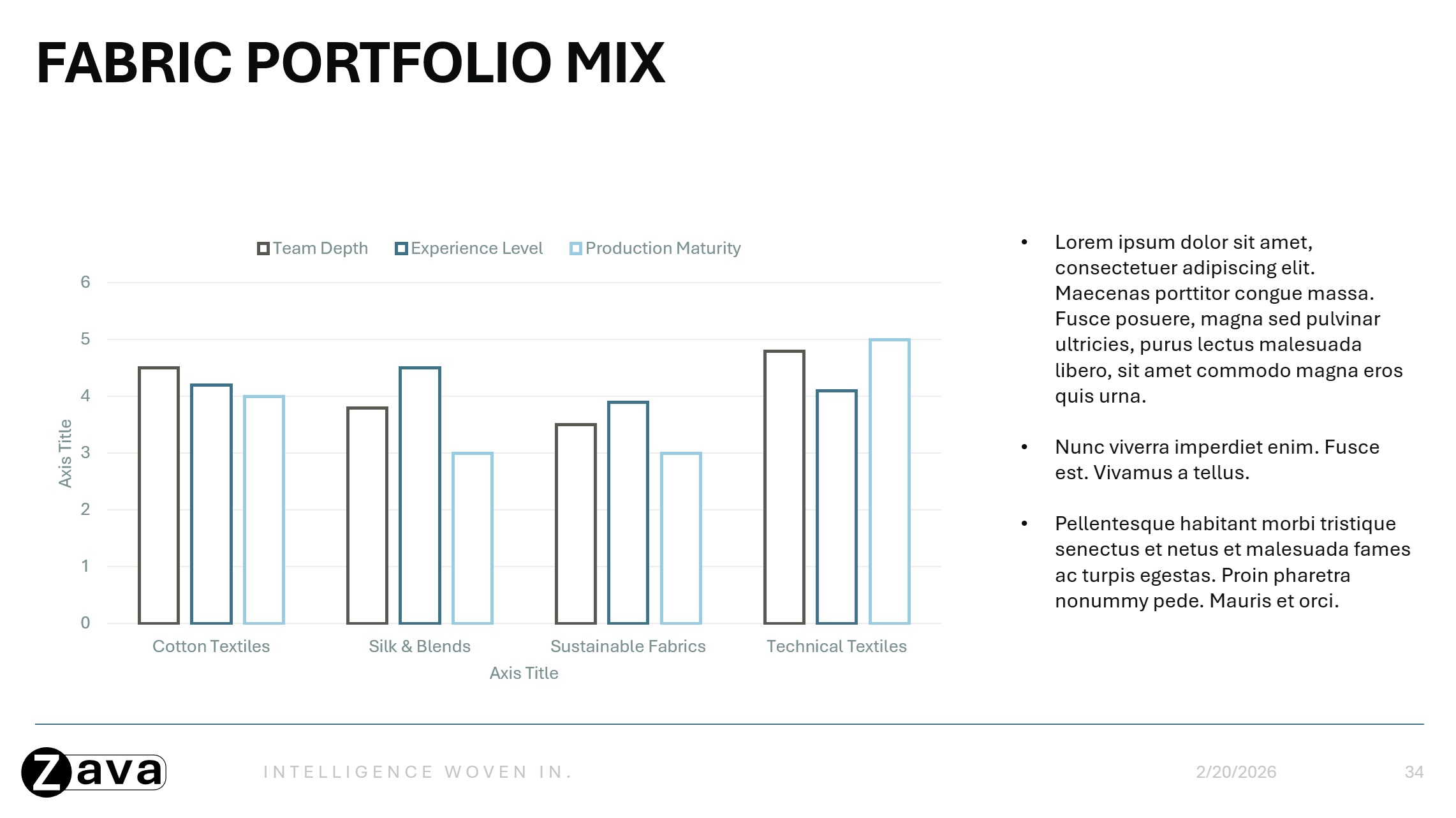
Data Visualization (tables, charts, statistics, dashboards)
-
Timelines
-
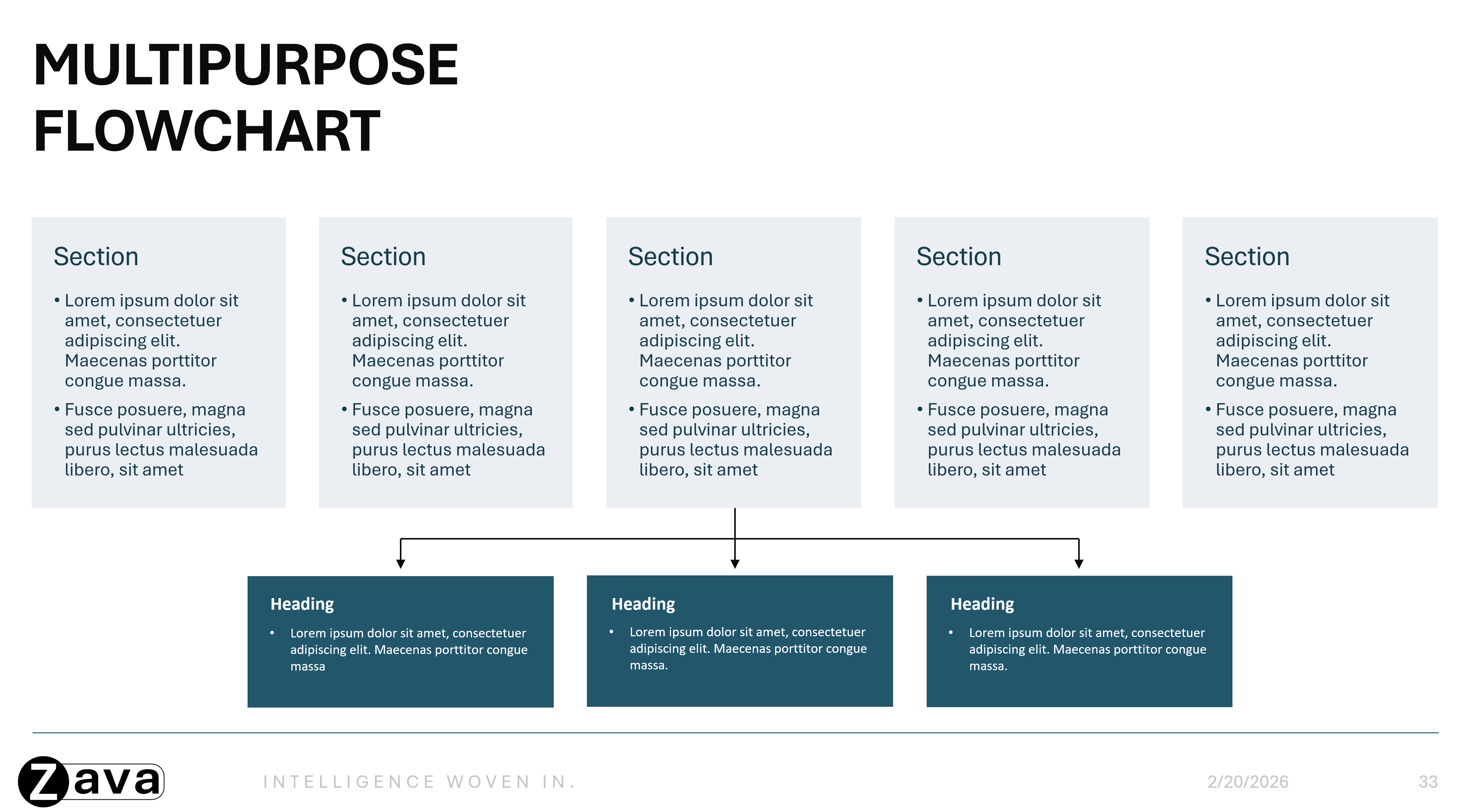
Process Diagrams (circular/block) / Flow Charts / Lists
-
Quotes / Statements / Testimonials
-
Questions and Answers (Q&A)
-
Summary / Key Takeaways
-
Conclusion
-
Thank You / Next Steps
Scenario‑dependent or specialized sample slide types that also can be added are:
-
Introductions / Biographies
-
Team Slides / Meet the Team
-
Contacts
-
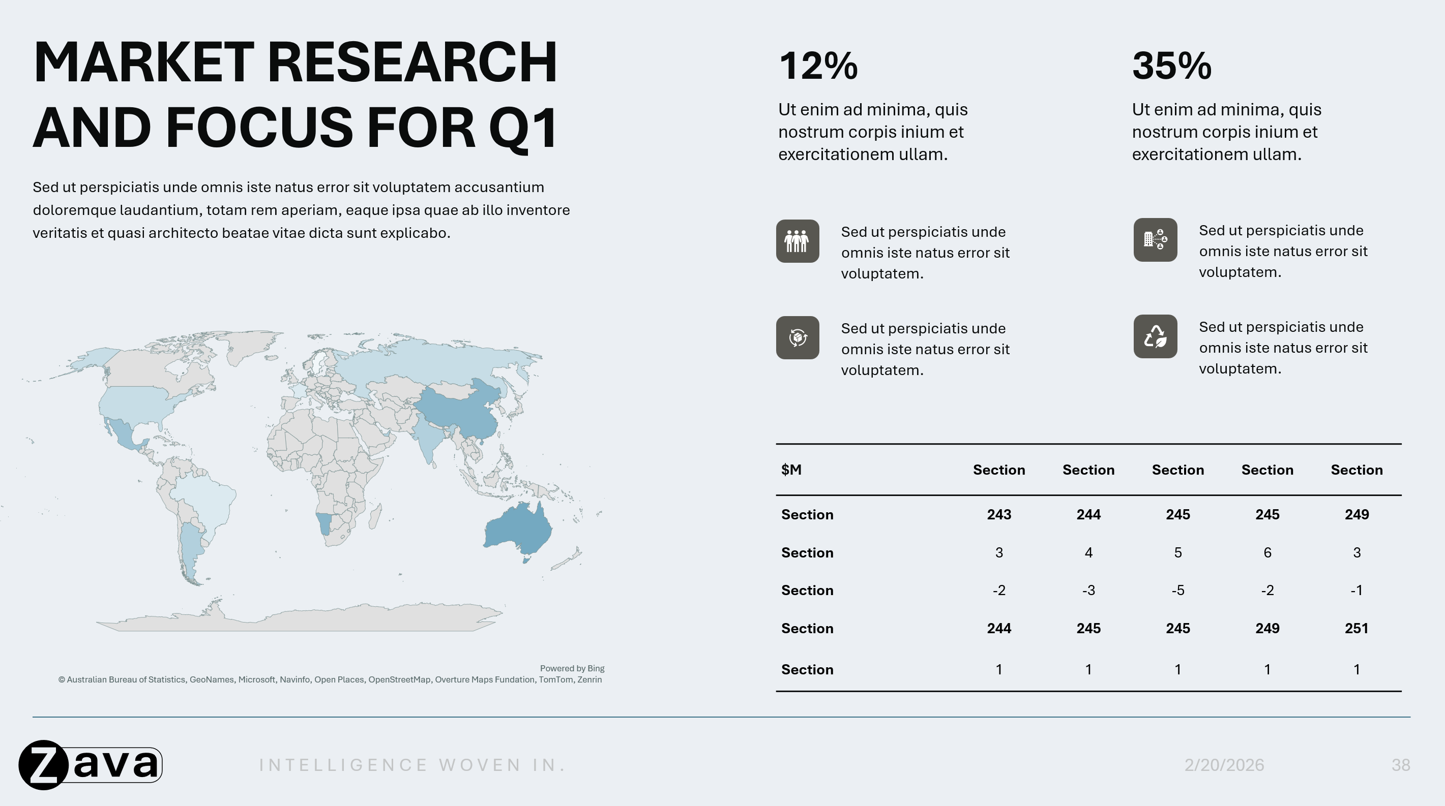
Maps
-
Calendar
-
Case Studies
-
Any other specific use case slide
Note: These sample slide types are representative recommendations only and are not required. You may add any sample slide types based on your brand definitions and use cases; however, ensuring good coverage across layouts, slide types, and object styles will help produce better results.
Within those slides, show examples that demonstrate how your brand handles these concepts:
Content Density
Demonstrate how your brand handles varying amounts of information:
-
Light density: Titles/subtitles only, generous whitespace
-
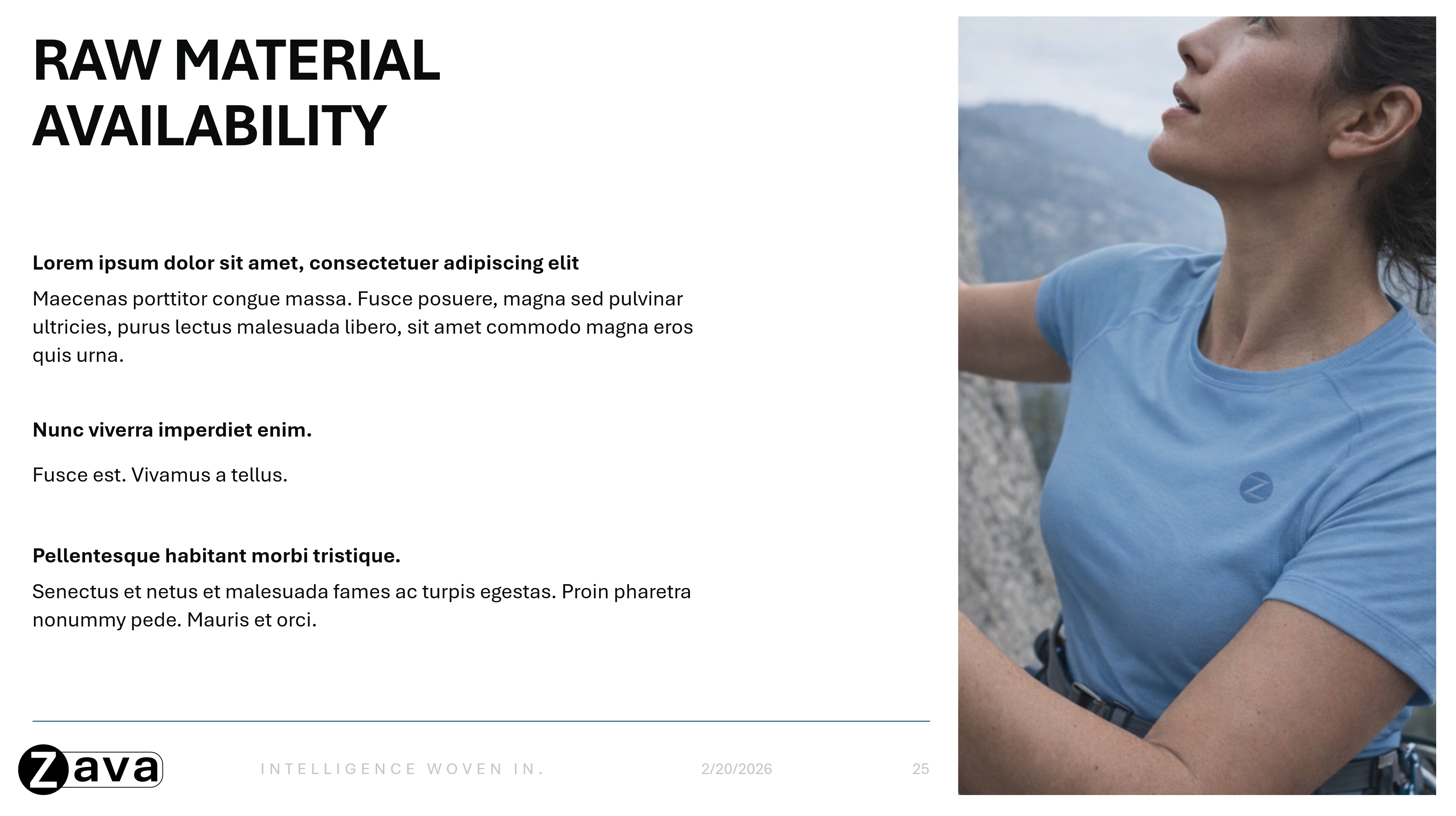
Medium density: Balanced layouts (e.g. text on one side and a large image on the other)
-
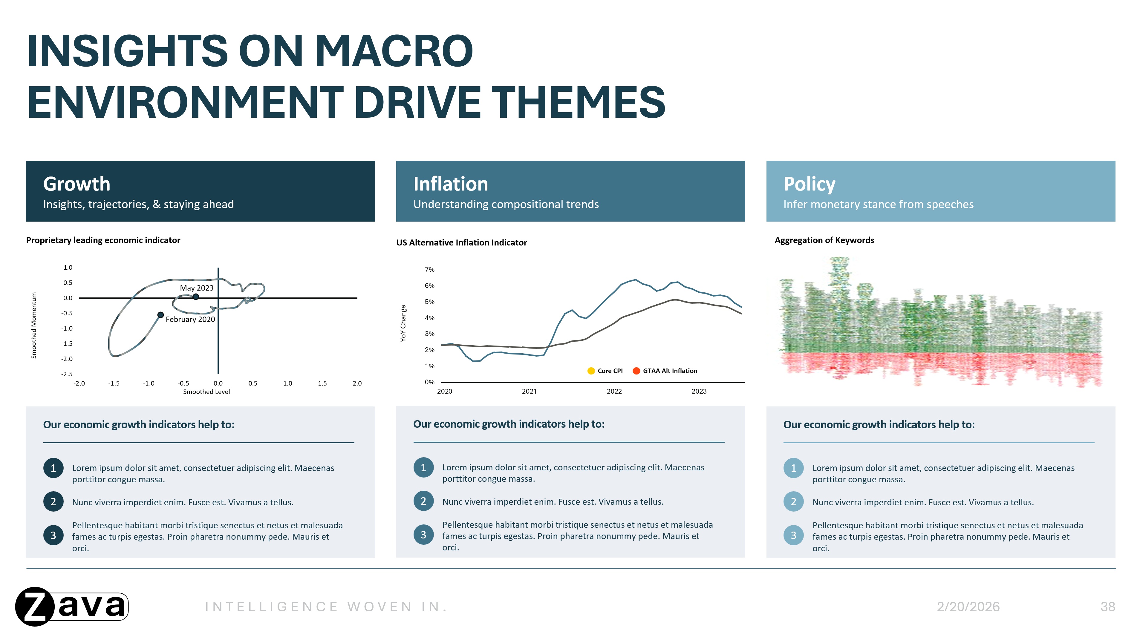
Heavy density: Content rich slides with minimal whitespace, including dense text, multicolumn layouts, and detailed charts or tables
Visual Style
Show how visual elements are consistently applied:
-
Color usage across different slide types
-
Color usage across different elements within graphs, charts, diagrams, etc
-
Typography hierarchy, with examples of headings, subheadings, and body text in use
-
Icon and image incorporation into layouts via placeholders or actual icon placement
-
Multicolor variants of slide types, where appropriate (e.g. various section header slides in different colors)
Photography/Image styles
Include examples that reflect how your brand uses images in the sample slides, including:
-
Preferred composition and layout styles
-
Image usage patterns (e.g. full bleed background images on title slides or inset images on content slides)
Data Visualization
Show how data is presented for your brand:
-
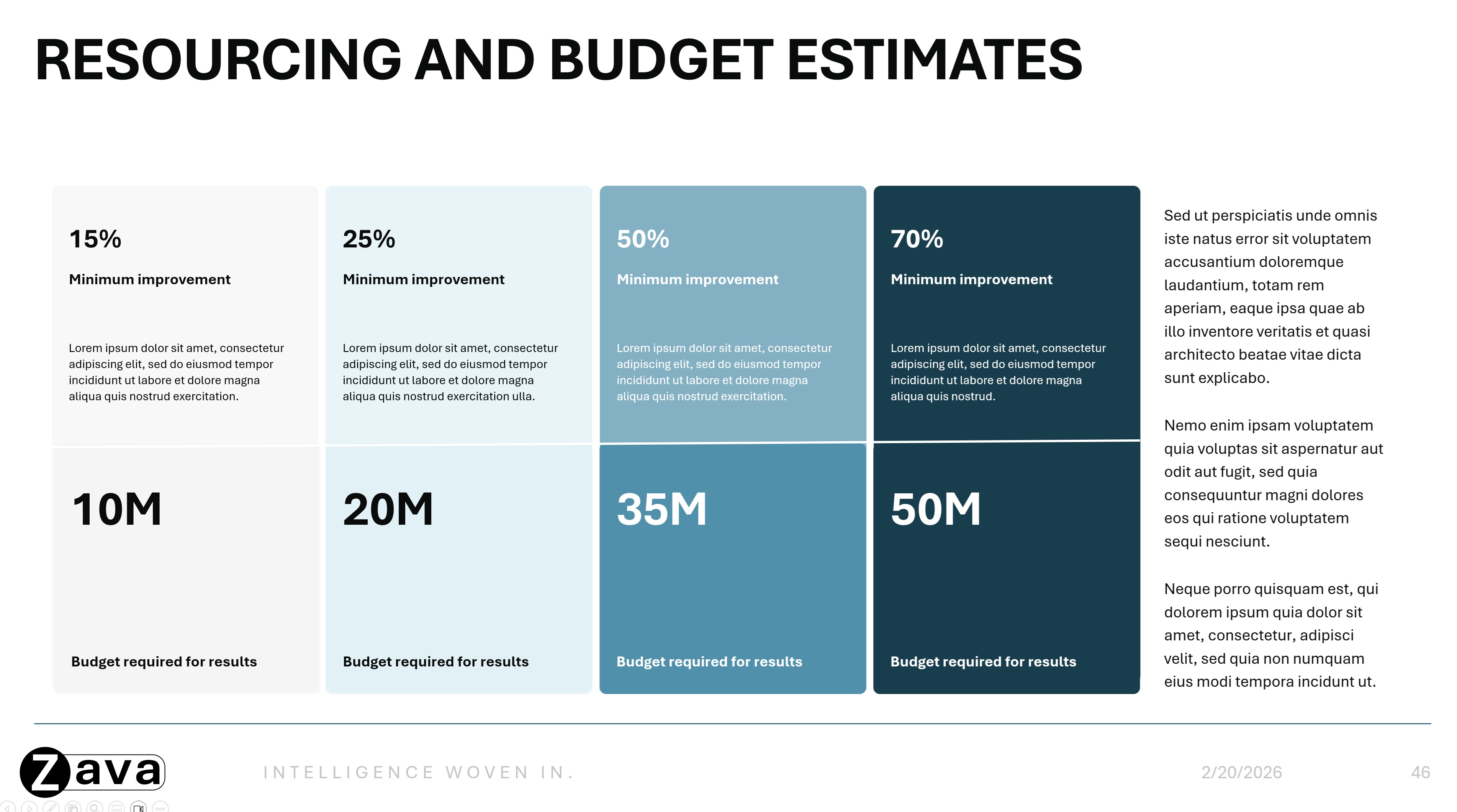
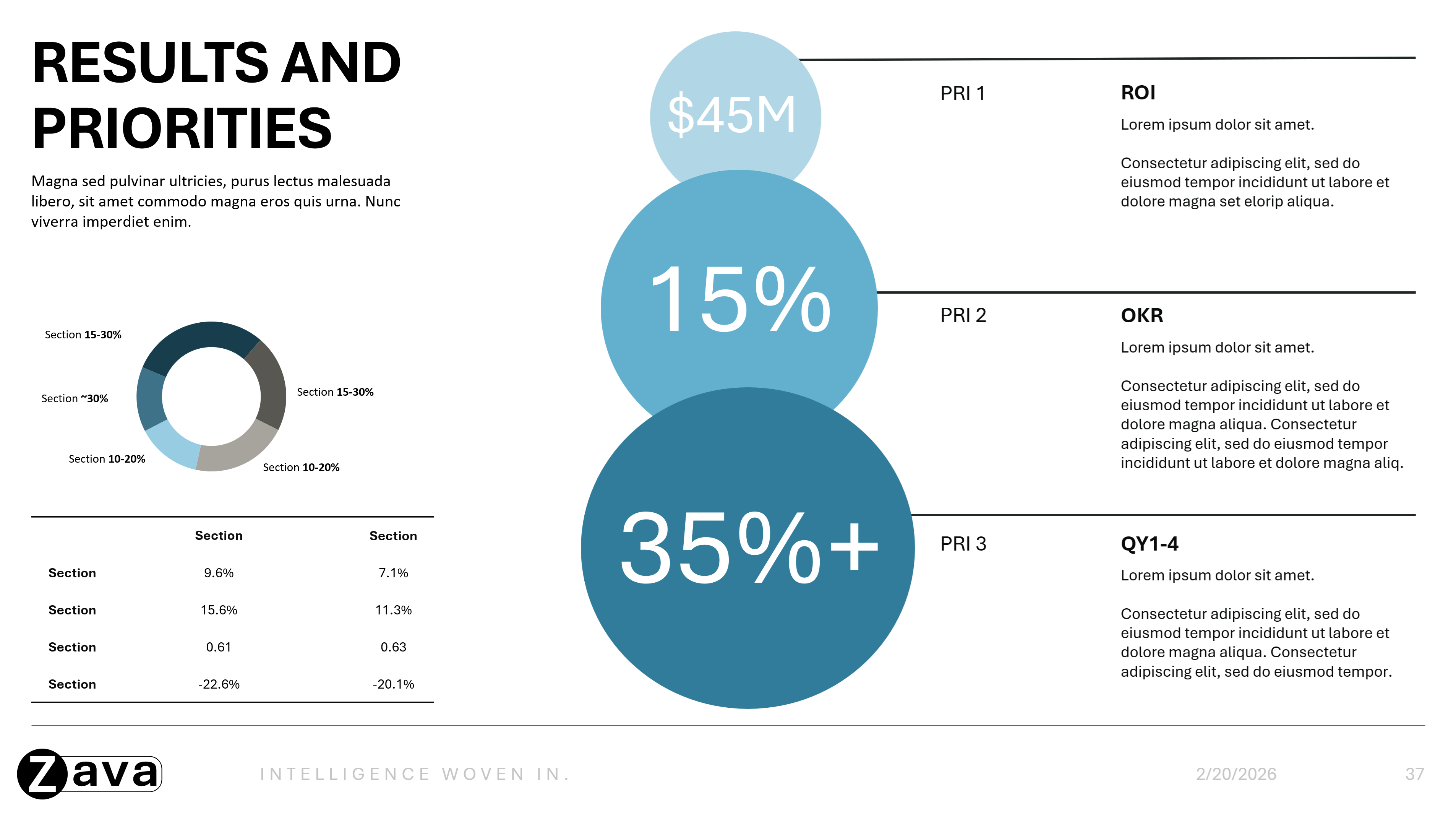
Layouts for highlighted statistics and key takeaways
-
Examples of charts, tables, processes, timelines, diagrams, and infographics as they appear on slides for your brand
Tips for best results
-
Design slide types with a clear, recognizable purpose. When each slide intent is obvious, Copilot can more effectively choose and use the right layout.
-
Create complete, end-to-end slide layouts that demonstrate a single, clear use case. Cohesive sample slides — rather than collections of individual elements like icon libraries or charts libraries — help Copilot better understand how the full slide layout is intended to be used, resulting in more consistent and polished presentations.
-
Keep your template focused on reusable layouts and place any instructional or guidance content outside the template.
-
Ensuring that negative spaces of objects, especially text boxes, do not overlap with other objects – this will help improve how Copilot reads and generates the output.
-
Choose layouts that reflect how you actually work day-to-day.
-
Use images and icons to improve readability and visual flow.
2. Set Up Your Template in Slide Master
Note: With the ability to understand sample slides, Copilot uses Slide Masters only when there are not enough sample slides added.
Customize your template in Slide Master to ensure consistent branding across all AI generated slides.
To learn more about working in Slide Master view, see What is a slide master?
How to access Slide Master:
-
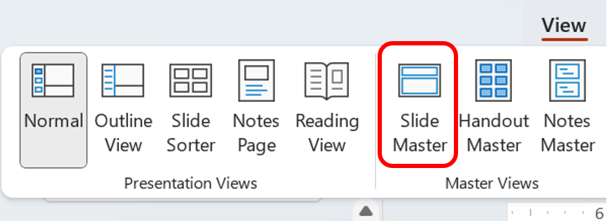
PowerPoint Desktop → View tab → Slide Master (in Master Views section)
Hierarchy:
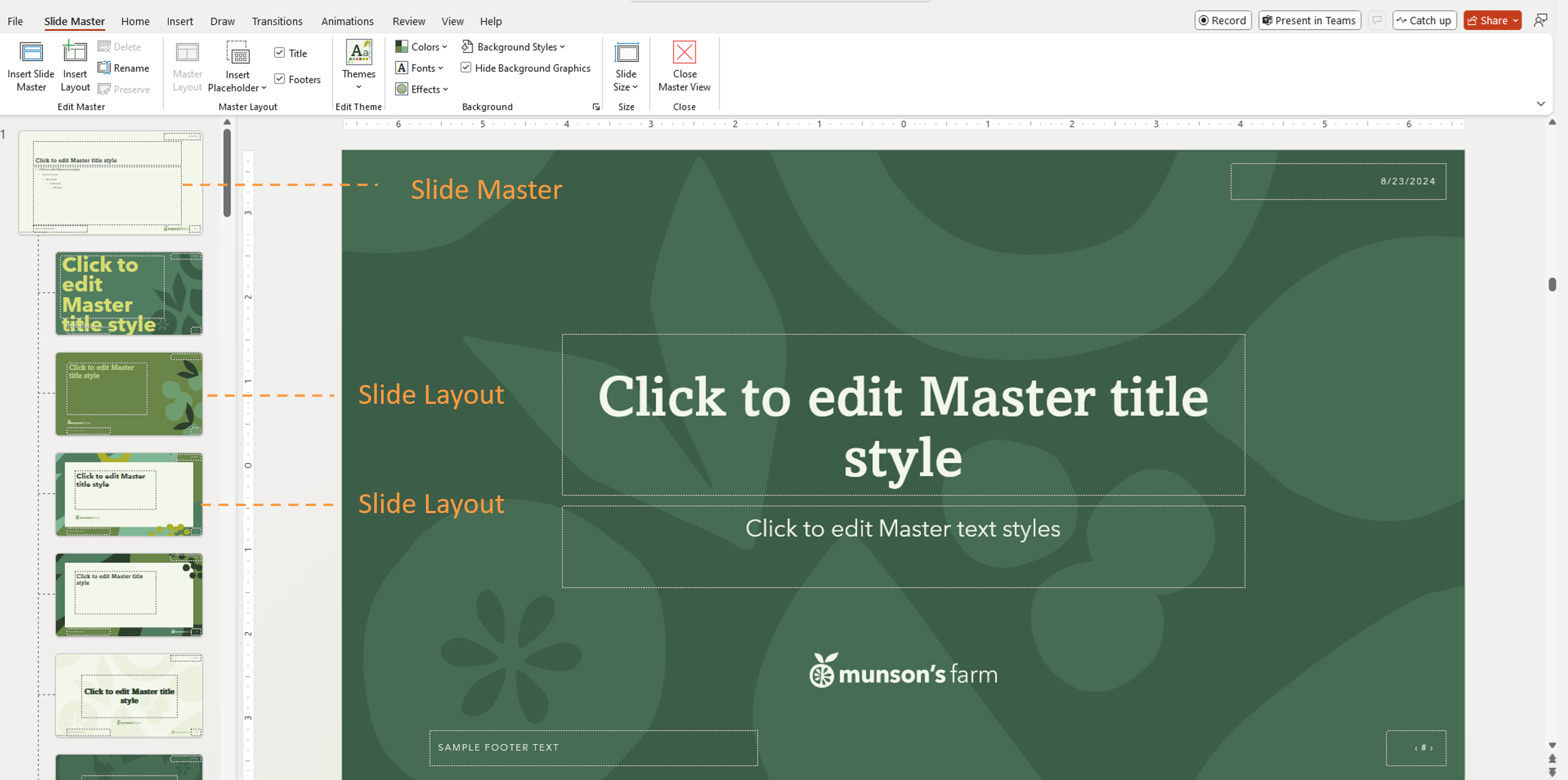
There is a hierarchy of slides. The topmost slide is the Slide Master. Any elements or slide level definitions on the Slide Master will be inherited by the slides below it, known as Slide Layouts.
Important: You can use a PowerPoint template to create a presentation on any platform, but templates must be created in PowerPoint for Windows or Mac (not Web).
3. Use Theme Settings (not manual styling)
Copilot learns from theme definitions, not one-off formatting.
Define Theme Colors
-
Go to Slide Master > Colors > Create New Theme Colors
Set Theme Fonts
-
Define heading and body fonts in the theme
-
Use consistent font sizes and hierarchy
Standardize Visual Styles
Apply consistent styles across all layouts:
-
Color schemes for charts and data visuals
-
Icon styles
-
Shape styles (rounded corners, borders, etc.)
-
Image placeholder styles
4. Use Placeholders Correctly
Placeholders help Copilot understand content structure. Placeholders are defined containers for content such as:
-
Title
-
Body text
-
Image
-
Chart
-
Table
Copilot uses placeholder type, position, and size to determine what content should be generated and where it should appear. Copilot does not rely on placeholder text wording to understand layout intent.
Best practices
-
Use text placeholders instead of text boxes
-
Insert placeholders by going to Slide Master > Insert Placeholder
-
Keep placeholders readable and nonoverlapping with other objects
-
Avoid placing decorative elements on top of text or image areas
5. Upload your templates
Once your template is optimized, upload it to your Brand kit or your Organizational Asset Library (OAL) for Copilot to use. To upload to Brand kit, please below are the steps:
-
Open the Microsoft 365 Copilot app
-
Select Create in the left navigation menu > More… > Brand kits
-
Open your Brand kit
-
Go to Templates
-
Click Upload Template or select an existing template from your Organization Asset Library
-
Select your .potx file or .pptx file
-
Add metatags (optional)
-
Select Add to Brand kit
Frequently Asked Questions
No. Provide representative sample slides across typical and specific slide intents.
Yes. Copilot recognizes picture placeholders and places images in the appropriate position.
No. Placeholder text is used for styling only and is not treated as instructions.
Copilot does not change the font size or placeholder size. It may instead add additional design elements to accommodate the content.
Instructional slides can remain if they follow reusable layouts, but mixing instructions with regular content may lead to unintended output.
What template formats are supported in Brand Kit?
Both .pptx and .potx are supported as template files.
Will Copilot follow the template if I open it first?
Yes.
Learn more
Create a new presentation with Copilot in PowerPoint
Create and manage official Brand kits in the Microsoft 365 Copilot app


