Note: This article pertains only to beta users of this feature. It is not yet available to general users.
The Viva Connections dashboard provides fast and easy access to key employee data and job-related tasks that can be targeted to users across roles, markets, and job functions. A dashboard can be built with no code, or a developer can create custom cards to meet the specific needs of an organization.
Once certain prerequisites are met, you author the dashboard on your home site. You can add it to Teams so that its easily accessible to your users' mobile devices and desktops.
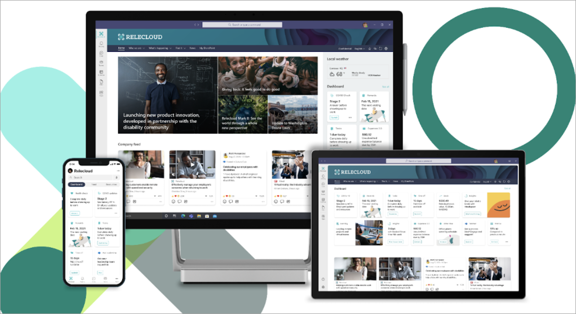
The dashboard is made up of cards that can be linked to SharePoint pages, existing Teams apps, third-party apps, and other custom solutions.
As you are building the dashboard in edit mode, you can see an approximation of how it will look on different devices. If you've audience targeted any of the cards, use preview mode to see how it will look for different audiences. Once you're done, publish the dashboard to make it available for use on your home site, in Teams, and in Teams mobile.
Here's what this article covers:
Create and add cards to a dashboard
Preview to see how your dashboard will display for different audiences
Create a dashboard and add cards to it
Note: To create a dashboard, you'll need edit permissions on the home site where you're creating it.
-
On your home site, select New > Dashboard.
-
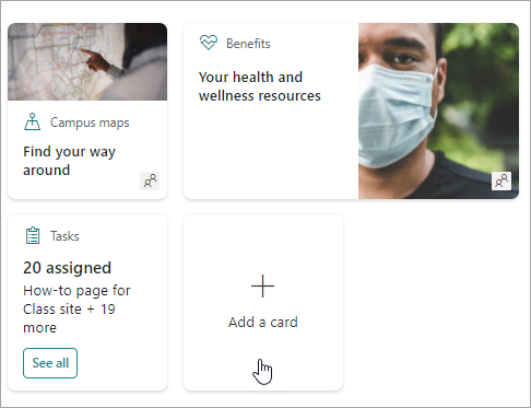
Select +Add a card
-
Select the type of card you want to add from the dashboard cards toolbox.
-
Follow the steps below to set up each type of card.
-
When you're done, publish the dashboard by selecting Publish at the top right of your dashboard to make it available for use on your home site, on Teams, and in Teams mobile.
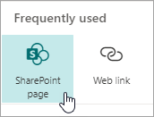
Add a SharePoint page card
Add a page card when you want your users to go to a specific SharePoint page when they select the card.
-
While in edit mode, select + Add a card from the dashboard.
-
Select SharePoint page from the dashboard cards toolbox.
-
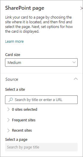
In the property pane on the right, select your options.
-
-
Select a card size.
-
Select the site where your page is located. To do this:
-
In the Source section, you can search for a site by entering a title or partial title. Or, expand the Frequent or Recent items to find your frequently visited sites or sites you've recently viewed.
-
Once your site is selected, search for the page you want to use by entering a title or partial title of the page.
-
-
-
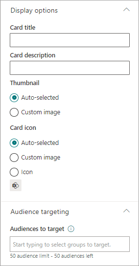
Set the card display options:
-
-
Enter a card title. This won't change your page title; it is the title that will be displayed on the top of the card.
-
Enter a card description. This will show in larger text under the title.
-
-
Under Thumbnail, select one of the following options:
-
Auto-selected: This will automatically display an image at the top of your card that comes from your page.
-
Custom image: When you select this option, you can select the Change button to choose an image you want to use.
-
-
Under Card icon, select the icon to show on the left side of the card title:
-
Auto-selected: This will automatically display a built-in icon associated with the page.
-
Custom image: Select the Change button to choose an image you want to use.
-
Icon: Select the Change button to choose from a set of stock icons.
-
-
If you want to target your card to specific audiences (that is, only audience you specify will see the card in the dashboard, select one or more groups to target. For more information on audience targeting see the Audience targeting section below.
-
When you're done, you can close the property pane by selecting the X at the top right.
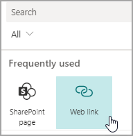
Add a Web link card
Add a web link card when you want your users to go to an internal or external link on a web site.
-
While in edit mode, select + Add a card from the dashboard.
-
Select Web link from the dashboard cards toolbox.
-
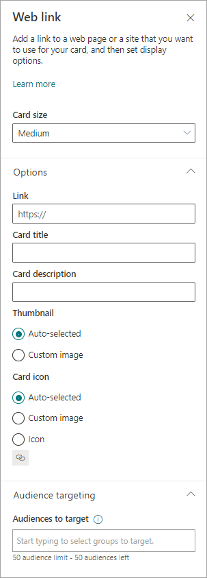
In the property pane on the right, select your options
-
-
Select a card size.
-
Enter the URL for your link. This should start with https://
-
-
Set the card display options:
-
Enter a card title. This won't change your page title; it is the title that will be displayed on the top of the card.
-
Enter a card description. This will show in larger text under the title.
-
-
Under Thumbnail, select one of the following options:
-
Auto-selected: This will automatically display an image at the top of your card that comes from your page.
-
Custom image: When you select this option, you can select the Change button to choose an image you want to use.
-
-
Under Card icon, select the icon to show on the left side of the card title:
-
Auto-selected: This will automatically display a built-in icon associated with the page.
-
Custom image: Select the Change button to choose an image you want to use.
-
Icon: Select the Change button to choose from a set of stock icons.
-
-
If you want to target your card to specific audiences (that is, only audience you specify will see the card in the dashboard, select one or more groups to target. For more information on audience targeting see the Audience targeting section below.
-
When you're done, you can close the property pane by selecting the X at the top right.
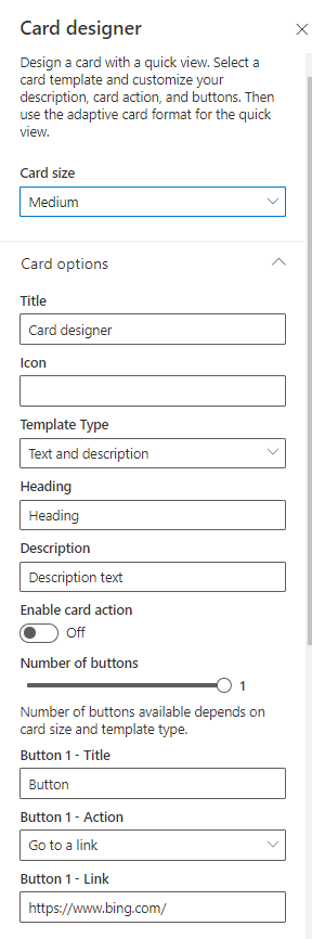
Design your own card with a quick view
You can choose this card to design your own by specifying a title, size, icon, a template, and custom buttons with specific actions like linking to an app or showing a quick view.
Note: If you want to show a quick view of your card, you can use an Adaptive card template and you should be familiar with JSON. See Templating Overview - Adaptive Cards | Microsoft Docs for more information.
You can choose this card to design your own card that includes a quick view. To do this, you should be familiar with JSON and Adaptive Card templates. See Templating Overview - Adaptive Cards | Microsoft Docs for more information.
-
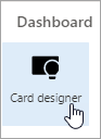
While in edit mode, select + Add a card from the dashboard.
-
Select Card designer.
Set your card options
-
In the property pane, select your card options.
-
Select a Medium or Large card size.
A Medium card will allow you to add one button, while a Large card will allow you to add two buttons. -
Add a title for your card.
-
Add an URL for your icon.
-
Select a Template type:
-
Text will give you the ability to add a heading only.
-
Text and image will give you the ability to add a heading and an image.
-
Text and description will give you the ability to add your own heading and a description, but without an image option.
-
-
Depending on the template type you’ve chosen, add a Heading, Description, and a link to an image. If you don’t have one of these options but want it, choose a different template type.
-
Toggle Enable card action to On if you want the card to either go to a link or show a quick view when the user selects it. The quick view will need to be set up first (see the Add a quick view section below).
-
Choose the number of buttons to show. For a medium card, you can show only 1 button. For a large card you can show 1 or 2 buttons.
-
Add your button title, action, and link.
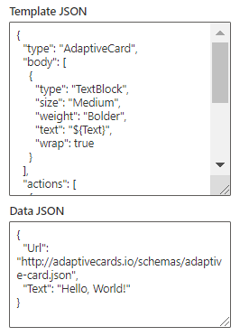
Set up a quick view
Under Quick view layout and data, enter JSON template code for your quick view layout, and then add the code for the data you want to use. For more information on templating and data with some examples, see Templating Overview - Adaptive Cards | Microsoft Docs. You can find more examples at Designer | Adaptive Cards.
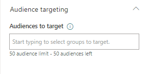
Audience targeting
If you want to target your card to specific audiences (that is, only audience you specify will see the card in the dashboard, select one or more groups to target. For more information on audience targeting see the Audience targeting section below.
Coming soon: Add a Teams app card
A Teams app card allows you to create a card that uses an existing Teams app.
This card is not available for beta.
Audience targeting
By using audience targeting, you can promote cards to specific groups of people. This is useful when you want to present information that is especially relevant to a particular group of people. For example, you can target cards to a specific department.
Set the target audiences for a card
-
If your page is not already in edit mode, select Edit at the top right of the dashboard page.
-
Select the card you want to target to one or more audiences, and select the Edit card pencil from the toolbar on the left.
-
In the property pane on the right, under Audiences to target, type or search for the audience group(s) you want to target.
If you've selected an audience group that you recently created or changed, it may take some time to see targeting applied for that group.
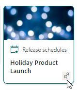
When a card is successfully audience targeted, you’ll see a people icon in the lower left corner of the card.
Preview your dashboard to see how it will display for different audiences
When you've audience-targeted cards, you can see how different audiences will see your dashboard depending on the audience they are part of, and how it will look on mobile, desktop, and tablet.
What you see in preview mode approximates what it will like on a device for audiences you choose (you can choose Desktop, Tablet, or Mobile). The actual view will depend on the device and display of each user.
To preview for different audiences:
-
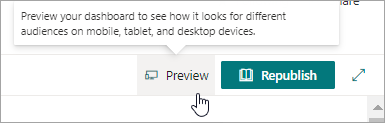
While in edit mode, select Preview on the top right.
-
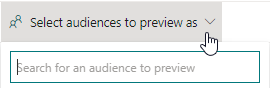
Select the dropdown for Select audiences to preview as. (if no cards are audience targeted, you will see a dimmed Audience targeting label instead).
-
Search for a group, and then select it. Once added, it will be selected by default. You can select the group again in the dropdown to de-select it from displaying.
-
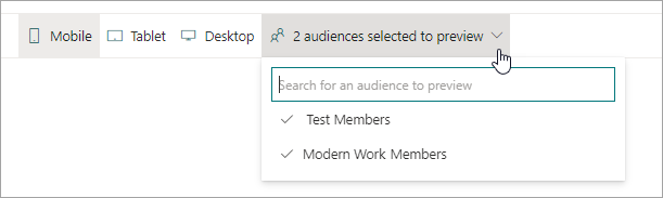
The cards that are targeted for the group you added will display.
-
When one or more audiences are selected, cards that have no audience targeting will also display.
-
If no audiences are selected, only cards that are not audience targeted will display. If no cards are audience targeted, none will display.
-
If you are not part of one of the audiences you've selected, you will only see cards that are .not audience targeted. If none are audience targeted, you won't see any cards.
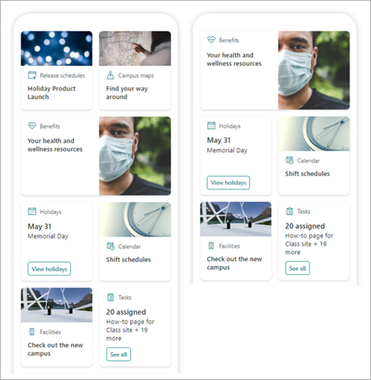
Example
In the following dashboard, the preview is set for Mobile, and the first one shows the top two cards are audience targeted as the part of the group that is selected for preview. In the second preview, the top two cards are not targeted for the chosen audience group.
You can also see how your dashboard will look on Mobile, Table, and Desktop by selecting those options.