A dashboard is a visual representation of key metrics that allows you to quickly view and analyze your data in one place. Dashboards not only provide consolidated data views, but a self-service business intelligence opportunity, where users are able to filter the data to display just what's important to them. In the past, Excel reporting often required you to generate multiple reports for different people or departments depending on their needs.
Overview
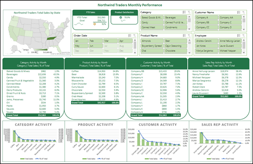
In this topic, we'll discuss how to use multiple PivotTables, PivotCharts, and PivotTable tools to create a dynamic dashboard. Then, we'll give users the ability to quickly filter the data the way they want with Slicers and a Timeline, which allow your PivotTables and charts to automatically expand and contract to display only the information that users want to see. In addition, you can quickly refresh your dashboard when you add or update data. This makes it very handy because you only need to create the dashboard report once.
For this example, we're going to create four PivotTables and charts from a single data source.
Once your dashboard is created, we'll show you how to share it with people by creating a Microsoft Group. We also have an interactive Excel workbook that you can download and follow these steps on your own.
Get your data
-
You can copy and paste data directly into Excel, or you can set up a query from a data source. For this topic, we used the Sales Analysis query from the Northwind Traders template for Microsoft Access. If you want to use it, you can open Access and go to File > New > Search and in Search, enter "Northwind" and create the template database. Once you've done that, you'll be able to access any of the queries included in the template. We've already put this data into the Excel workbook for you, so there's no need to worry if you don't have Access.
-
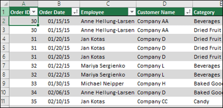
Verify your data is structured properly with no missing rows or columns. Each row should represent an individual record or item. For help with setting up a query or if your data needs to be manipulated, see Get & Transform in Excel.
-
If it's not already, format your data as an Excel Table. When you import from Access, the data will automatically be imported to a table.
Create PivotTables
-
Select any cell within your data range, and go to Insert > PivotTable > New Worksheet. See Create a PivotTable to analyze worksheet data for more details.
-
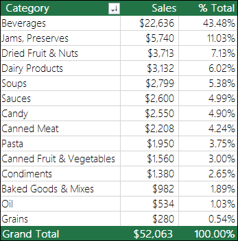
Add the PivotTable fields that you want, then format as desired. This PivotTable will be the basis for others, so you should spend some time making any necessary adjustments to style, report layout and general formatting now, so you don't have to do it multiple times. For more details, see: Design the layout and format of a PivotTable.
In this case, we created a top-level summary of sales by product category, and sorted by the Sales field in descending order.
See Sort data in a PivotTable or PivotChart for more details.
-
Once you've created your master PivotTable, select it, then copy and paste it as many times as necessary to empty areas in the worksheet. For our example, these PivotTables can change rows, but not columns so we placed them on the same row with a blank column in between each one. However, you might find that you need to place your PivotTables beneath each other if they can expand columns.
Important: PivotTables can't overlap one another, so make sure that your design will allow enough space between them to allow for them to expand and contract as values are filtered, added, or removed.
At this point, you might want to give your PivotTables meaningful names, so you know what they do. Otherwise, Excel will name them PivotTable1, PivotTable2, and so on. You can select each one, then go to PivotTable Analyze > PivotTable and then enter a new name in the PivotTable Name box. This will be important when it comes time to connect your PivotTables to Slicers and Timeline controls.
Create PivotCharts
-
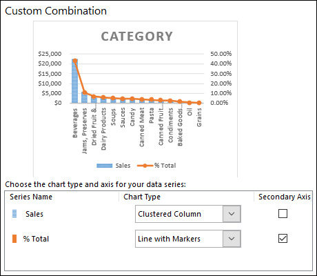
Click anywhere in the first PivotTable and go to PivotTable Analyze > Tools > PivotChart and then select a chart type. We chose a Combo chart with Sales as a Clustered Column chart, and % Total as a Line chart plotted on the Secondary Axis.
-
Select the chart, then size and format as desired from the PivotChart Analyze, Design, and Format tabs. For more details, see our series on Formatting charts.
-
Repeat for each of the remaining PivotTables.
-
Now is a good time to rename your PivotCharts, too. Go to PivotChart Analyze > PivotChart and then enter a new name in the Chart Name box.
Add Slicers and a Timeline
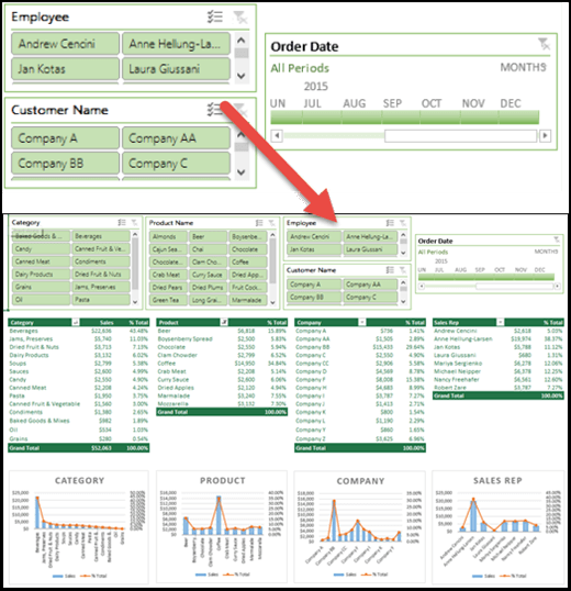
Slicers and Timelines allow you to quickly filter your PivotTables and PivotCharts so you can see just the information that's meaningful to you.
-
Select any PivotTable and go to PivotTable Analyze > Filter > Insert Slicer, then check each item you want to use for a slicer. For this dashboard, we selected Category, Product Name, Employee, and Customer Name. When you click OK, the slicers will be added to the middle of the screen, stacked on top of each other, so you'll need to arrange and resize them as necessary.
-
Slicer Options: If you click on any slicer, you can go to the Slicer tab and select various options, like Style and how many columns are displayed. You can align multiple slicers by selecting them with Ctrl+Left-click, then use the Align tools on the Slicer Tools tab.
-
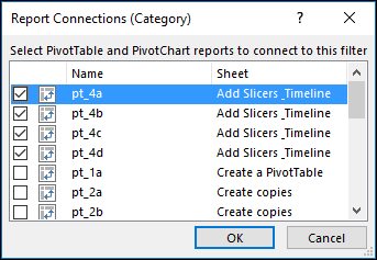
Slicer Connections: Slicers will only be connected to the PivotTable you used to create them, so you need to select each Slicer, and then go to Slicer > Slicer > Report Connections and check which PivotTables you want connected to each. Slicers and Timelines can control PivotTables on any worksheet, even if the worksheet is hidden.
-
Add a Timeline: Select any PivotTable and go to PivotTable Analyze > Filter > Insert Timeline, then check each item you want to use. For this dashboard, we selected Order Date.
-
Timeline Options: Click on the Timeline and go to the Timeline tab and select options like Style, Header, and Caption. Select the Report Connections option to link the timeline to the PivotTables of your choice.
Learn more about Slicers and Timeline controls.
Next steps
Your dashboard is now functionally complete, but you probably still need to arrange it to be the way you want it and make final adjustments. For instance, you might want to add a report title or a background. For our dashboard, we added shapes around the PivotTables and turned off Headings and Gridlines from the View tab.
Make sure to test each of your slicers and timelines to make sure that your PivotTables and PivotCharts behave the way you want them to. You might find situations where certain selections cause issues if one PivotTable wants to adjust and overlap another, which it can't do and will display an error message. These issues should be corrected before you distribute your dashboard.
Once you're done setting up your dashboard, you can click the Share your dashboard tab at the top of this topic to learn how to distribute it.
Congratulations on creating your dashboard! In this step, we'll show you how to set up a Microsoft Group to share your dashboard. What we're going to do is pin your dashboard to the top of your group's document library in SharePoint, so your users can easily access it at any time.
Note: If you don't already have a group set up see Create a group in Outlook
Store your dashboard in the group
If you haven't already saved your dashboard workbook in the group, you'll want to move it there. If it's already in the group's files library, then you can skip this step.
-
Go to your group in either Outlook 2016 or Outlook on the web.
-
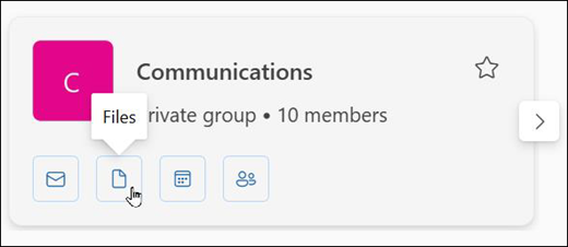
On the group's card, select Files to access the group's document library.
3. Select Files > Upload > Files, then browse and select your dashboard workbook, and then select Open to upload it to the document library.
Add it to your group's SharePoint Online team site
-
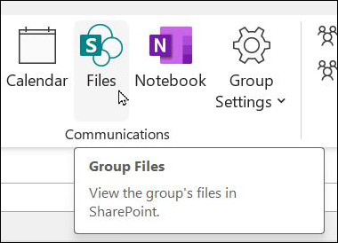
Go to your group's SharePoint Online team site. From Outlook, in the Communications group, select Files.
2. On the navigation pane at the left, select Documents.
3. Find your dashboard workbook and select the selection circle just to the left of its name.
4. When you have the dashboard workbook selected, select Pin to top.
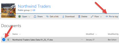
Now, whenever your users come to the Documents page of your SharePoint Online team site, your dashboard worksheet will be right there at the top. They can select it and easily access the current version of the dashboard.
Tip: Your users can also access your group document library, including your dashboard workbook, via the Outlook Groups mobile app.
See also
Got questions we didn't answer here?
Visit the Microsoft Answers Community.

