
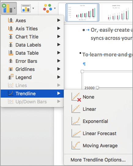
Add a trendline to your chart to show visual data trends.
Add a trendline
Select a chart.
Select the
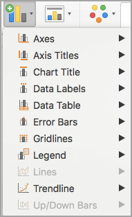
 at the top right of the chart.
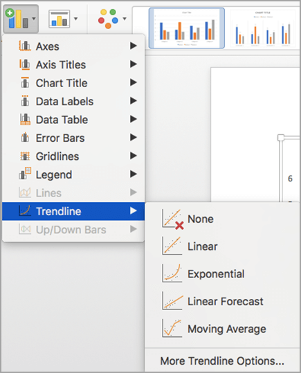
Select Trendline. and choose
Note
Excel displays the Trendline option only if you select a chart that has more than one data series without selecting a data series.
In the Add Trendline dialog box, choose any data series options you want, and select OK.
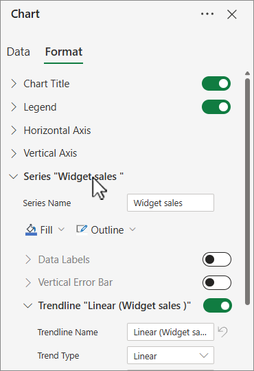
Format a trendline
- Select anywhere in the chart.
- On the Format tab, select the trendline option in the dropdown list in the Current Selection group.
- Select Format Selection.
- In the Format Trendline pane, select a Trendline Option to choose the trendline you want for your chart. Formatting a trendline is a statistical way to measure data:
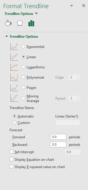
- Set a value in the Forward and Backward fields to project your data into the future.
Add a moving average line
You can format your trendline to a moving average line.
Click anywhere in the chart.
On the Format tab, in the Current Selection group, select the trendline option in the dropdown list.
Click Format Selection.
In the Format Trendline pane, under Trendline Options, select Moving Average. Specify the points if necessary.
Note
The number of points in a moving average trendline equals the total number of points in the series less the number that you specify for the period.
Important
Beginning with Excel version 2005, Excel adjusted the way it calculates the R2 value for linear trendlines on charts where the trendline intercept is set to zero (0). This adjustment corrects calculations that yielded incorrect R2 values and aligns the R2 calculation with the LINEST function. As a result, you may see different R2 values displayed on charts previously created in prior Excel versions. For more information, see Changes to internal calculations of linear trendlines in a chart.
Need more help?
You can always ask an expert in the Excel Tech Community or get support in Communities.