You can change the format of individual chart elements, such as the chart area, plot area, data series, axes, titles, data labels, or legend.
Two sets of tools are available for formatting chart elements: the Format task pane and the Chart Tools Ribbon. For the most control, use the options in the Format task pane.
Format your chart using the Format task pane
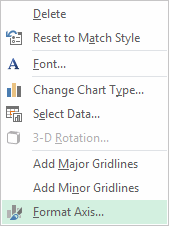
Select the chart element (for example, data series, axes, or titles), right-click it, and click Format <chart element>. The Format pane appears with options that are tailored for the selected chart element.
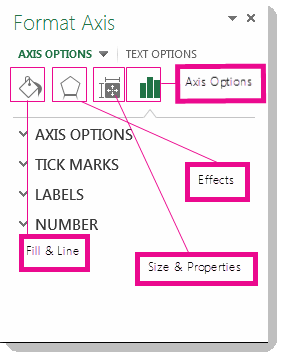
Clicking the small icons at the top of the pane moves you to other parts of the pane with more options. If you click on a different chart element, you’ll see that the task pane automatically updates to the new chart element.
For example, to format an axis:
-
Right-click the chart axis, and click Format Axis.
-
In the Format Axis task pane, make the changes you want.
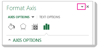
You can move or resize the task pane to make working with it easier. Click the chevron in the upper right.
-
Select Move and then drag the pane to a new location.
-
Select Size and drag the edge of the pane to resize it.
-
Format your chart using the Ribbon
-
In your chart, click to select the chart element that you want to format.
-
On the Format tab under Chart Tools, do one of the following:
-
Click Shape Fill to apply a different fill color, or a gradient, picture, or texture to the chart element.
-
Click Shape Outline to change the color, weight, or style of the chart element.
-
Click Shape Effects to apply special visual effects to the chart element, such as shadows, bevels, or 3-D rotation.
-
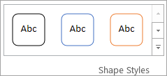
To apply a predefined shape style, on the Format tab, in the Shape Styles group, click the style that you want. To see all available shape styles, click the More button
-
To change the format of chart text, select the text, and then choose an option on the mini toolbar that appears. Or, on the Home tab, in the Font group, select the formatting that you want to use.
-
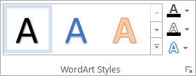
To use WordArt styles to format text, select the text, and then on the Format tab in the WordArt Styles group, choose a WordArt style to apply. To see all available styles, click the More button
-
Need more help?
You can always ask an expert in the Excel Tech Community or get support in Communities.

