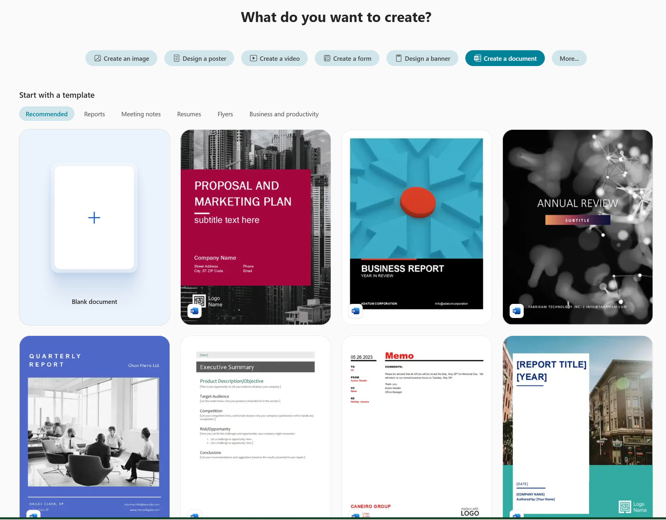
Templates that help you make your content accessible to everyone are now available on create.microsoft.com. You can find them by searching for "accessible templates" or you can use our query: Accessible Office templates.

Alternatively, you can get to them straight from your Office application. Go to File > New and type "accessible templates" in the Search for online templates box.

Get a quick view of several accessible templates in these template samplers.

Make your own templates with the accessibility guides

Want to make your own templates? Several of these templates are not just for you to use, but also guide you through making your own accessible templates. Open the templates to discover tips and how to instructions for making templates for your organization to use.

What makes these templates accessible?

They use the accessibility features provided by Windows and Office and have been improved with the following:

The accessible templates now have an enriched color contrast so the users neither find any dull, hard-to-read text nor miss out on the meaning that specific colors convey. Adequate contrast for the text and background colors makes the text in the documents, slides and spreadsheets really easy-to-read. All styles, cell styles, table borders and data labels in the Office templates pass the color contrast ratio.

Old

Old Personal budget Excel template with colors that are low contrast (blue and light blue on a gray background).

New

New Personal budget Excel template with high contrast colors (dark blue and orange on a white background).

You can see noticeable changes in the new version of the Personal budget Excel template. Unlike the old version, the accessible template uses colors in the high contrast mode.

The accessible templates include alt text for tables, pictures, charts and other visual objects in the Office templates for the convenience of users.

Alt text comprises words that best describe the picture, graphic, or background used in the templates. When a screen reader reads out the alt text of an image, users can easily understand what the image is all about. Redundant words like “an image of”, “Design of”, or “It is a graphic of” have been removed to retain focus only on what is relevant.

Old

Old glacial lake image with Format Picture dialog box showing no Alt text in the Description box.

New

New Alt Text dialog box showing autogenerated alt text in Word

For example, there was no alt text for the main image in the old version of the Student report with cover photo Word template. In the accessible version, the alt text "Bright blue glacial lake surrounded by white ice on a dark mountain" provides a clear description of the image to users with visual impairments using screen readers.

To learn how to write meaningful alt text or automatically generate alt text, see Everything you need to know to write effective alt text.

A screen reader loses cell count if a table is nested, or a cell is merged or split. For example, a heavily formatted table is often part of a form, which cannot easily be read by the screen reader due to navigational problems. Our templates now include simple table structures with clear headings, and no blank cells. The screen reader uses the header information to identify rows and columns, and provides a meaningful information to the user.

Old

Old To do list Word template with blank cells in rows and columns.

New

New To do list Word template with row and column header information in the cells.

In the old version of the To do list Word template, there was no information about rows and columns. The accessible template includes a simple table structure, and clearly specifies row and column header information.

The font size is set to 11 points and above in our enhanced templates. Using larger fonts, we aim to reduce the reading load for our partially sighted users. This font size has been fixed for writing the text as well as HTML addresses in the Accessible Templates.

Old

Old Project task list template with a minimum font of 8.5 points.

New

New Project task list template with a minimum font of 11  points.

In the previous version of the Project task list Word template, the minimum font size was 8.5 points. In the new version, we set the font size to 11 points and above making it easy to read for our partially sighted users.

The accessible Excel templates now include input messages, which are read out by the screen readers to help users understand how a workbook can be used. These input messages assist the users in entering inputs in a spreadsheet. Separate input messages have been provided for all worksheets and editable cells.

Old

Old College Course Manager Excel template without descriptions for elements.

New

New College Course Manager Excel template with descriptions for elements.

There was no description for the workbook in the old version of the College Course Manager Excel template. In the accessible version, you can find description for the workbook in the A1 cell. In the accessible template, for Start Time, the screen reader now reads the input message to the user, who can then enter the start time for the schedule table.

  • PowerPoint slides with better reading order:    In the accessible PowerPoint templates, we have improved the reading order for slide content by making it logical for user actions. Moreover, each slide in the accessible template contains a unique title wherein a user can enter the title of his choice. For example, the reading order was Title, Content, and Picture which has been changed to Title, Picture, and Content. Earlier, the title in a slide said "Click to add title" and now it says, “Add a Slide Title – 1.”

  • Hyperlink information:    People who use screen readers sometimes scan a list of links. The accessible templates include appropriate description about the hyperlinks. For example, a hyperlink that says "click here" is not helpful to a user who cannot see the link. Consequently, we use full title of the destination page, for example, Visit Microsoft OneNote - Official Site, which comes with screen tips.

  • Headings in logical order:    Our users need headings ordered logically. The accessible templates provide headings in a rational order, such as Heading 1, Heading 2, and then Heading 3, instead of presenting these in a random way. Ideally, the headings should be short, clear, and concise.

  • Content controls with titles and tags:    Our latest Word templates use Rich Text Content Controls with values in both Titles and Tags for the screen readers to read out the editable text. This way, users can easily enter the text of a heading in an area identified for it.

  • Evergreen date:    There is no relevance of information that is too old to be used. That’s why we introduced the evergreen date. Now, whenever the users open an accessible spreadsheet, they hear the current date (Today), instead of the date when the template was created.

See also

Make your content accessible to everyone with the Accessibility Checker

Improve accessibility with the Accessibility Checker

Make your Word documents accessible to people with disabilities

Make your Excel documents accessible to people with disabilities

Make your PowerPoint presentations accessible to people with disabilities

Need more help?

Want more options?

Explore subscription benefits, browse training courses, learn how to secure your device, and more.

Communities help you ask and answer questions, give feedback, and hear from experts with rich knowledge.