Abstract: This is the second tutorial in a series. In the first tutorial, Import Data into and Create a Data Model, an Excel workbook was created using data imported from multiple sources.
Note: This article describes data models in Excel 2013. However, the same data modeling and Power Pivot features introduced in Excel 2013 also apply to Excel 2016.
In this tutorial, you use Power Pivot to extend the Data Model, create hierarchies, and build calculated fields from existing data to create new relationships between tables.
The sections in this tutorial are the following:
At the end of this tutorial is a quiz you can take to test your learning.
This series uses data describing Olympic Medals, hosting countries, and various Olympic sporting events. The tutorials in this series are the following:
-
Extend Data Model relationships using Excel, Power Pivot , and DAX
-
Incorporate Internet Data, and Set Power View Report Defaults
We suggest you go through them in order.
These tutorials use Excel 2013 with Power Pivot enabled. For more information on Excel 2013, click here. For guidance on enabling Power Pivot, click here.
Add a relationship using Diagram View in Power Pivot
In this section, you use the Microsoft Office Power Pivot in Excel 2013 add-in to extend the model. Using Diagram View in Microsoft SQL Server Power Pivot for Excel makes creating relationships easy. First, you need to make sure you have the Power Pivot add-in enabled.
Note: The Power Pivot in Microsoft Excel 2013 add-in is part of Office Professional Plus. See Start Power Pivot in Microsoft Excel 2013 add-in for more information.
Add Power Pivot to the Excel ribbon by enabling the Power Pivot add-in
When Power Pivot is enabled, you see a ribbon tab in Excel 2013 called POWER PIVOT. To enable Power Pivot, follow these steps.
-
Go to FILE > Options > Add-Ins.
-
In the Manage box near the bottom, click COM Add-ins> Go.
-
Check the Microsoft Office Power Pivot in Microsoft Excel 2013 box, and then click OK.
The Excel ribbon now has a POWER PIVOT tab.

Add a relationship using Diagram View in Power Pivot
The Excel workbook includes a table called Hosts. We imported Hosts by copying it and pasting it into Excel, then formatted the data as a table. To add the Hosts table to the Data Model, we need to establish a relationship. Let’s use Power Pivot to visually represent the relationships in the Data Model, and then create the relationship.
-
In Excel, click the Hosts tab to make it the active sheet.
-
On the ribbon, select POWER PIVOT > Tables > Add to Data Model. This step adds the Hosts table to the Data Model. It also opens the Power Pivot add-in, which you use to perform the remaining steps in this task.
-
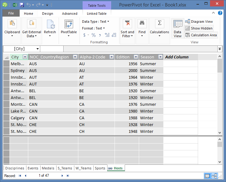
Notice that the Power Pivot window shows all the tables in the model, including Hosts. Click through a couple of tables. In Power Pivot you can view all of the data that your model contains, even if they aren’t displayed in any worksheets in Excel, such as the Disciplines, Events, and Medals data below, as well as S_Teams,W_Teams, and Sports.
-
In the Power Pivot window, in the View section, click Diagram View.
-
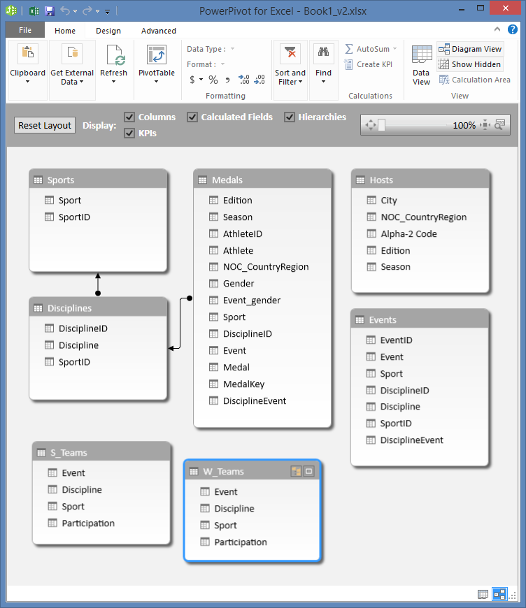
Use the slide bar to resize the diagram so that you can see all objects in the diagram. Rearrange the tables by dragging their title bar, so they’re visible and positioned next to one another. Notice that four tables are unrelated to the rest of the tables: Hosts, Events, W_Teams, and S_Teams.
-
You notice that both the Medals table and the Events table have a field called DisciplineEvent. Upon further inspection, you determine that the DisciplineEvent field in the Events table consists of unique, non-repeated values.
Note: The DisciplineEvent field represents a unique combination of each Discipline and Event. In the Medals table, however, the DisciplineEvent field repeats many times. That makes sense, because each Discipline+Event combination results in three awarded medals (gold, silver, bronze), which are awarded for each Olympics Edition the Event is held. So the relationship between those tables is one (one unique Discipline+Event entry in the Disciplines table) to many (multiple entries for each Discipline+Event value).
-
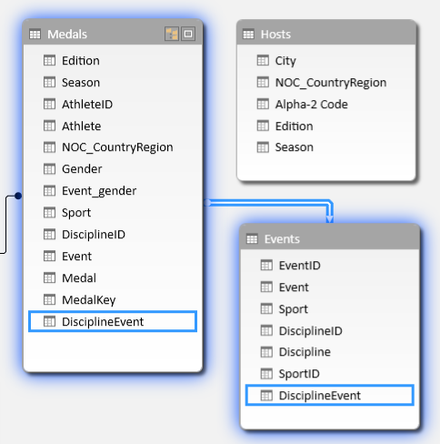
Create a relationship between the Medals table and the Events table. While in Diagram View, drag the DisciplineEvent field from the Events table to the DisciplineEvent field in Medals. A line appears between them, indicating a relationship has been established.
-
Click the line that connects Events and Medals. The highlighted fields define the relationship, as shown in the following screen.
-
To connect Hosts to the Data Model, we need a field with values that uniquely identify each row in the Hosts table. Then we can search our Data Model to see if that same data exists in another table. Looking in Diagram View doesn’t allow us to do this. With Hosts selected, switch back to Data View.
-
After examining the columns, we realize that Hosts doesn’t have a column of unique values. We’ll have to create it using a calculated column, and Data Analysis Expressions (DAX).
It’s nice when the data in your Data Model has all the fields necessary to create relationships, and mash up data to visualize in Power View or PivotTables. But tables aren’t always so cooperative, so the next section describes how to create a new column, using DAX, that can be used to create a relationship between tables.
Extend the Data Model using calculated columns
To establish a relationship between the Hosts table and the Data Model, and thereby extend our Data Model to include the Hosts table, Hosts must have a field that uniquely identifies each row. In addition, that field must correspond to a field in the Data Model. Those corresponding fields, one in each table, are what enables the tables’ data to be associated.
Since the Hosts table doesn’t have such a field, you need to create it. To preserve the integrity of the Data Model, you can’t use Power Pivot to edit or delete existing data. You can, however, create new columns by using calculated fields based on the existing data.
By looking through the Hosts table, then looking at other Data Model tables, we find a good candidate for a unique field we could create in Hosts, and then associate with a table in the Data Model. Both tables will require a new, calculated column in order to meet the requirements necessary to establish a relationship.
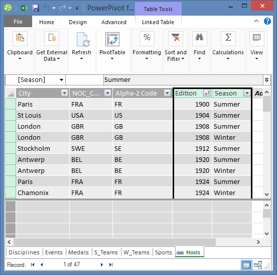
In Hosts, we can create a unique calculated column by combining the Edition field (the year of the Olympics event) and the Season field (Summer or Winter). In the Medals table there is also an Edition field and a Season field, so if we create a calculated column in each of those tables that combines the Edition and Season fields, we can establish a relationship between Hosts and Medals. The following screen shows the Hosts table, with its Edition and Season fields selected
Create calculated columns using DAX
Let’s start with the Hosts table. The goal is to create a calculated column in the Hosts table, and then in the Medals table, which can be used to establish a relationship between them.
In Power Pivot, you can use Data Analysis Expressions (DAX) to create calculations. DAX is a formula language for Power Pivot and PivotTables, designed for the relational data and contextual analysis available in Power Pivot. You can create DAX formulas in a new Power Pivot column, and in the Calculation Area in Power Pivot.
-
In Power Pivot, select HOME > View > Data View to make sure Data View is selected, rather than being in Diagram View.
-
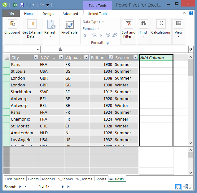
Select the Hosts table in Power Pivot. Adjacent to the existing columns is an empty column titled Add Column. Power Pivot provides that column as a placeholder. There are many ways to add a new column to a table in Power Pivot, one of which is to simply select the empty column that has the title Add Column.
-
In the formula bar, type the following DAX formula. The CONCATENATE function combines two or more fields into one. As you type, AutoComplete helps you type the fully qualified names of columns and tables, and lists the functions that are available. Use tab to select AutoComplete suggestions. You can also just click the column while typing your formula, and Power Pivot inserts the column name into your formula.
=CONCATENATE([Edition],[Season]) -
When you finish building the formula, press Enter to accept it.
-
Values are populated for all the rows in the calculated column. If you scroll down through the table, you see that each row is unique – so we’ve successfully created a field that uniquely identifies each row in the Hosts table. Such fields are called a primary key.
-
Let’s rename the calculated column to EditionID. You can rename any column by double-clicking it, or by right-clicking the column and choosing Rename Column. When completed, the Hosts table in Power Pivot looks like the following screen.

The Hosts table is ready. Next let’s create a calculated column in Medals that matches the format of the EditionID column we created in Hosts, so we can create a relationship between them.
-
Start by creating a new column in the Medals table, like we did for Hosts. In Power Pivot select the Medals table, and click Design > Columns > Add. Notice that Add Column is selected. This has the same effect as simply selecting Add Column.
-
The Edition column in Medals has a different format than the Edition column in Hosts. Before we combine, or concatenate, the Edition column with the Season column to create the EditionID column, we need to create an intermediary field that gets Edition into the right format. In the formula bar above the table, type the following DAX formula.
= YEAR([Edition])
-
When you finish building the formula, press Enter. Values are populated for all the rows in the calculated column, based on the formula you entered. If you compare this column to the Edition column in Hosts, you’ll see that these columns have the same format.
-
Rename the column by right-clicking CalculatedColumn1 and selecting Rename Column. Type Year, and then press Enter.
-
When you created a new column, Power Pivot added another placeholder column called Add Column. Next we want to create the EditionID calculated column, so select Add Column. In the formula bar, type the following DAX formula and press Enter.
=CONCATENATE([Year],[Season]) -
Rename the column by double-clicking CalculatedColumn1 and typing EditionID.
-
Sort the column in ascending order. The Medals table in Power Pivot now looks like the following screen.
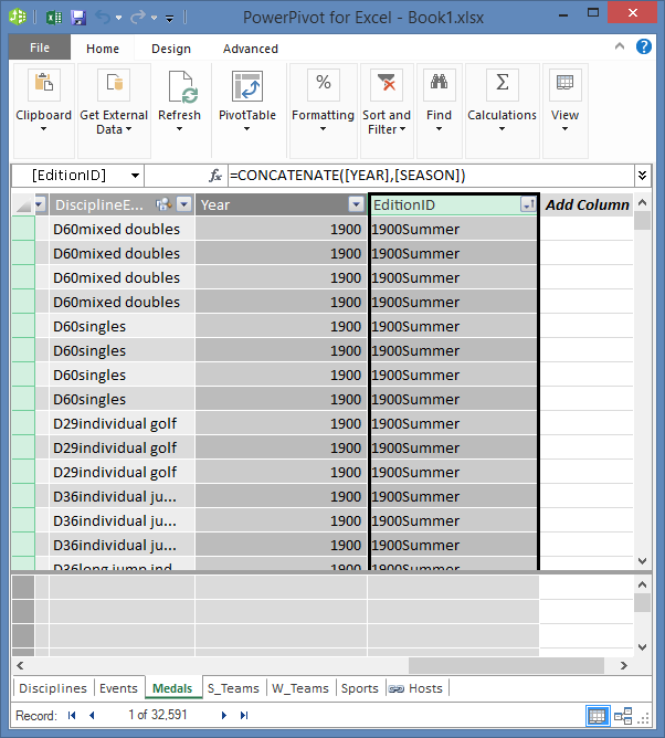
Notice many values are repeated in the Medals table EditionID field. That’s okay and expected, since during each edition of the Olympics (now represented by the EditionID value) many medals were awarded. What is unique in the Medals table is each awarded medal. The unique identifier for each record in the Medals table, and its designated primary key, is the MedalKey field.
The next step is to create a relationship between Hosts and Medals.
Create a relationship using calculated columns
Next let’s use the calculated columns we created to establish a relationship between Hosts and Medals.
-
In the Power Pivot window, select Home > View > Diagram View from the ribbon. You can also switch between Grid view and Diagram view using the buttons at the bottom of the PowerView window, as shown in the following screen.

-
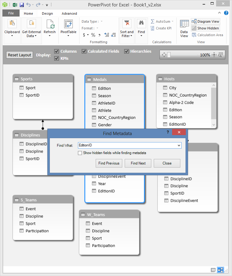
Expand Hosts so you can view all of its fields. We created the EditionID column to act as the Hosts table primary key (unique, non-repeated field), and created an EditionID column in the Medals table to enable establishment of a relationship between them. We need to find them both, and create a relationship. Power Pivot provides a Find feature on the ribbon, so you can search your Data Model for corresponding fields. The following screen shows the Find Metadata window, with EditionID entered in the Find What field.
-
Position the Hosts table so that it is next to Medals.
-
Drag the EditionID column in Medals to the EditionID column in Hosts. Power Pivot creates a relationship between the tables based on the EditionID column, and draws a line between the two columns, indicating the relationship.
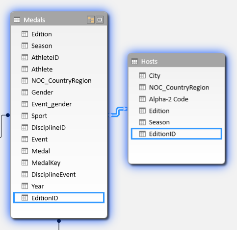
In this section, you learned a new technique for adding new columns, created a calculated column using DAX, and used that column to establish a new relationship between tables. The Hosts table is now integrated into the Data Model, and its data is available to the PivotTable in Sheet1. You can also use the associated data to create additional PivotTables, PivotCharts, Power View reports, and much more.
Create a hierarchy
Most Data Models include data that is inherently hierarchical. Common examples include calendar data, geographical data, and product categories. Creating hierarchies within Power Pivot is useful because you can drag one item to a report – the hierarchy – instead of having to assemble and order the same fields over and over.
The Olympics data is also hierarchical. It’s helpful to understand the Olympics hierarchy, in terms of sports, disciplines, and events. For each sport, there is one or more associated disciplines (sometimes there are many). And for each discipline, there is one or more events (again, sometimes there are many events in each discipline). The following image illustrates the hierarchy.
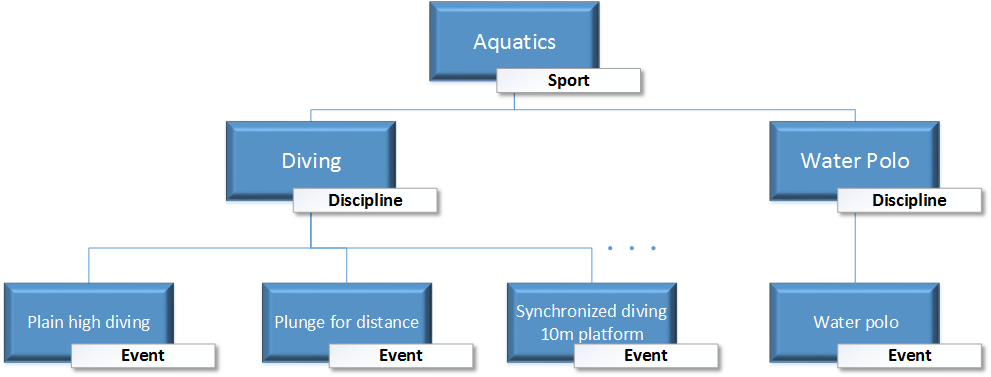
In this section you create two hierarchies within the Olympic data you’ve been using in this tutorial. You then use these hierarchies to see how hierarchies make organizing data easy in PivotTables and, in a subsequent tutorial, in Power View.
Create a Sport hierarchy
-
In Power Pivot, switch to Diagram View. Expand the Events table so that you can more easily see all of its fields.
-
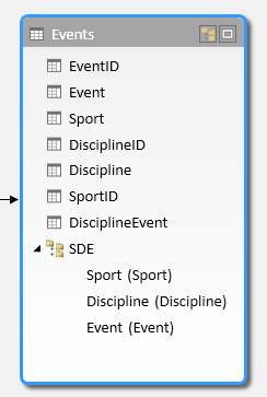
Press and hold Ctrl, and click the Sport, Discipline, and Event fields. With those three fields selected, right-click and select Create Hierarchy. A parent hierarchy node, Hierarchy 1, is created at the bottom of the table, and the selected columns are copied under the hierarchy as child nodes. Verify that Sport appears first in the hierarchy, then Discipline, then Event.
-
Double-click the title, Hierarchy1, and type SDE to rename your new hierarchy. You now have a hierarchy that includes Sport, Discipline and Event. Your Events table now looks like the following screen.
Create a Location hierarchy
-
Still in Diagram View in Power Pivot, select the Hosts table and click the Create Hierarchy button in the table header, as shown in the following screen.
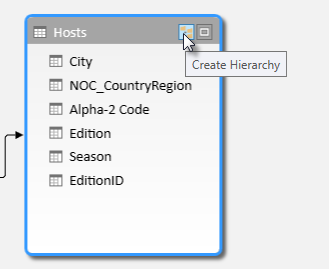
An empty hierarchy parent node appears at the bottom of the table. -
Type Locations as the name for your new hierarchy.
-
There are many ways to add columns to a hierarchy. Drag the Season, City and NOC_CountryRegion fields onto the hierarchy name (in this case, Locations) until the hierarchy name is highlighted, then release to add them.
-
Right-click EditionID and select Add to Hierarchy. Choose Locations.
-
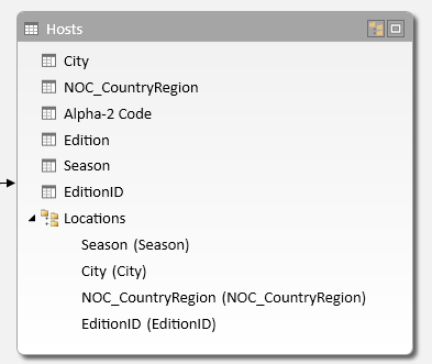
Ensure that your hierarchy child nodes are in order. From top to bottom, the order should be: Season, NOC, City, EditionID. If your child nodes are out of order, simply drag them into the appropriate ordering in the hierarchy. Your table should look like the following screen.
Your Data Model now has hierarchies that can be put to good use in reports. In the next section, you learn how these hierarchies can make your report creation faster, and more consistent.
Use hierarchies in PivotTables
Now that we have a Sports hierarchy and Locations hierarchy, we can add them to PivotTables or Power View, and quickly get results that include useful groupings of data. Prior to creating hierarchies, you had to add individual fields to the PivotTable, and arrange those fields how you wanted them to be viewed.
In this section you use the hierarchies created in the previous section to quickly refine your PivotTable. Then, you create the same PivotTable view using the individual fields in the hierarchy, just so you can compare using hierarchies to using individual fields.
-
Go back to Excel.
-
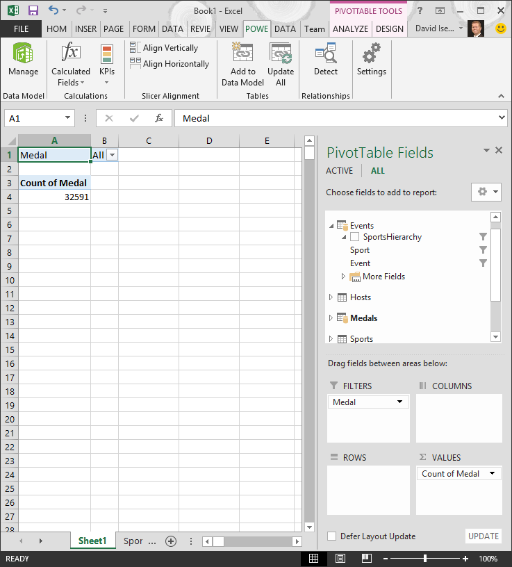
In Sheet1, remove the fields from the ROWS area of PivotTable Fields, then remove all the fields from the COLUMNS area. Make sure the PivotTable is selected (which is now quite small, so you can choose cell A1 to make sure your PivotTable is selected). The only remaining fields in the PivotTable fields are Medal in the FILTERS area, and Count of Medal in the VALUES area. Your nearly empty PivotTable should look like the following screen.
-
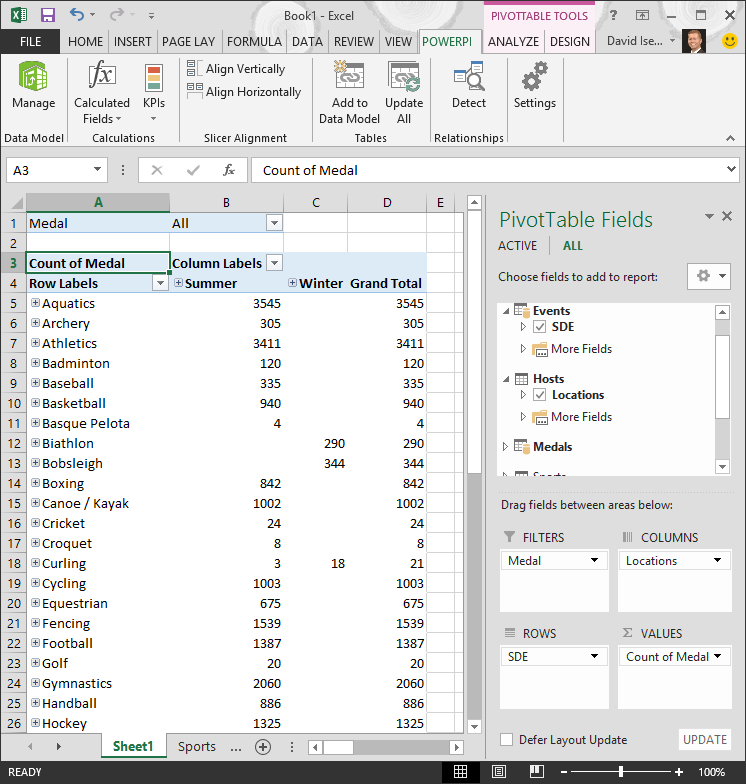
From the PivotTable Fields area, drag SDE from the Events table to the ROWS area. Then drag Locations from the Hosts table into the COLUMNS area. Just by dragging those two hierarchies, your PivotTable is populated with a lot of data, all of which is arranged in the hierarchy you defined in the previous steps. Your screen should look like the following screen.
-
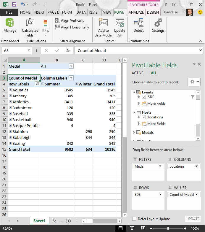
Let’s filter that data a bit, and just see the first ten rows of events. In the PivotTable, click the arrow in Row Labels, click (Select All) to remove all selections, then click the boxes beside the first ten Sports. Your PivotTable now looks like the following screen.
-
You can expand any of those Sports in the PivotTable, which is the top level of the SDE hierarchy, and see information in the next level down in the hierarchy (discipline). If a lower level in the hierarchy exists for that discipline, you can expand the discipline to see its events. You can do the same for the Location hierarchy, the top level of which is Season, which shows up as Summer and Winter in the PivotTable. When we expand the Aquatics sport, we see all of its child discipline elements and their data. When we expand the Diving discipline under Aquatics, we see its child events too, as shown in the following screen. We can do the same for Water Polo, and see that it has only one event.
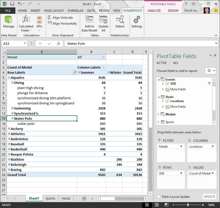
By dragging those two hierarchies, you quickly created a PivotTable with interesting and structured data that you can drill into, filter, and arrange.
Now let’s create the same PivotTable, without the benefit of hierarchies.
-
In the PivotTable Fields area, remove Locations from the COLUMNS area. Then remove SDE from the ROWS area. You’re back to a basic PivotTable.
-
From the Hosts table, drag Season, City, NOC_CountryRegion, and EditionID into the COLUMNS area, and arrange them in that order, from top to bottom.
-
From the Events table, drag Sport, Discipline, and Event into the ROWS area, and arrange them in that order, from top to bottom.
-
In the PivotTable, filter Row Labels to the top ten Sports.
-
Collapse all the rows and columns, then expand Aquatics, then Diving and Water Polo . Your workbook looks like the following screen.
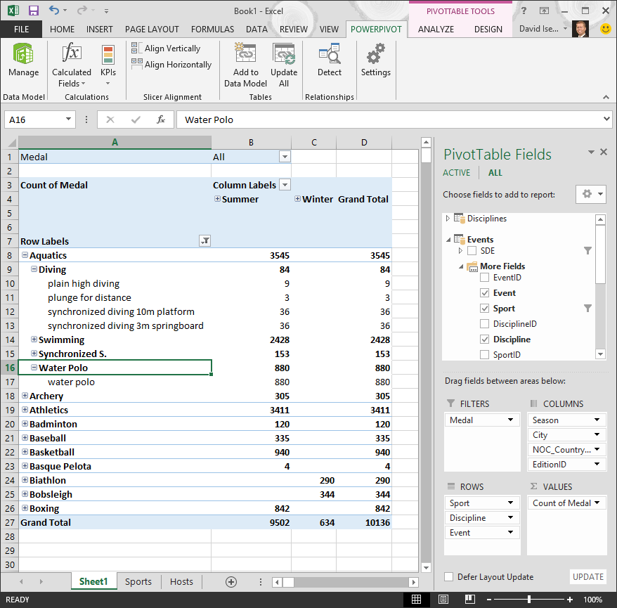
The screen looks similar, except that you dragged seven individual fields into the PivotTable Fields areas, instead of simply dragging two hierarchies. If you’re the only person creating PivotTables or Power View reports based on this data, creating hierarchies might only seem convenient. But when many people are creating reports, and must figure out the proper ordering of fields to get the views correct, hierarchies quickly become a productivity enhancement, and enable consistency.
In another tutorial, you learn how to use hierarchies and other fields in visually engaging reports created using Power View.
Checkpoint and Quiz
Review what you learned
Your Excel workbook now has a Data Model that includes data from multiple sources, related using existing fields and calculated columns. You also have hierarchies that reflect the structure of data within your tables, which make creating compelling reports quick, consistent, and easy.
You learned that creating hierarchies lets you specify the inherent structure within your data, and quickly use hierarchical data in your reports.
In the next tutorial in this series, you create visually compelling reports about Olympic medals using Power View. You also do more calculations, optimize data for fast report creation, and import additional data to make those reports even more interesting. Here’s a link:
Tutorial 3: Create Map-based Power View Reports
QUIZ
Want to see how well you remember what you learned? Here’s your chance. The following quiz highlights features, capabilities, or requirements you learned about in this tutorial. At the bottom of the page, you’ll find the answers. Good luck!
Question 1: Which of the following views let you create relationships between two tables?
A: You create relationships between tables in Power View.
B: You create relationships between tables using Design View in Power Pivot.
C: You create relationships between tables using Grid View in Power Pivot
D: All of the above
Question 2: TRUE or FALSE: You can establish relationships between tables based on a unique identifier that is created by using DAX formulas.
A: TRUE
B: FALSE
Question 3: In which of the following can you create a DAX formula?
A: In the Calculation Area of Power Pivot.
B: In a new column in Power Pivotf.
C: In any cell in Excel 2013.
D: Both A and B.
Question 4: Which of the following is true about hierarchies?
A: When you create a hierarchy, the included fields are no longer available individually.
B: When you create a hierarchy, the included fields including their hierarchy can be used in client tools by simply dragging the hierarchy to a Power View or PivotTable area.
C: When you create a hierarchy, the underlying data in the Data Model is combined into one field.
D: You cannot create hierarchies in Power Pivot.
Quiz answers
-
Correct answer: D
-
Correct answer: A
-
Correct answer: D
-
Correct answer: B
Notes: Data and images in this tutorial series are based on the following:
-
Olympics Dataset from Guardian News & Media Ltd.
-
Flag images from CIA Factbook (cia.gov)
-
Population data from The World Bank (worldbank.org)
-
Olympic Sport Pictograms by Thadius856 and Parutakupiu


