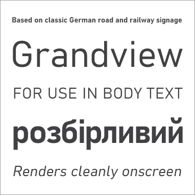
Grandview is a sans serif typeface based heavily on classic German road and railway signage, which was designed to be legible at a distance and under poor conditions.
Grandview is designed for use in body text but retains the same qualities of high legibility, with subtle adjustments made for long-form reading. The straight, squared-off ends of strokes render cleanly onscreen, and wide character widths encourage horizontal eye movement when reading.
The large x-height of the characters and their open counters (internal spaces) make them easy to discern at small sizes. The widths of the characters are consistent across weights and styles.
Type designer Aaron Bell designed Grandview for Microsoft. It has two weights, Regular and Bold, with slanted romans as complementary italic styles. The font includes characters for the Latin, Greek, Cyrillic, and Coptic alphabets as well as Latin support for Vietnamese.


