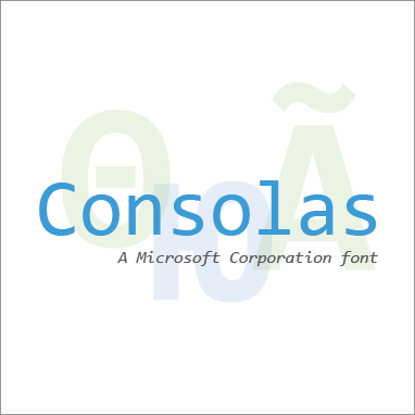
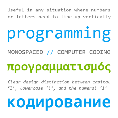
Consolas is a “monospaced” typeface, where every letter is exactly the same width. In most typefaces, the widths of the letters vary; an ‘I’ for instance is usually a lot narrower than a ‘w’.
Consolas is ideal for computer code, but it's also useful in personal and business correspondence, and in any situation where numbers or letters need to line up vertically. In both upright and italic styles, Consolas makes a clear distinction between capital ‘I’, lowercase ‘l’, and the numeral ‘1’, which in some typefaces are easy to confuse.
Although Consolas works best in text, sometimes its peculiarities can impart what its designer calls “a punkish radiation” to headlines.
Consolas was designed to be easy to read on a screen, as part of the Microsoft ClearType font collection. Type designer Lucas de Groot, who also designed Calibri, wanted to create a “really usable monospaced typeface.” The proportions of Consolas are more comfortably readable than the very wide proportions of an older monospaced typeface like Courier New.


