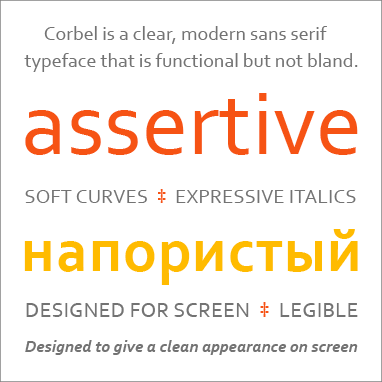
Corbel is a clear, modern sans serif typeface that is functional but not bland. It is designed to give an uncluttered and clean appearance onscreen, especially in longer text, and it works equally well in print. It is easily legible at small sizes.
The upright letters are look simple and neutral; the italics are more expressive. Corbel is a good choice for business documents, email, and electronic documents that are meant to be read onscreen.
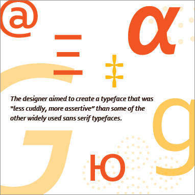
Corbel was designed in 2004 as part of the Microsoft ClearType font collection. Type designer Jeremy Tankard aimed to create a typeface that was "less cuddly, more assertive" than some of the other widely used sans serif typefaces.
Corbel had to work across a wide range of applications and environments. It has two weights, regular and bold, and italics for both. The font's default numerals are "old style" (lowercase, rather than the same height as the capital letters).

