This guide provides step-by-step instructions and best practices to ensure your Word documents are accessible, making your content available to everyone.
Accessibility Assistant helps you to address accessibility issues as you write your document. It guides you on how to add an alt text to images, allowing people using screen readers to understand the image content. Additionally, it provides tips on using fonts, colors, and styles to make your Word documents more inclusive.
Note: Accessibility Assistant is now available exclusively for Microsoft Word on Windows. The features and instructions mentioned in this article apply only to the Windows version of Microsoft Word.
In this article
Check accessibility while you work in Word
Avoid using fixed-width tables
Use the built-in title, subtitle, and heading styles
Add accessible hyperlink text and screen Tips
Check accessibility while you work in Word
The Accessibility Assistant is a tool that reviews your content and flags accessibility issues in your document. In Word, the Accessibility Assistant automatically runs in the background, detecting accessibility issues and sending reminders in the status bar.
Select Review and then Check Accessibility to open the accessibility pane, where you can review and fix accessibility issues.
To use the features described in this article, open a new document in Word or access an existing one.
Use accessible font colors
The text in your document should be easy to read, with enough contrast against the background color.
-
Go to the Home tab or press Alt+H.
-
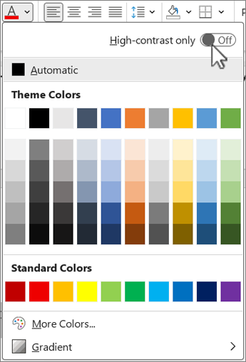
In the Font group, click the arrow next to Font Color.
-
To see only the colors that have enough contrast, select the High-contrast only and toggle to turn on high-contrast mode.
Notes:
-
When you hover over any color choice in the color picker, a tooltip will indicate whether the selected color has low or good contrast with the background.
-
The Accessibility Assistant flags text colors with poor contrast and provides suggestions to improve them.
Add alt text to the visuals
Alt text helps users who are blind or have low vision understand the content of visual elements. These visual elements include pictures, SmartArt graphics, shapes, groups, charts, embedded objects, ink, and videos.
-
Click on the image, video, or any other visual content in the document.
-
Right-click on the visual content and select View Alt Text from the context menu.
-
In the right pane, select Alt Text, Type a description for the visual content in one or two sentences.
Note: If the visual content is decorative, then select the Mark as decorative checkbox
Tips:
-
Avoid using images with text to convey essential information. If you do, put the same text in the document.
-
Use alt text to briefly describe the image and text and why they are there.
-
Write an accurate and short alt text that explains the content and function of the image.
-
A few words are often enough. Don't write more than a sentence or two.
-
Don't repeat the text around the image; use "a graphic of" or "an image of."
-
For audio and video, use alt text and closed captions for those who are deaf or have a hearing disability.
-
Make diagrams into pictures and add alt text. Avoid grouping objects in diagrams, as they will remain in tab order.
Use table headers
Use a simple table structure with column headers. Nested tables, empty cells and merged or split cells may confuse the reader, making it hard to convey useful information.
-
In the left pane, select Insert.
-
Click on the Table button. A drop-down menu will appear.
-
Select the number of rows and columns by dragging your cursor over the grid.
-
Once the table is inserted, click inside the first row of the table.
-
when you select the table, the Table Design tab will appear on the ribbon tab.
-
Check the box labeled Header Row in the Table Style Options section.
-
When you select the table, the Table Design tab will appear with the cursor in the first row.
-
Check the box labeled Header Row in the Table Style Options section.
-
This will format the first row as the header row.
Avoid using fixed-width tables
Using fixed-width tables in Word files can cause several accessibility issues. They don't adjust well to different screen sizes or zoom levels, making content hard to read on mobile devices or when zooming in. Screen readers may struggle with the fixed structure, leading to confusion for people who are blind or have low vision.
Fixed-width tables can also cause text to overflow or get cut off, making it difficult to access all the information.
Additionally, because screen magnifiers only enlarge a portion of the screen, cutting off content or requiring excessive scrolling, users who use the screen magnifiers may find it challenging to view the content properly. For better accessibility, use flexible widths and ensure a clear table structure.
Use the built-in title, subtitle, and heading styles
Use the built-in title and subtitle styles for your document's title and subtitle. These styles are designed to be easily scanned both visually and with assistive technology. Headings should provide a well-defined structure and serve as navigational landmarks
-
Select the text that you want to format as a title.
-
Click on the Home tab or press Alt+H.
-
Select the required style from the Styles group.
Note: Organize headings in the prescribed logical order; do not skip heading levels. For example, use Heading 1, Heading 2, and then Heading 3, rather than Heading 3, Heading 1, and then Heading 2.
For the step-by-step instructions on how to use the headings and styles, see: Improve accessibility with heading styles.
Create paragraph banners
In Word, a paragraph banner is a visual element often used to emphasize or highlight a specific paragraph within a document. It typically consists of a horizontal line, or a decorative border placed above or below the paragraph.
This formatting technique helps draw attention to the paragraph, making it stand out from the surrounding text. Paragraph banners can be customized with different line styles, colors, and thicknesses to suit the document's design and purpose.
-
Select the text that you want to apply shading to.
-
Go to the Home tab.
-
Select the Shading button in the Paragraph group.
-
Open the Shading menu and choose the desired color from the options provided.
Add accessible hyperlink text and ScreenTips
People who use screen readers have the option to scan a list of links in the document. Links should convey clear and accurate information about the destination. You can also add ScreenTips that appear when your cursor hovers over text or images that include a hyperlink.
For the step-by-step instructions on how to create accessible hyperlinks and ScreenTips, go to Create accessible links in Word and Create or edit a hyperlink.
-
Highlight the text or picture that you want to add a link to.
-
Go to the Insert tab.
-
Click on the Hyperlink button or press Ctrl+K.
To link an existing file or web page:
-
Go to the “Link to” section and select Existing File or Web Page.
-
Enter the webpage's address or select the file you want to link to.
To link a place in the same document:
-
Go to the "Link to" section and select Place in This Document.
-
A list of locations within the document will appear; from the list, select the Headings or Bookmarks that you want to link to.
-
-
Click on the Text to display and provide definitive and accurate information about the link destination, then select OK.
Note: Avoid using link texts such as “click here,” “see this page,” “go here,” or “learn more.” Instead, include the destination page's full title.
Create accessible lists
To make documents easier for screen readers, use small chunks like bulleted or numbered lists. Avoid plain paragraphs in the middle of lists to prevent confusion. This ensures accurate navigation and enhances readability for all users.
Bulleted List:
-
Place your cursor where you want to start the bulleted list.
-
Go to the Home tab or press Alt+H.
-
Click on the Bullets button in the Paragraph group.
-
Type your list items. Press Enter after each item to create a new bullet point.
Numbered List:
-
Place your cursor where you want to start the numbered list.
-
Go to the Home tab or press Alt+H.
-
Click on the Numbering button in the Paragraph group.
-
Type your list items. Press Enter after each item to create a new numbered point.
Multilevel List:
-
Place your cursor where you want to start the multilevel list.
-
Go to the Home tab or press Alt+H.
-
Click on the MultilevelList button in the Paragraph group.
-
Choose the type of multilevel list you want to create from the list styles provided.
-
Type your list items. Press Enter after each item to create a new point. To create a sub-level item, press the Tab key before typing.
Adjust the spacing between sentences and paragraphs
Text can appear to “blend together” on a page (the lines of text squeeze into each other). To make reading easier, you can increase the line spacing between sentences and add space before or after paragraphs.
-
Select one or more paragraphs to adjust the space.
-
Go to the Home tab or press Alt+H.
-
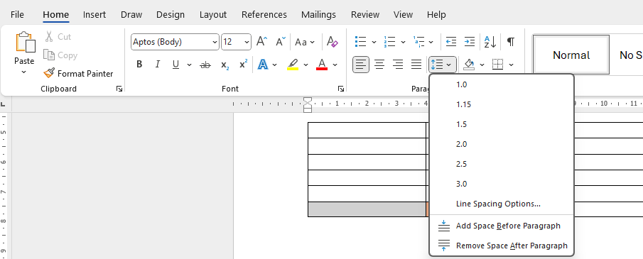
In the paragraphs group, click on the Line and Paragraph Spacing button.
Note: It is recommended to use a line spacing of 1.5 in the Word file.
-
From the dropdown menu, select the desired line and paragraph spacing.
For the step-by-step instructions on how to adjust the spacing, go to Adjust indents and spacing in Word.
Test accessibility with an Immersive Reader
Immersive Reader in Microsoft Word enhances readability with features like Read Aloud, Text Spacing, Syllable Breakdown, and Line Focus. Access it via the View tab and select Immersive Reader.
For more information, visit the Use Immersive Reader in Word.
See also
Improve accessibility in your documents with the Accessibility Assistant
Get real-time notifications of accessibility issues while working on Microsoft 365 Apps


