

After you create a Map chart, explore its powerful formatting features.

Note
If you're a Microsoft 365 subscriber, make sure you have the latest version of Office.
Series options
Note
Several Map chart specific Series options aren't supported on Android devices. If you need some of the Map Series options, build your chart in Excel for Windows and view it on an Android device.
Depending on the map chart type, you can change the following Series options:
- Map projection - Change the cartographic projection of the map. The available projections are Mercator, Miller, Albers, and Robinson. Map projections are methods of displaying a spherical object (the Earth) on a flat plane.
- Map area - Change the zoom level of the map, ranging from a state or province view all the way to the world view.
- Map labels - Show geographic names for your regions. Choose to show names based on fit, or show all labels.
Formatting guidelines
The following guidelines help you format a Map chart's Series Options. To display the Series Options for your map chart, right-click the outer portion of the map and select Format Chart Area in the right-click menu. Or, double-click the outer portion of the map. You see the Format Object Task Pane on the right-hand side of the Excel window. If the Series Options aren't already displayed, click the Series Option expander button on the right side and select the Series "value" option that corresponds with your data.
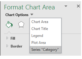 Next, select the Series Options button to display the Series Options and Color choices:

Note
The Map projection, Map area, and Map labels options are the same for either type of map chart, but the Series Color options are only available for value charts.
Map projection
Excel automatically selects the Map projection option that it thinks is best, but you can choose from any of the available selections. Not all options are available depending on the scope of your chart.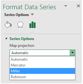
Map area
Excel automatically selects the Map area option that it thinks is best, but you can choose from any of the available selections. Not all options are available depending on the scope of your chart.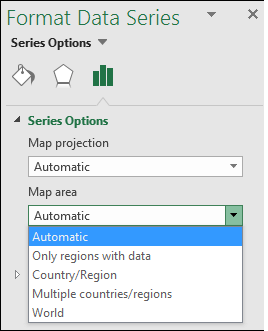
Map labels
You can choose not to display country or region names, or display them where possible based on the Best fit only or Show all options. Label display depends greatly on the actual size of your chart - the larger the chart, the more labels can be displayed.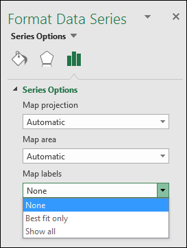
Series Color
Series Colors are only available for Map charts that display values. You can choose from the Sequential (2-color) option, which is the default color setting, or the Diverging (3-color) option. You can experiment with changing the Minimum, Midpoint, and Maximum values, as well as the colors assigned to each.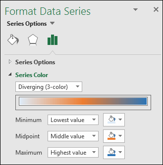
Color formatting a category map chart
Although there are no Series Colors options for a map chart based on a category, you can adjust the individual category colors. Select the data point of interest in the chart legend or on the chart itself. In the Ribbon > Chart Tools > Format, change the Shape Fill. Or, change it from the Format Object Task Pane > Format Data Point > Fill dialog, and select from the Color Palette: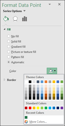
Other chart formatting
You can apply the same charting styles and elements to map charts that you can use with other Excel charts. For more information, see Format elements of a chart.
Need more help?
You can always ask an expert in the Excel Tech Community or get support in Communities.