Tables can help you identify a set of data by name, or apply a more polished format that makes that data stand out.
By carefully naming and formatting your table, you can be sure that everyone—including those with a reading or vision disability—can understand your data.
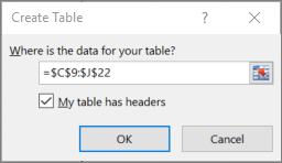
My data’s already arranged in the rows and columns I want. Now I want to turn it into a table.
I select any cell within my set of data,…
…select Insert, and then Table.
In the highlighted box I can see the cells that will be included.
If I want to adjust the selection, I just drag to redefine the cell range.
I select My table has headers. This is important for accessibility, because screen readers use table headers to navigate.
Now I want to give my table a descriptive name.
I select anywhere in my table, and then select Design
Under Table Name, I replace the generic name with a more descriptive one.
With the descriptive name, I can now quickly jump to the table using the Go To command or the Name Box. I can also easily refer to the table in formulas.
A meaningful name like “EmployeeList” is more helpful than the generic “Table1” or a table reference code like $A$3:$D$16.
VO INSTRUCTION: (Voice as “Dollar A Dollar One Colon Dollar D Dollar Sixteen”.)
Now that I have my table, I want to optimize the design for accessibility.
Certain table formats can be hard on people with reading or vision disabilities,…
…so I want to be sure to choose a format with good contrast and readability.
I select anywhere in my table, and then select the Design tab.
I see that Header Row is already selected. Excel includes headers by default, because they’re so essential for accessibility.
But I also want the customer names in the first column to stand out, so I select First Column.
Next, I select Banded Rows. This makes the separation between rows more visible.
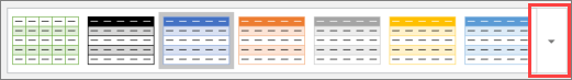
Now I’ll choose a table style that works well for people with low vision or reading disabilities.
There are lots of table styles to choose from.
Lighter colored tables with LOW contrast can be hard for anyone to read, but it’s even harder for people with a reading or vision disability.
On the other hand, styles that alternate between white and a dark color—such as black, dark gray, or dark blue—provide a strong contrast that makes a table more accessible.
To make sure the text INSIDE my table is readable, I can adjust my font, as well as my row and column size.
With the table selected, I select Home, and then Font Size.
I bump the font size from 11 up to 14. I’ll adjust the column width in a minute.
I also want to make sure there’s enough space AROUND my text to keep it from looking crowded. Users with dyslexia can find crowded text especially tough to read.
Under Format, I select Row Height, and increase it to 30. This makes my rows a little taller.
But the text is still too big to fit in my cells. So I select the columns...
Now I select Format again, and then AutoFit Column Width. That’s better…
…but I’ll add a little more white space manually to get the look I want.
Now I can take advantage of this extra space. In the Alignment group, I select Left Align. This adds more space between columns.
We’ll increase the font size and bold the title of our table.
One last thing: Don’t merge or split cells, because that might trip up a screen reader.
That’s it! My new table is done, and ready for EVERY reader.
For more on accessibility, go to aka.ms/OfficeAccessibility

 .
.