

If a chart that you create doesn't display the worksheet data on the axis that you want, you can quickly change the way that data is plotted. For example, if rows of data appear on the horizontal (category) axis, but you want them on the vertical (value) axis, you can switch rows to columns so that the data is displayed in the chart the way that you want.
Important
To complete this procedure, you must have an existing chart. For more information about how to create a chart, see Create a chart from start to finish.
In this article
How Excel determines how data is plotted in a chart
When you create a chart, Microsoft Office Excel determines the axis on which to plot the data series. It bases this decision on the number of worksheet rows and columns that you include in the chart. Excel places the larger number on the horizontal axis.
If your data has an equal number of rows and columns, Excel plots the rows of data on the vertical axis, and the columns of data on the horizontal axis. After you switch rows to columns in the chart, the columns of data are plotted on the vertical axis, and the rows of data are plotted on the horizontal axis.
However, you can quickly change the way that worksheet rows and columns are plotted in the chart by switching rows to columns or vice versa.

Change the way that data is plotted
- Select any point in the chart that contains the data series you want to plot on different axes.
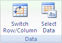
When you select the chart, Chart Styles appears, and the Chart Design and Format tabs are added. - On the Chart Design tab, in the Data group, select Switch Row/Column.
Tips
- For more changes to the way data is displayed on the axes, see Change the display of chart axes.
- To reverse the order in which the categories or values are plotted along the axes, see Change the plotting order of categories, values, or data series.