

A bubble chart is a type of scatter chart that uses bubbles instead of data points. Bubble size adds a third data dimension. Like a scatter chart, a bubble chart doesn't use a category axis. Both the horizontal and vertical axes are value axes. In addition to x and y values, a bubble chart plots z (size) values.
Learn more about plotting data in a bubble chart
You can use a bubble chart instead of a scatter chart when your data has three data series with related values. The values in the third data series determine the bubble sizes. Bubble charts are often used to present financial data. Different bubble sizes can help emphasize specific values.
To create a bubble chart, arrange your data in rows or columns on a worksheet. List x values in the first row or column, and list the corresponding y values and bubble size (z) values in adjacent rows or columns. For example, organize your worksheet data as shown in the following image.

In this bubble chart, the number of products is displayed along the horizontal axis, the sales amounts are displayed along the vertical axis, and the market share percentages are represented by the size of the bubbles.
Consider using a bubble chart when your data includes the following:
- Three values per data point Three values are required for each bubble. These values can be in rows or columns on the worksheet, but they must be in the following order: x value, y value, and then z value.
- Multiple data series Plotting multiple data series in a bubble chart (multiple bubble series) is similar to plotting multiple data series in a scatter chart (multiple scatter series). Scatter charts use sets of x values and y values, but bubble charts use sets of x values, y values, and z values.
When you create a bubble chart, you can choose to display bubbles in 2-D format or with a 3-D effect.

Create an elaborate bubble chart

The following procedure shows how to create a bubble chart with similar results. For this chart, we used the example worksheet data. You can copy this data to your worksheet or use your own data.
Copy the example worksheet data into a blank worksheet, or open the worksheet that contains the data that you want to plot in a bubble chart. To copy the example worksheet data
- Create a blank workbook or worksheet.
- Select the example in the Help topic.
- Press Ctrl+C.
- In the worksheet, select cell A1, and press Ctrl+V.
Number of Products Sales Percentage of Market Share 5 $5,500 3% 14 $12,200 12% 20 $60,000 33% 18 $24,400 10% 22 $32,000 42% Note
Make sure that your worksheet has at least four rows or columns of data. If you create a bubble chart from three or fewer rows or columns of data, the chart doesn't plot the bubbles correctly.
Select the data that you want to plot in the bubble chart.
Note
Don't include row or column headings in the selection. If you select the headings with your data, the chart might produce incorrect results.
On the Insert tab, in the Charts group, click the arrow next to Scatter Charts.

Select the bubble with the 3-D effect icon.
Click the chart area of the chart. This displays Chart Tools.
Under Chart Tools, on the Design tab, in the Chart Styles group, click the chart style that you want to use.
If you see a legend on the chart, click the legend, and then press Delete.
To change the size of the chart, on the Format tab, in the Size group, select the shape size that you want in the Shape Height and Shape Width box, and then press Enter. For our bubble chart, we used
3.5"for both shape height and shape width.
To format and position a chart title on the chart, click the chart area, and then do the following:
- In the chart, click the chart title, and then type the text that you want.
For our bubble chart, we typed
Industry Market Share Study. - To reduce the size of the chart title, right-click the title, select Font, and then enter the size that you want.
For our bubble chart, we used
12. - To align the chart title with the plot area, click the chart title, and then drag it to the position that you want.
- In the chart, click the chart title, and then type the text that you want.
For our bubble chart, we typed
To add a horizontal axis title, click the chart area of the chart, and then do the following:
- Click the plus sign next to the chart.
- Select Axis Titles, and then select Primary Horizontal.
- Select the Axis Title text box, and then enter your text.
 For our bubble chart, we typed
 Number of products.
Click the vertical axis, or select it from a list of chart elements (Format tab, Current Selection group, Chart Elements box).
On the Format tab, in the Current Selection group, click Format Selection.
Under Axis Options, do the following:
- For Minimum, type
0(zero). - For Maximum, type the number that you want.
For our bubble chart, we typed
80000.
- For Minimum, type
In the Format Axis dialog box, click Number.
Under Number, in the Decimal places box, type
0(zero), and then click the down arrow in the upper-right corner, and select Close.To apply a special formatting effect to the plot area, chart area, chart title, or vertical axis of the chart, click that chart element, or select it from a list of chart elements (Format tab, Current Selection group, Chart Elements box), and then do the following:
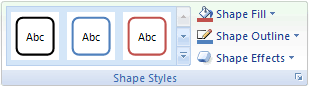
- On the Format tab, in the Shape Styles group, click the More button next to Shape Effects.
- Click the effect that you want to use.
If you want to use theme colors different from the default theme that is applied to your workbook, do the following:
- On the Page Layout tab, in the Themes group, click Themes.

- Click the theme that you want to use. Hover over each theme to preview how it will appear when applied to your chart.
- On the Page Layout tab, in the Themes group, click Themes.
You can save the chart as a template that you can use as the basis for other similar charts. For more information, go to Save a custom chart as a template.