
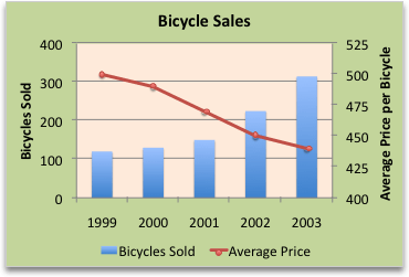
To emphasize different kinds of information in a chart, you can combine two or more charts. For example, you can combine a line chart that shows price data with a column chart that shows sales volumes.
Note
To create a combination chart, you must use a 2-D chart, such as a 2-D Line, 2-D Column, Scatter, or Bubble chart.
Note
To complete this procedure, you must have an existing chart. For more information about how to create a chart, see Create a chart from start to finish.
Do one of the following:
To change the chart type of the whole chart, click the chart area or plot area of the chart to display the chart tools.
Tip
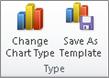
Alternatively, right-click the chart area or plot area, click Change Chart Type, and then continue with step 3.
To change the chart type of a data series, click that data series.
Note
You can change the chart type of only one data series at a time. To change the chart type of more than one data series in the chart, repeat the steps of this procedure for each data series that you want to change.
This displays the Chart Tools, adding the Design, Layout, and Format tabs.
On the Design tab, in the Type group, select Change Chart Type.
In the Change Chart Type dialog box, click a chart type that you want to use.
The first box shows a list of chart type categories, and the second box shows the available chart types for each chart type category. For more information about the chart types that you can use, see Available chart types.