Create plots and charts with Python in Excel
Applies To
For availability information, see Python in Excel availability. If you encounter any concerns with Python in Excel, please report them by selecting Help > Feedback in Excel.
New to Python in Excel? Start with Introduction to Python in Excel and Get started with Python in Excel.
Use open-source Python libraries to create plots and charts
Python in Excel comes with a core set of Python libraries provided by Anaconda. This article describes how to use Python libraries, such as seabornand Matplotlib, to create plots and charts. To learn more about the open-source libraries available with Python in Excel, see Open-source libraries and Python in Excel.
The examples in this article use the Iris flower data set. Download this sample workbook to follow along with the article: python-in-excel-iris-dataset.xlsx.
Create a pair plot with seaborn
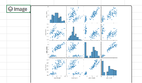
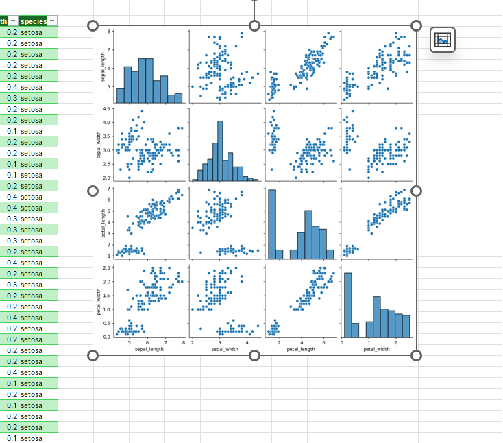
This example shows how to create a pair plot visualization of the Iris flower data set. A pair plot is a matrix of plots and charts that compares the relationship between each variable in a data set. In this case, the Iris flower data set contains four columns of numerical data: sepal_length, sepal_width, petal_length, and petal_width.
Python in Excel creates the visualization with the seabornlibrary. The seabornlibrary is automatically imported for Python in Excel with the following import statement, letting you reference it with the alias sns.
import seaborn as sns
To create a pair plot of the Iris flower data set with the seaborn library, take the following steps:
-
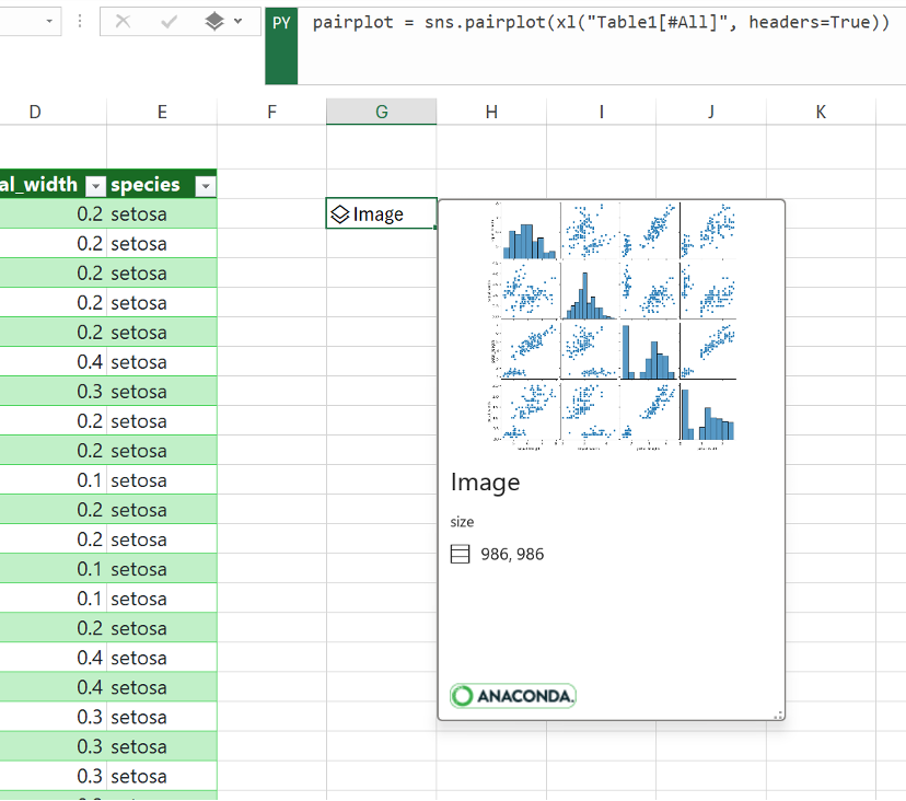
Enter the following code snippet in a Python in Excel cell. The code snippet stores the pair plot as a variable called pairplot. It creates the pair plot with the seaborn library alias sns and the seaborn function pairplot.pairplot = sns.pairplot(xl("Table1[#All]", headers=True)) As the argument for the pairplot function, the code snippet uses the custom Python function xl() and references the first table in the worksheet, Table1. It includes the entire table contents (as [#All]), and notes that the table includes a header row (as headers=True). In this example, Table1 in the worksheet contains the Iris dataset.
Note: If you encounter any errors, see Troubleshoot Python in Excel errors for more information.
-
After committing your Python formula, Python in Excel returns the pair plot visualization in an image object. Select the card icon in the image object cell to see a preview of the visualization.
-
Keep the visualization as an Image object to continue using it for Python calculations. Extract the image to the Excel grid to resize it and view each plot in more detail. To extract the image to the grid, right-click or Ctrl+click on the cell that contains the image object and select Display Plot over Cells from the menu. For additional information about extracting image objects, see the Extract an image object to the Excel grid article section in this article.
Create a scatter plot with Matplotlib
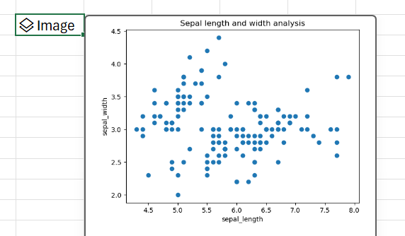
This example describes how to create a scatter plot with the Iris flower sample data set. A scatter plot shows the relationship between two numerical variables in a data set. The example creates a scatter plot that looks like the following screenshot, comparing the sepal_width and sepal_length values.
Python in Excel creates the visualization with the Matplotlibopen-source library. The Matplotliblibrary is automatically imported for Python in Excel with the following import statement, letting you reference it as plt.
import matplotlib.pyplot as plt
To create a scatter plot of the Iris flower data set with the Matplotlib library, take the following steps:
-
In a Python in Excel cell, use the Matplotlib scatterfunction and enter the sepal_length and sepal_width columns of the Iris data set as the arguments. In this example, Table1 in the worksheet contains the Iris dataset.plt.scatter(xl("Table1[sepal_length]"), xl("Table1[sepal_width]"))
-
Add labels and a title to the scatter plot.# Label the x and y axes of the plot. plt.xlabel('sepal_length') plt.ylabel('sepal_width')# Add a title to the plot.plt.title('Sepal length and width analysis')
Note: You can add this code snippet as an additional line of code after the Python formula in the previous step, in the same Excel cell, or you can enter it in a new Python in Excel cell in your workbook. If you choose to enter it in a new cell, make sure to follow the row-major calculation order rules and enter it after the first cell.
-
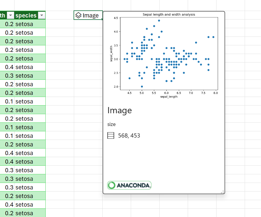
After committing your Python formulas, Python in Excel returns the scatter plot visualization as an image object. Select the card icon in the image object cell to see a preview of the visualization.
Note: If you encounter any errors, see Troubleshoot Python in Excel errors for more information.
-
Keep the visualization as an image object to continue using it for Python calculations. Extract the image to the Excel grid to resize it and view the plot in more detail. To extract the image to the grid, right-click or Ctrl+click on the cell that contains the image object and select Display Plot over Cells from the menu. For additional information about extracting image objects, see the Extract an image object to the Excel grid article section in this article.
Extract an image object to the Excel grid
As demonstrated by the examples in this article, Python libraries such as seaborn and Matplotlib can return data visualizations to Excel cells. By default, Python in Excel returns these visualizations as image objects.
Select the card icon in an image object cell to see a preview of the visualization.
There are two ways to extract an image to the Excel grid: display the image as a plot over cells or display the image within a cell.
Display the image over cells
Follow these steps to display the image as a plot over cells.
-
Right-click or Ctrl+click on the cell that contains the image object and select Display Plot over Cells from the menu (or use the keyboard shortcut Ctrl+Alt+Shift+C). This creates a copy of the image that floats over the Excel grid and can be resized easily. The original image object remains in the original cell.
-
Select and drag the plot image to move it around your worksheet. Select and drag the nodes at the corners and sides of the image to resize it.
Display the image within a cell
Follow these steps to display the image within a cell.
-
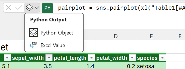
Return the image object as an Excel value. Select the image object cell, go to the Python output menu in the formula bar, and select Excel Value.
Tip: To toggle Python formula results between Python objects and Excel values, use the keyboard shortcut Ctrl+Alt+Shift+M. To learn more keyboard shortcuts, see Python in Excel keyboard shortcuts.
-
The size of the plot image depends on the size of the cell. Increase the size of the image by increasing the size of the cell, or by merging cells.
Use different fonts for non-English languages
To chart data that uses non-Latin alphabet characters, such as Chinese, Korean, or Thai, use excel.FontPath. By default, Python in Excel renders non-Latin alphabet characters as an empty square ('□'). To resolve this, excel.FontPath allows you to use the excel module to call a different font and render the characters.
The following fonts are available. The attribute is appended to excel.FontPath in your Python code. The path refers to the font file called by the attribute.
|
Attribute |
Path |
|---|---|
|
BENGALI |
/usr/share/fonts/Vrinda.ttf |
|
CHINESE_SIMPLIFIED |
/usr/share/fonts/SimSun.ttf |
|
CHINESE_TRADITIONAL |
/usr/share/fonts/MingLiU.ttf |
|
HINDI |
/usr/share/fonts/Mangal.ttf |
|
JAPANESE |
/usr/share/fonts/Meiryo.ttf |
|
KOREAN |
/usr/share/fonts/Batang.ttf |
|
THAI |
/usr/share/fonts/THSarabunPSK.ttf |
Use excel.FontPath to display simplified Chinese plot labels
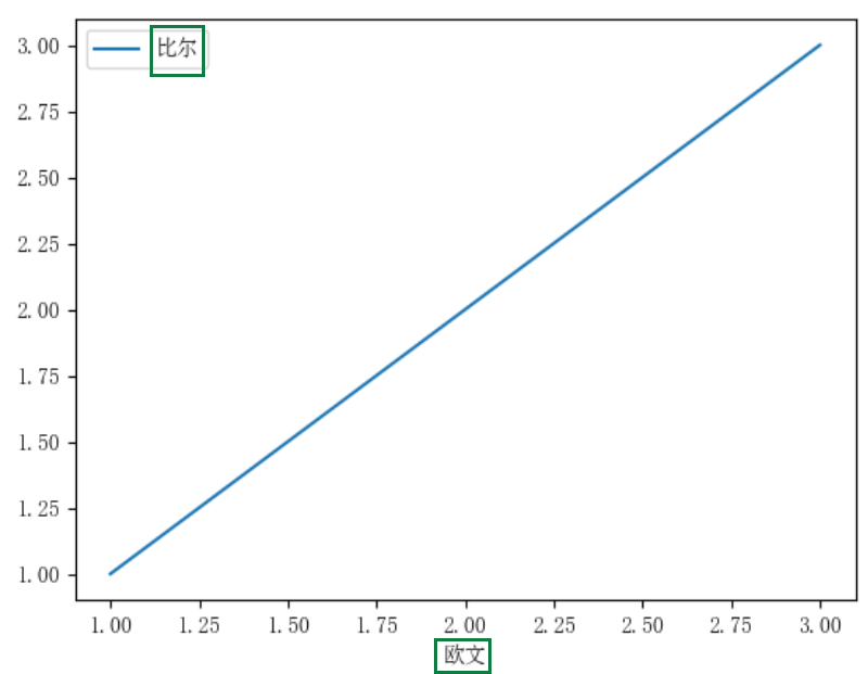
The following screenshot shows a chart with plot labels in simplified Chinese characters using excel.FontPath. The code sample after the screenshot demonstrates how to use excel.FontPath.CHINESE_SIMPLIFIED to display characters from the simplified Chinese library.
Code sample using excel.FontPath
This code sample shows how to use excel.FontPath.CHINESE_SIMPLIFIED to generate the plot and the simplified Chinese characters in the plot labels that display in the preceding screenshot.
-
import matplotlib.pyplot as plt
from matplotlib.font_manager import FontProperties

# Set the font path. This returns '/usr/share/fonts/simsun.ttf'.
font_path = excel.FontPath.CHINESE_SIMPLIFIED

# Point the properties to the font path.
font_properties = FontProperties(fname=font_path)
plt.rcParams['font.family'] = font_properties.get_name()

# Make the plot.
myplot = pd.DataFrame({'欧文': [1,2,3], '比尔': [1,2,3]}).plot(x='欧文')

# Show the plot.
plt.show()

