Create a publication in Microsoft Viva Amplify
What is a Viva Amplify publication?
A Viva Amplify Publication is a communication created as part of a campaign. For each campaign, you can create multiple publications to inform, educate, and engage your audience. Publications can be published to email, Teams, and SharePoint. Viva Amplify publications can help you reach your audience in a timely and effective manner.
The main draft allows you to create a base publication, which Viva Amplify tailors for email, SharePoint, and Teams. You'll learn here how to create your main draft.
Viva Amplify includes pre-built campaigns that you can customize and share to your organization. The currently available campaigns include customizable publications, along with pre-drafted campaign briefs with objectives and key messages. Learn how to try out the pre-built campaigns.
Note: There is a maximum image attachment size of 12582912 bytes.
Note: Viva Amplify doesn't support subsites, including publishing to subsites.
Notes: Viva Amplify has limits to the number of recipients each publication can be sent to:
-
200 individual email addresses (including individuals, distribution lists, and groups
-
10 SharePoint sites
-
5 Teams channels
Create a new publication
From the campaign Overview page
On the campaign overview page, you can create a publication from a template.
From the Publications page
From the Publications page, you can select the +New button to create a blank publication.
Access an existing publication
From the Overview page
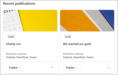
You can see your recently created drafts on the Overview page. Select the title of a draft to view and edit the publication.
From the Publications page
Open the publication overview page by selecting Publications in the main navigation. From there you can select the publication you want to edit by selecting the title.
Add, remove, and modify content
For any new template or existing publication, you can easily add and modify the content and formatting to create your personalized communication. Each template provides a starting point for your design, but you have the flexibility to customize it to fit your specific needs and requirements.
Customize the title area
You can customize the title area with the following options:
-
An image
-
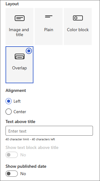
A choice of four layouts
-
Text above the title
-
The displayed author
-
Show or hide the published date
Add a title (required)
Adding a title to your publication is an important step in the creation process. Not only does it give your publication a clear and concise name, but it also allows you to save your work and share it with collaborators.
Note: it's required to enter a title before you move onto the next step. If you forget to add a title, you’ll receive a reminder pop up before being able to continue.
Add a title image (optional)
To add an image, select the Browse images icon in the toolbar. Hover above your title to see the toolbar.
To change the image, go to Browse images and select a different image.
Choose a recent image or get an image from stock images provided by Microsoft, from a web search, your site, your computer, or a link. If your organization has specified a set of approved images, you'll be able to choose from that set under Your organization.
SCREENSHOT
Notes:
-
Web search uses Bing images that utilize the Creative Common license. You are responsible for reviewing licensing for an image before you insert it on your page.
-
Images look best when they are landscape or 16:9 or greater in aspect ratio.
-
Make sure that the recipients across all channels have access to the image you're including.
Set a focal point (optional)
You can set a focal point to make sure the most important part of your picture is in the frame. Select Set image focal point in the toolbar, and then drag the focal point in the image to where you want it.
Add or change displayed page author (optional)
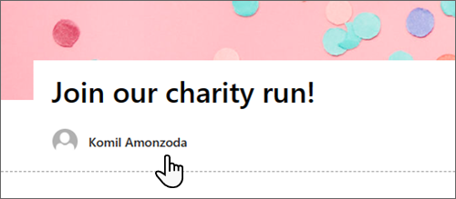
In the title area, add a name, partial name, or email name in the Author box. Amplify will search the name against your organization's profiles and present you with suggested people. Choose the one you want. If you don't enter a name, the publication won't display an author byline.
Choose a title layout (optional)
Select the Edit web part
Set title alignment (optional)
If the toolbox isn't already showing, select the Edit
Add text above the title (optional)
You can add text in a contrasting block above your title to add qualifying information or draw attention to something on the page. The color of the block is based on your site theme.
-
Select the Edit web part
-
In the toolbox, enter up to 40 characters of text in the Text above title box.
-
Then, change the Show text block above title toggle to Yes.
Show or hide published date (optional)
-
Select the title area.
-
Select the Edit web part
-
Under Show published date, use the toggle to show or hide the published date.
Use sections to create your main content
Create attractive, organized layouts by adding sections with columns. To show content side-by-side, you can add up to three columns to each section. You can also stack multiple sections with varying numbers of columns. You can even add a vertical section to the right side which is great for showing things like quick links, contacts, countdown timers, and more.
The following example has three one-column sections on the left and a vertical section on the right.
Note: Some functionality is introduced gradually to organizations that have opted into the targeted release program. This means that you might not see this feature yet, or it may look different from what's described here.
Add a section layout
-
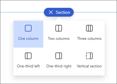
Make sure you're in edit mode. Hover over the + icon on a section divider and select + Section.
-
Select the number of columns that you want. Or, you can select one full-width column to span the entire page.
Use Design ideas to create sections
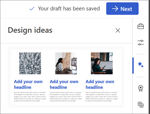
You can use Design ideas to easily create sections that meet your needs. Select the Design ideas icon to explore different sections. Learn more about Design ideas.
Add a section template
-
Hover your mouse below the title area, or above or below an existing web part to the far left of the page. A line with a circled plus sign (+) will appear with a tooltip that says Add a new section.
-
Select the plus icon.
-
In the pane that opens, select the Templates tab.
-
From the list of templates, select the one that best suits your needs. Then add content into each field of the template.
Add a vertical section
Tip: In a narrow browser window, a vertical section moves to the bottom of the page. The vertical section will return to the right side of the page when you make the window wider. This can also happen if the viewer's screen width is less than 1024 pixels.
-
Hover your mouse below the title area, or above or below an existing web part to the far left of the page. A line with a circled plus sign (+) will appear with a tooltip that says Add a new section.
-
Select the plus icon.
-
Under Section layout, select Vertical section.
-
In a narrow browser window, a vertical section can be moved to the bottom or top of the page. Choose whether you want your vertical section to go to the top or bottom of your page when your browser window is condensed to a smaller size by selecting Edit section.
Notes:
-
Vertical sections are currently only available on the right side of the page.
-
Length of vertical sections is adjusted based on the content on the page, growing or shrinking with the length of content in non-vertical sections.
-
You can't have a full-width column and a vertical section on the same page
-
Change an existing section
Tip: When you have content in two or more columns, and then reduce the number of columns, the content in the right most column will move to the next column on the left. If you reduce to one column, content in the second or third columns will move to the bottom of the first column.
-
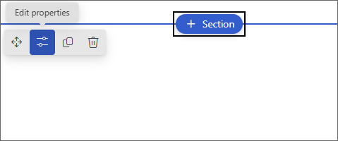
Each section of a page is marked with a line. Select the section you want to add columns to, then select Edit properties.
-
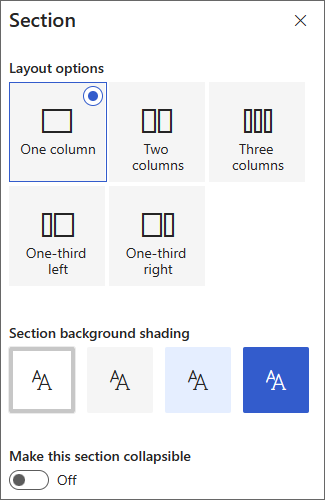
In the section toolbox, choose the number and type of columns you want. If you want to add emphasis to the section or change the appearance, choose a section background color. The available colors are based on your site theme.
Note: The section background color shows through most web parts. Other web parts maintain the background of the page rather than the section. For accessibility purposes, the List, Document library, and Quick chart web parts will always maintain the page background.
Add content to a column
-
Go to the column where you want to add content.
-
Hover over the column and select the plus (+) icon.
-
Select the web part you want to add to the column, and then add your content to the web part.
Make sections collapsible
-
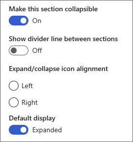
Select the section you want to make collapsible. Then select Edit section.
-
In the Section formatting pane, find Make this section collapsible and switch the toggle to On.
-
Add a Section display name to identify your section.
-
Choose whether or not you want to enable the divider line between sections with the Show divider line between sections toggle.
-
Choose the expand or collapse icon alignment by selecting Left or Right.
-
For each section, decide if the default display will be expanded or collapsed by switching the toggle.
Customize content using web parts
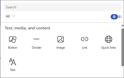
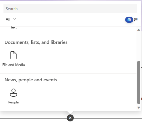
Viva Amplify offers a selection of web parts to transform your main draft into an engaging and appealing communication that's tailored for different communication channels such as Teams and Outlook. You can find web parts by hovering your pointer below the title area. Select the line with a circled plus sign (+) to see all available editing options. You can also add web parts from the Toolbox.
Notes:
-
If you've previously used SharePoint pages you may have seen additional webparts that aren't available in Viva Amplify. The reduced selection of webparts is to allow each webpart to display correctly in various distribution channels, such as Outlook and Teams. We are working to expand this selection.
-
Content and formatting adaptations: some webparts and webpart properties will display a behavior different from its default behavior. For example, in the Sections layout, when you organize content into two or three columns, the same content gets stacked into a single column when being published. Additionally, some properties like text on images, columns, and medium and large people web parts may have been changed for this distribution channel. For a full list of content and formatting adaptations see Formatting changes in Viva Amplify.
Use the Text web part to add paragraphs to your page. Formatting options such as styles, bullets, indentations, highlighting, and links are available. You can also paste inline images with Text.
-
Select the plus sign and choose Text from the list of web parts.
-
Click inside the box. The formatting toolbar will display.
-
Enter your text and format it using the toolbar. View more formatting options by selecting the ellipses (...) on the toolbar.
-
To add a table, select the ellipses and choose Insert table. Once you click into the table, the table styles options will appear. You can also access this menu by selecting the table itself.
Note: Though any table size can be added to an Amplify distribution, the conversion of larger tables into the 600px distribution width might lead to undesirable reflow. Make sure your table looks ok when you view it in preview. A horizontal scroll bar to prevent reflow issues is provided in some mail clients, but not all.
Use the Image web part to add images to your page.
-
Select the plus sign and choose Image.
-
Browse the image picker to select your image.
-
Once you've chosen your image, the following options will appear in the image toolbar:Learn more about image editing capabilities.
-
Move
-
Edit
-
Duplicate
-
Delete web part
-
Browse images
-
Text overlay (this will show on top of the image)
-
Resize
-
Crop
-
Center align
-
Advanced editing
-
Reset
-
Inline images
You can add an inline image with text by copying an image and pasting it into the Text web part at the location of your cursor. Then, select the image within the web part and use the toolbar at the upper left of the image to edit the image, move it, or align it left, right, or center. You can resize the image by selecting the handles at each corner of the image.
Note: In the generated email distribution, images won't show as inline with text. Instead, the text will render above or below the image depending on their location with respect to the inline image. The size of the inline image will be preserved. For best conversion results, rely on the full image webpart.
Who's on the team? What are they responsible for? How can I contact them? It's easy to answer these questions for your readers with the People web part. It can show the photos, contact information, and more of the people in your organization.
-
Select the plus sign and choose People from the list of web parts.
-
Change the title of the web part by selecting the text that says People profiles and typing over it.
-
Enter a name or partial name in the box. A list of matching results will appear, and you can select the person you want. Then select Add to profile.
-
Select as many people as needed.
Types of cards
Three different types of cards are supported: small, medium and large. You can choose to show more or less information by selecting the type of card to show. Small cards show a picture (if one is available) and the person's name or email address, as in the image above. The Medium layout shows one row of a text description. The Large layout shows a picture, name or email, title (if available), and an optional link and description.
To change the type of card, use the dropdown menu in the web part toolbar.
To reorder people profiles, drag and drop each one to your desired position using the Move button.
You can also reorder people cards using Ctrl + Left or Ctrl + Right arrow keys.
Use the File and media web part to insert a file on your page. File types you can insert include Excel, Word, PowerPoint, Visio, PDFs, 3D models, videos, and more.
-
Select the plus sign, then choose the File and media web part.
-
Choose a recent file or get a file from a SharePoint site, your computer, or a link. If your organization has specified a set of approved images, you'll be able to choose from that set under Your organization. That file will then display in line on your page.
Notes:
-
Web search uses Bing images that utilize the Creative Commons license. You're responsible for reviewing licensing for an image before you insert it in your draft.
-
For any imbedded file, the web part is translated as a card that links back to the full file form. For videos, a larger card is generated that shows a preview of the first frame.
Tips:
-
Image files aren't supported in the File and Media web part. If you want to insert an image, you can use the Image web part.
-
-
Select the plus sign, then choose the Divider web part.
-
Select Edit web part to customize the divider's length and width.
-
Set the length of the divider from 20% to 100%. The divider's length will change as you drag the slider so you can preview the change.
-
Set the weight of the divider from 1 (thinnest) to 6 (thickest). The divider's weight will change s you drag the slider so you can preview the change.
-
Select the plus sign, then choose the Quick links web part.
-
Add your own title by typing over the Quick links title.
-
Select the layout options above the Quick links to select your layout.
Note: Regardless of which layout you choose, it will be converted to the button format in your distribution.
Add links
-
Select +Add.
-
Choose a recent file or get a file or image from one of the following locations:
-
Stock images provided by Microsoft
-
A SharePoint site
-
Your OneDrive account
-
Your computer
-
A link
-
If your organization has specified a set of approved images, you'll be able to choose from that set under Your organization.
-
-
Choose your image, page, or document, and select Insert.
-
In the toolbox, you'll have options for each link. The options depend on the settings you've chosen for the layout. For example, if you chose to Show descriptions for a list layout, you can add a description for the individual link. Other types of options for individual links, depending on the layout options, include changing the image, formatting icons, adding descriptions, and adding alternative text.
Edit, remove, or reorder links
-
Hover over the item you want to edit. Select the Edit icon
-
This will open the toolbox for that item where you'll have options for that link. The options depend on the settings you've chosen for the layout. For example, if you chose to Show descriptions for a list layout, you can add a description for the individual link. Other types of options for individual links, depending on the layout options, include changing the image, formatting icons, adding descriptions, and adding alternative text.
-
To remove links, select the trash can icon for the item.
-
To reorder links, drag and drop items to new positions using the Move icon. You can also reorder links by using Ctrl + Left or Ctrl + Right keys.
Note: You can't reorder links in the Filmstrip layout.
Use the Link web part to add a link, along with its preview, to an internal or external page, video, image, or document.
-
Select the plus sign, then choose the Link web part.
-
Paste a link to a page, video, or document. In addition to the link text, a preview of the item will display on the page if available. To remove either the link or the preview, select the X next to it.
The link web part will look similar in your final distribution.
Save your content
Viva Amplify offers several features that make collaboration on publications more seamless and efficient.
Autosave
Amplify content is autosaved at regular intervals to ensure that you don't lose any progress on your draft in case of unexpected interruptions.
Save and close
When you're done editing, you can select Save and close to exit editing mode and allow other collaborators to enter and make changes.
Save on navigation
When you navigate away from the main draft using Campaign or Next, the content automatically updates for collaborators in the campaign to see. This ensures that everyone will be working with the latest version of the publication.
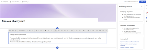
Use writing guidance to inform your draft
Writing for the audience is a critical aspect of creating effective communications. It's important to find the right tone for the message depending on where the audience can be reached. By understanding the audience, you can tailor the message to resonate with them and achieve the desired outcome.
Inspirational out-of-the-box content
To help you write for different audiences, we offer inspirational content that provides guidance on how to write accessible content and create communications for different distribution channels. This content is designed to help users understand how to create communications that are engaging and effective, regardless of the audience or distribution channel.
Key messages and Objectives from the campaign brief
Viva Amplify imports the key messages and objectives that users have previously determined in the campaign brief to the Main draft. These messages are displayed in the sidebar of the publication, ensuring that they are always front and center when crafting content. This feature helps to ensure that the content is aligned with the campaign objectives and effectively communicates the desired message to the audience.

