
Workload data in Education Insights Premium
Get a big picture view of student productivity, capacity, and balance between their Teams learning activities and life outside the online classroom. By understanding student workload, you can help to make adjustments when necessary.
Organization levels
Just like in your overview dashboard, you can adjust your Workload data view to include different levels in your education organization:
-
Organization: All schools or institutions in your education organization
-
School: Data from a specific school
-
Grade: Data from one grade level
-
Class: Data from a specific class
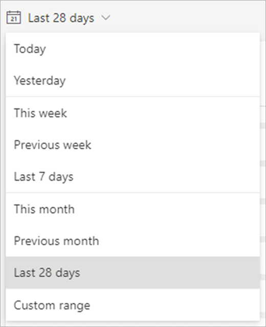
Choose time frame and activity
Time filter: select to open a dropdown of additional timeframe options.
Select Custom range to enter your own dates for a timeframe of up to 60 days. Timeframes can begin as far back as the beginning of the academic year, as determined by SDS.
Note: Percentage data is calculated only for students on the roster the last day of any timeframe you select. If there is no roster data for the timeframe selected, the default timeframe may change accordingly.
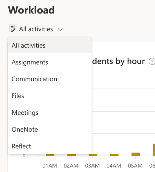
Activity: You can view all activities by default or drill down and select a specific activity:
-
Meetings: Attendance and time spent in meetings
-
Communications: Adding posts, replies, and reactions in channels
-
Files: Opening files in channels
-
Assignments: Opening and submitting assignments
-
OneNote: Opening and submitting content through OneNote
-
Reflect : Replying to Reflect check-ins
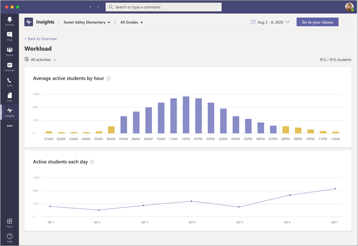
Reading your Workload dashboard:
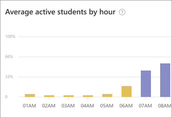
Average active students by hour graph:
-
Yellow bars on your graph represent data collected during quiet hours—8 PM to 7 AM, when students were active in a class team, outside of learning hours.
-
Blue bars reflect data collected during learning hours.
-
The Y-axis represents the percentage of active students according to the chosen filter, divided by hours.
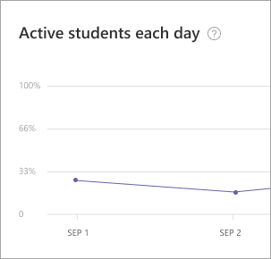
Active students each day graph:
-
Like in the bar graph for hourly activity, the Active students each day graph shows percentages of student activity, but here, you're looking at student activity per day during the selected time frame.
Learn more


Need more help?
Want more options?
Explore subscription benefits, browse training courses, learn how to secure your device, and more.


Communities help you ask and answer questions, give feedback, and hear from experts with rich knowledge.


